New Jersey Institute of Technology
The Project Challenge
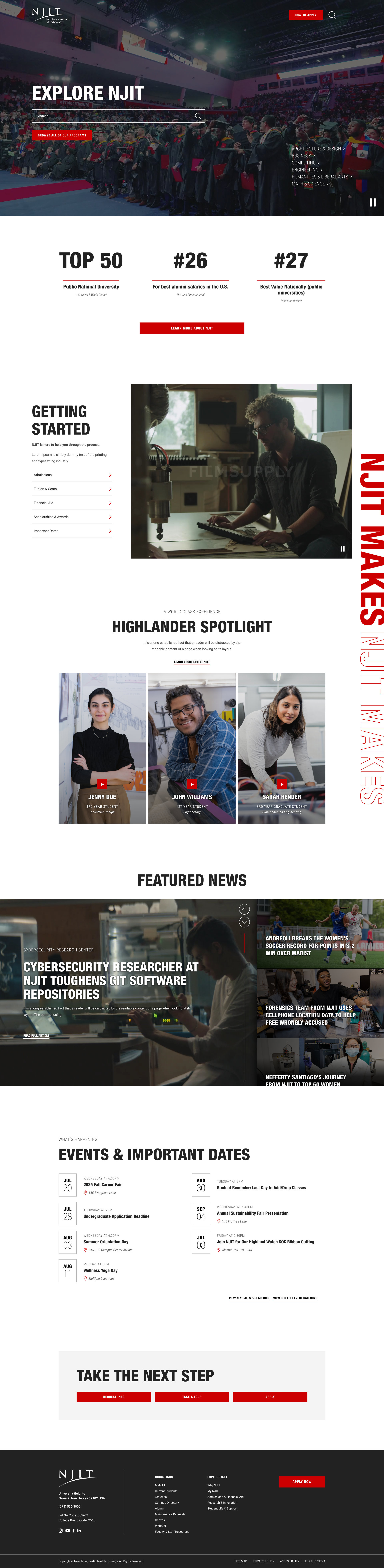
NJIT had acclaim in prestigious publications, rivalling renowned tech institutions like 'MIT', but struggled to expand their reach past the regional area of New Jersey. Aside from scale itself, their digital presence wasn't telling the true story of their campus: a lively, inventive, 'maker' space filled with art instillations, world class labs, and top research facilities.
New Jersey Institute of Technology (NJIT) is a top polytechnic research university focusing heavily on STEM fields, architecture, and business, located in Newark, New Jersey, USA.
My Roles:
My Process:
- RFP Response Strategy
- Shortlist Pitch
- Discovery Workshops
- UX Research & Analysis*
- Mood Board/Tiles*
- Wireframes*
- Prototypes*
- Mockups*
- Dev Hand-off
*Presentations & Revisions
Agency:
Northern Commerce




The Solution
Brand Refresh
From Generic Boilerplate to Refined, Innovative, Tech ‘Maker’ Hub.
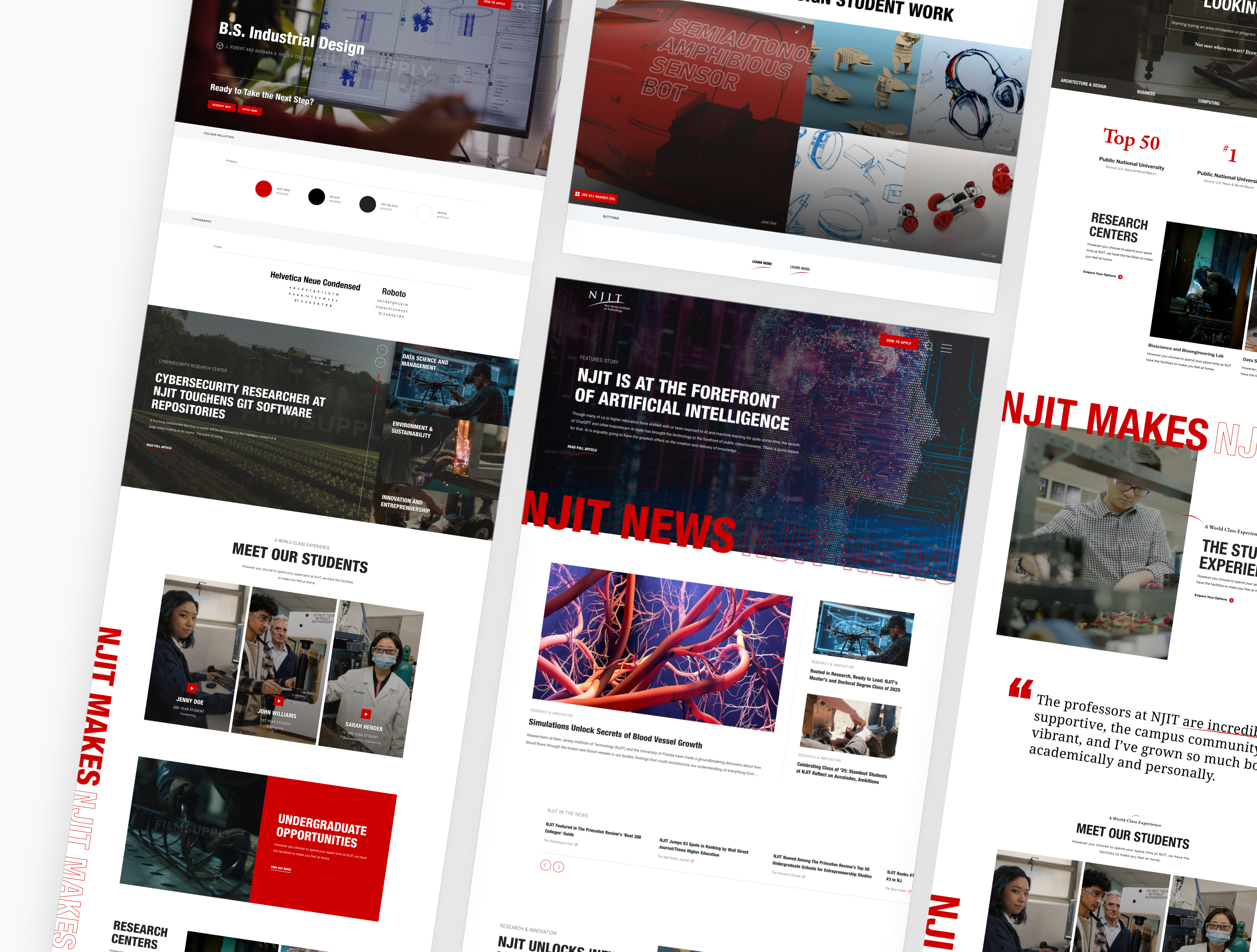
I designed a bold, tech-forward brand direction that surfaced NJIT's value propositions, ‘maker’ culture, and positioned it alongside the refined institutions it benchmarks itself against.
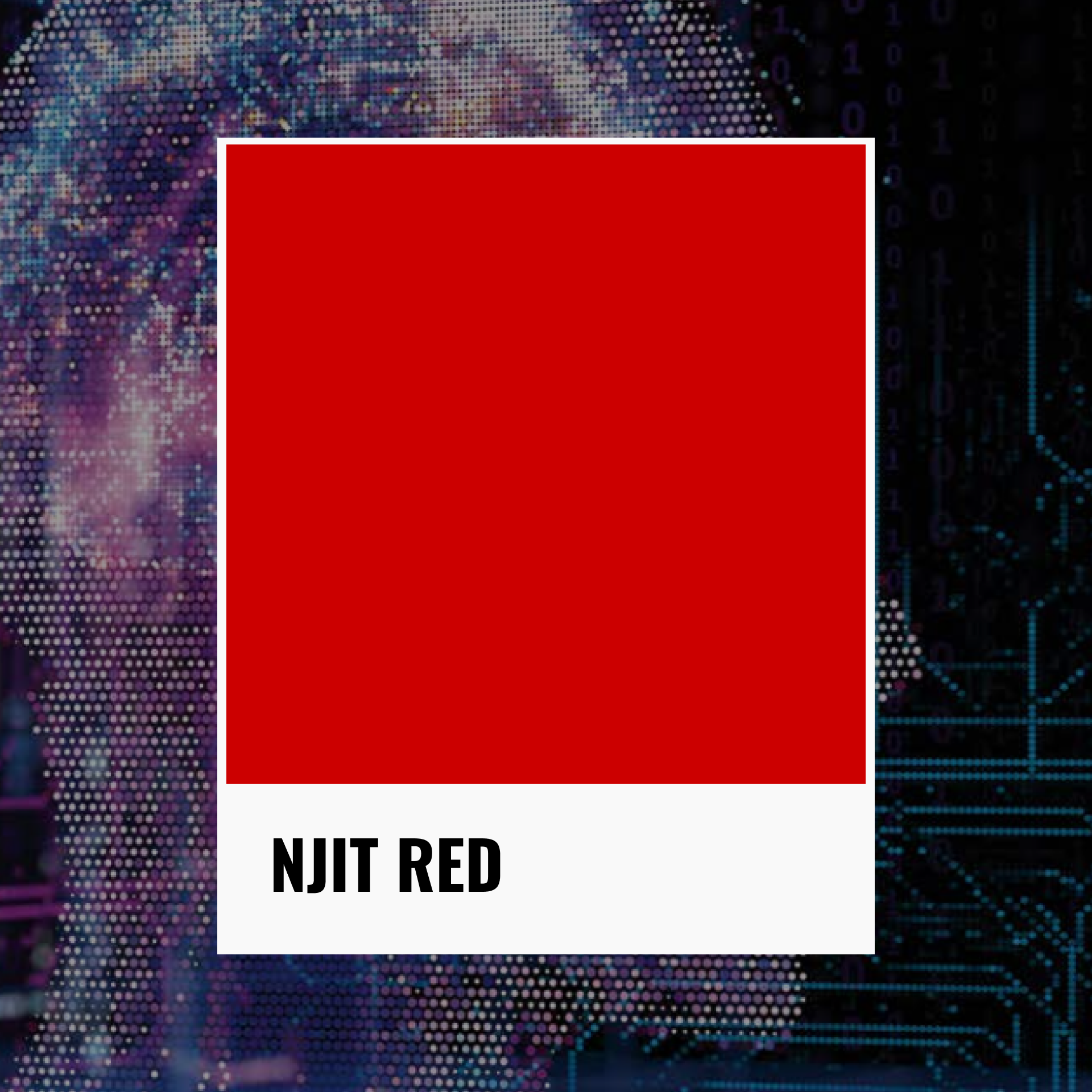
NJIT Red
New Sleeker, refined typography
NJIT's prior heading font leaned friendly and approachable: qualities not wrong in isolation, but misaligned with NJIT's ambition to be positioned alongside Ivy league institutions. Helvetica Neue was a deliberate shift: modern, refined, and authoritative.
infused ‘Gritty’, ’techy’, Editorial asthetic
My creative direction was anchored in a single, vivid image: a student welding a project in slow motion, while sparks fly against a dark, gritty background. Take that contrast between the raw energy of creation and surround it with the clean, prestigious, vibe of a journal like the New York Times, and you will reveal the emotional anchor of the entire redesign.
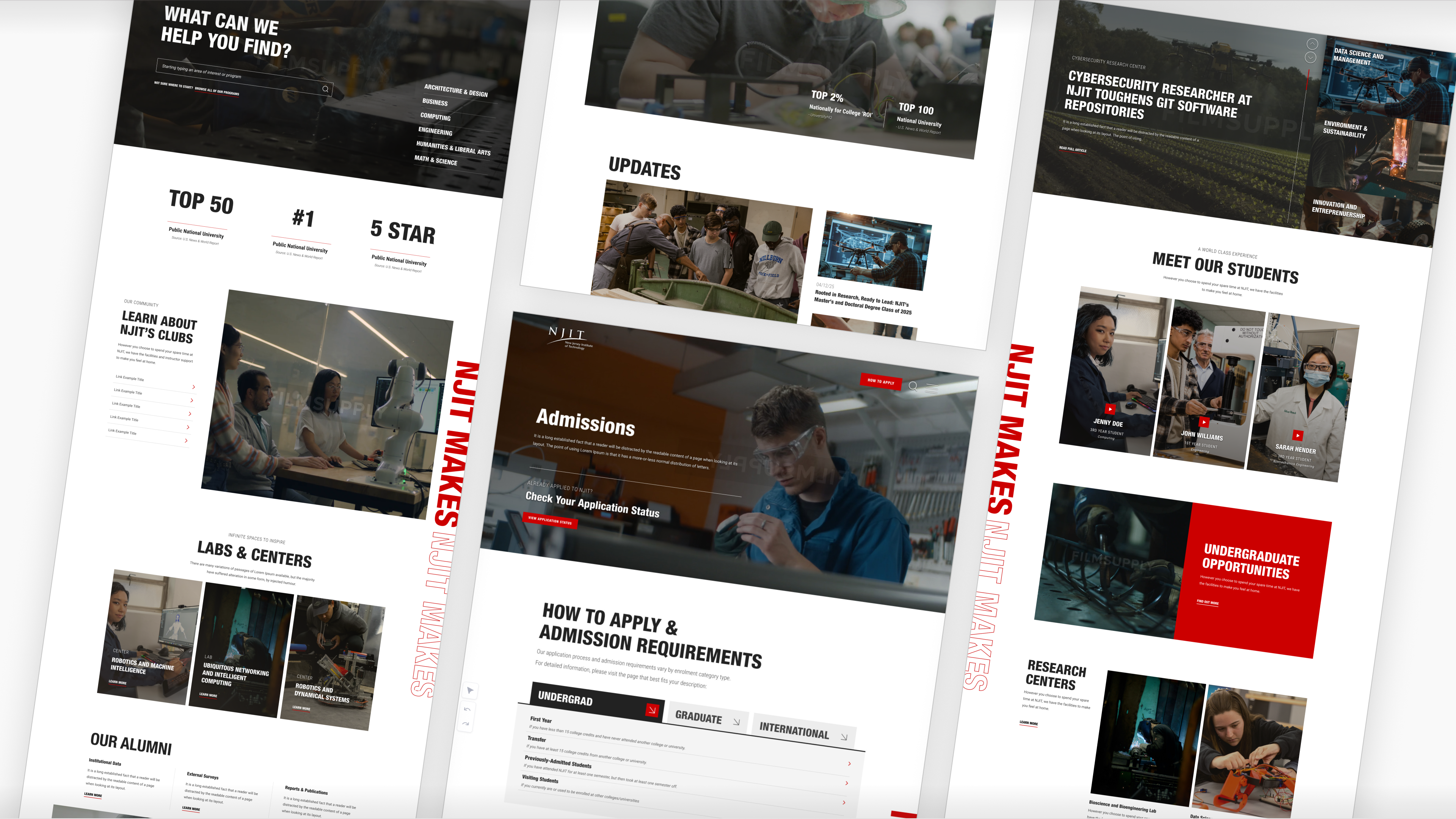
infusing Movement
using the 'maker studio' as inspiration
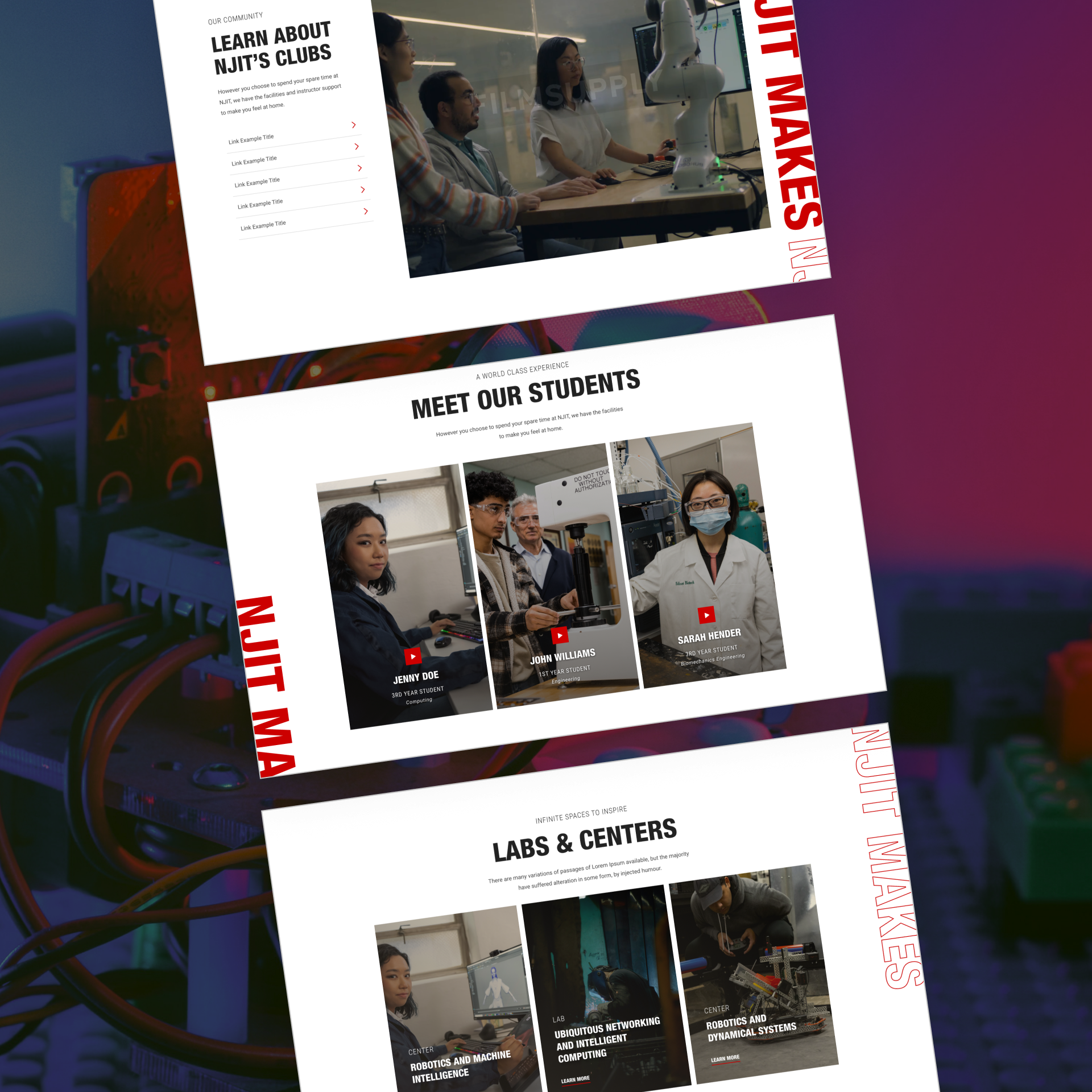
"NJIT Makes" is a slogan inspired by the Maker Lab: a student facility with 3D printers, welding stations, woodworking gear, textile machinery, race car-building bays, and more.
It stands as one of the most compelling physical assets on any university campus in the country, while also representing NJIT's ethos: students don't just study here, they 'make' things.
Where the old site relied on generic, static, higher-ed imagery, I infused the new experience with ample videos, showcasing students doing real, hands-on, technical explorations.
Incorporating NJITs Slogan
“NJIT MAKES”
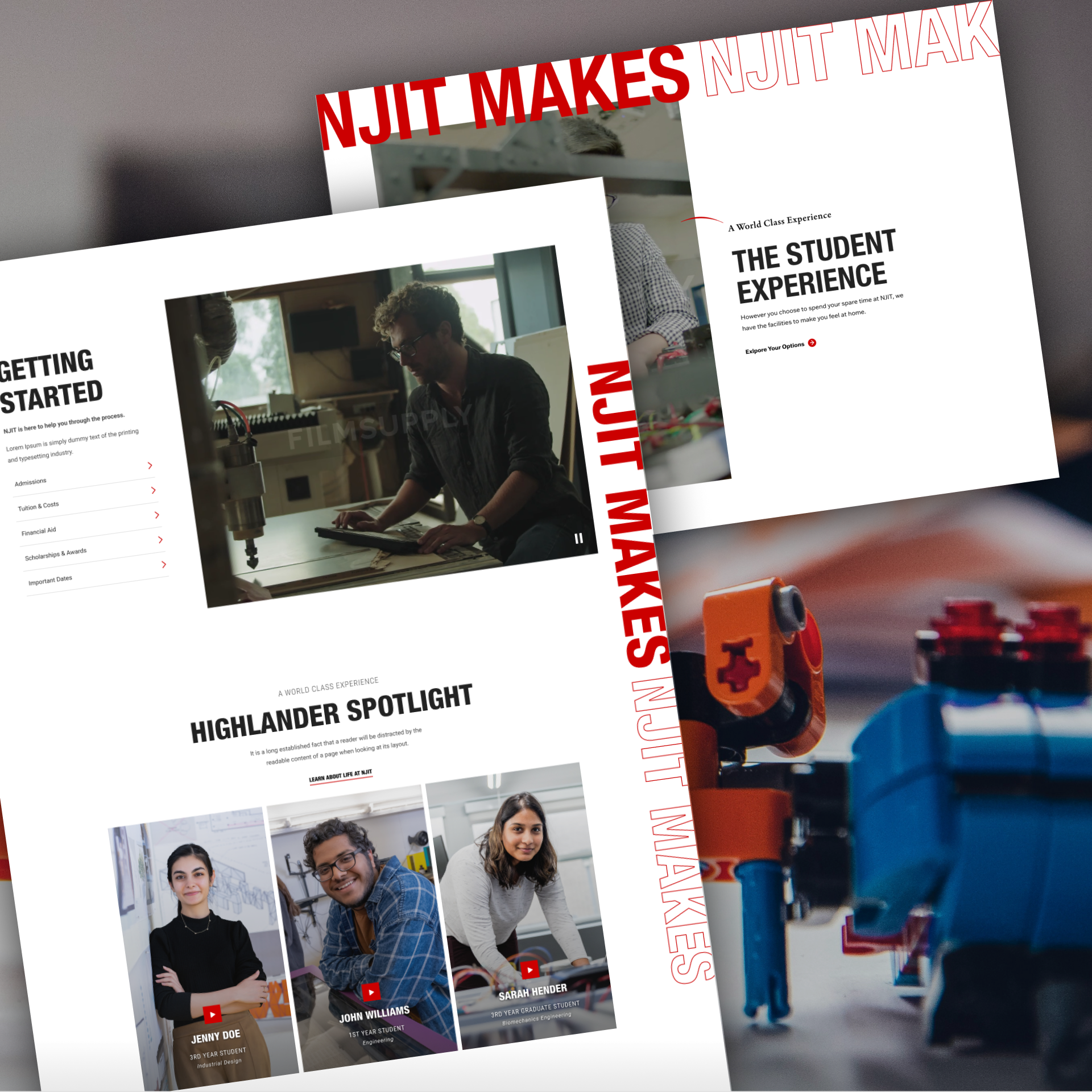
Considering the deep roots of NJIT'S primary slogan, I felt it was essential to infuse that message throughout the web experience.
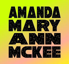
I created a stylized typographic treatment of the slogan, 'NJIT Makes', and placed it vertically along the side of the user's viewport on key pages. It serves two purposes simultaneously: a subtle prompt to keep scrolling, and an ever-present reminder of what this institution stands for.
The Solution
Improved User Journey
An IA rebuilt around NJIT's top value propositions and educational offerings.
NJIT had the reputation, statistics, and world class offerings to validate their excellence, they just needed these items to be better exposed to prospective students.
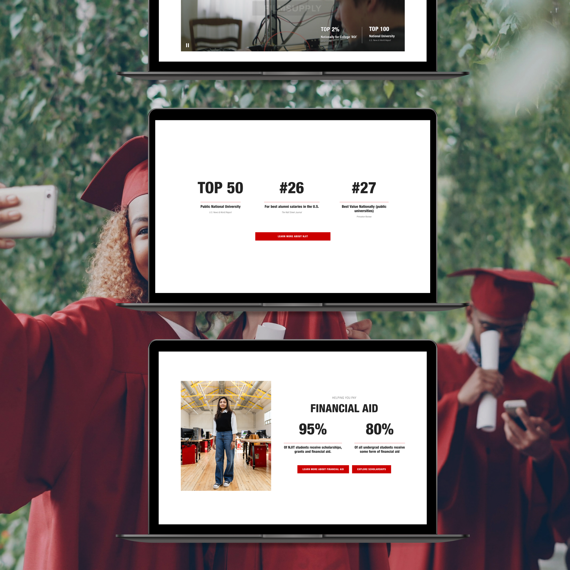
effectively placed, compelling, rankings
'If you got it, flaunt it'
NJIT is ranked #1 among New Jersey public universities for alumni salaries. It sits in the top 40 nationally. Its engineering and computing programs stack up against schools with far greater name recognition. None of this was being communicated effectively.
I carved out intentional, high-visibility placements for these stats across every page where they were contextually relevant, presented as visually engaging callouts rather than footnotes. For a prospective students weighing NJIT against a more famous school, a well-placed stat is irrefutable proof of ROI.
Surfacing Research Excellence
'If you got it, flaunt it'
I also brought NJIT's world class research more to the forefront.
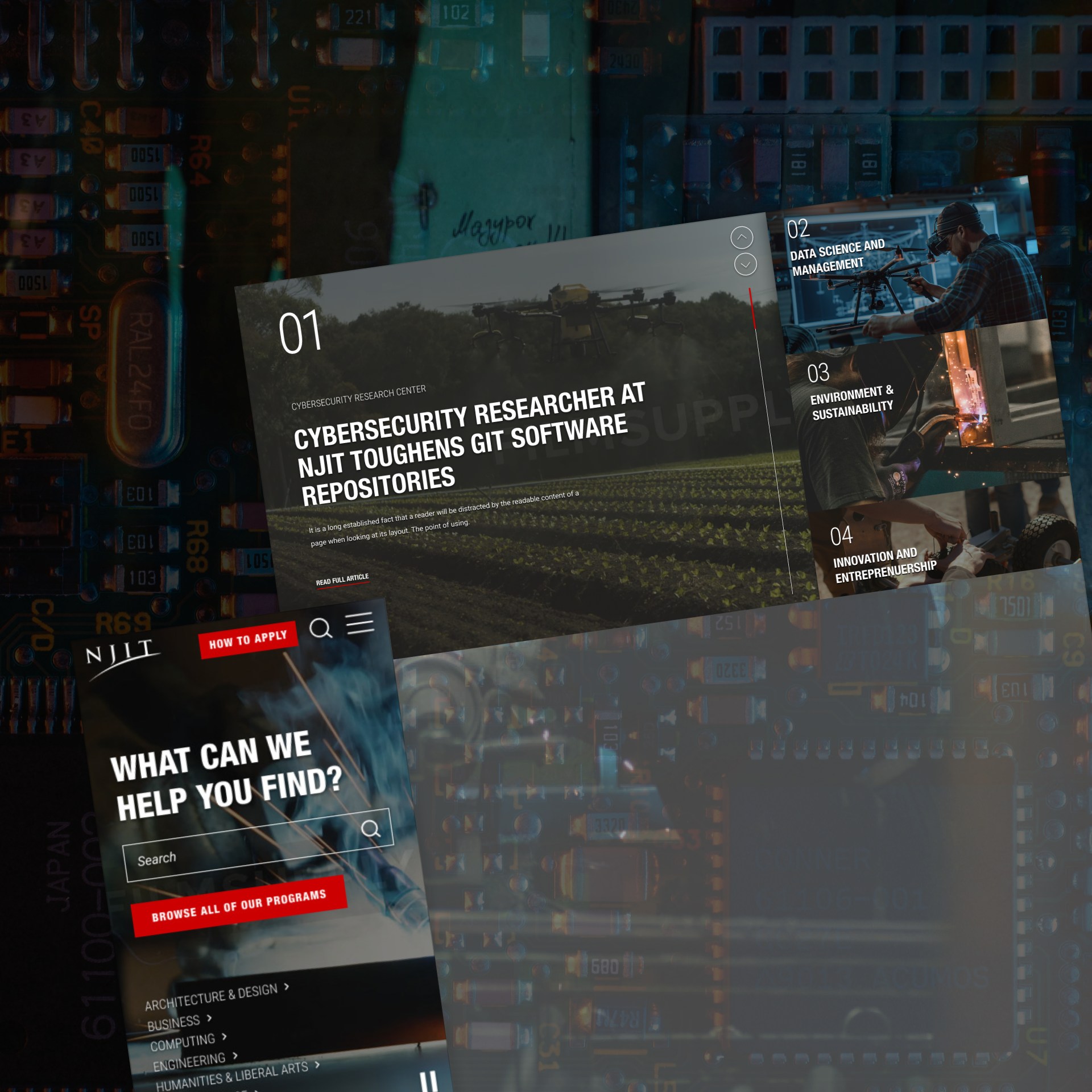
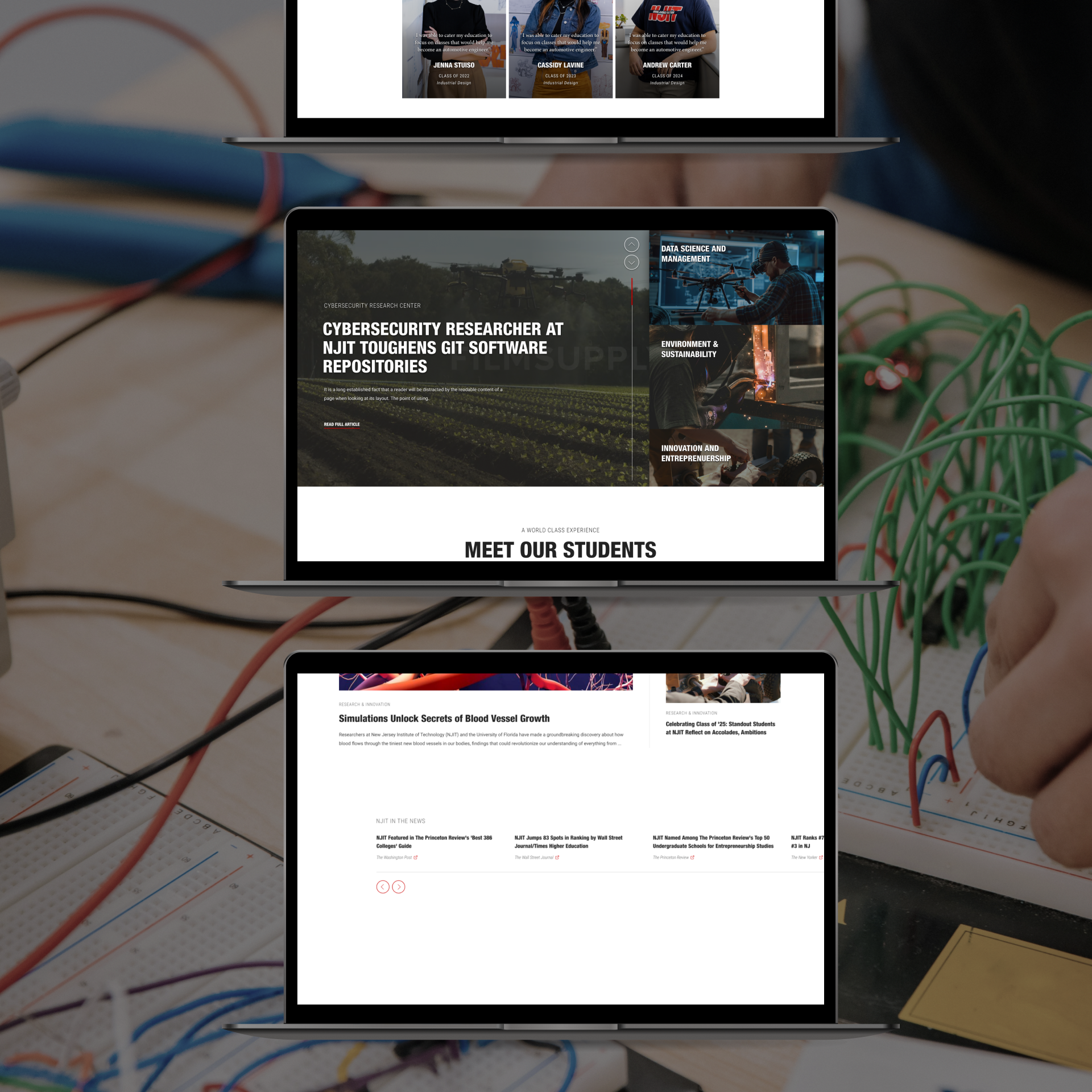
I created an eye-catching, innovative, oversized, video slider section to call attention to news stories featuring emerging advancements that NJIT is on the leading-edge of.
Additionally, I added sections like 'NJIT in the news' throughout the site and created a completely curated space for long-form, editorialized stories where NJIT can highlight important research and give it a distinctive treatment, similar to a long-form New York Times exposé piece.
Programs overhaul
Designing with 'ROI' in mind
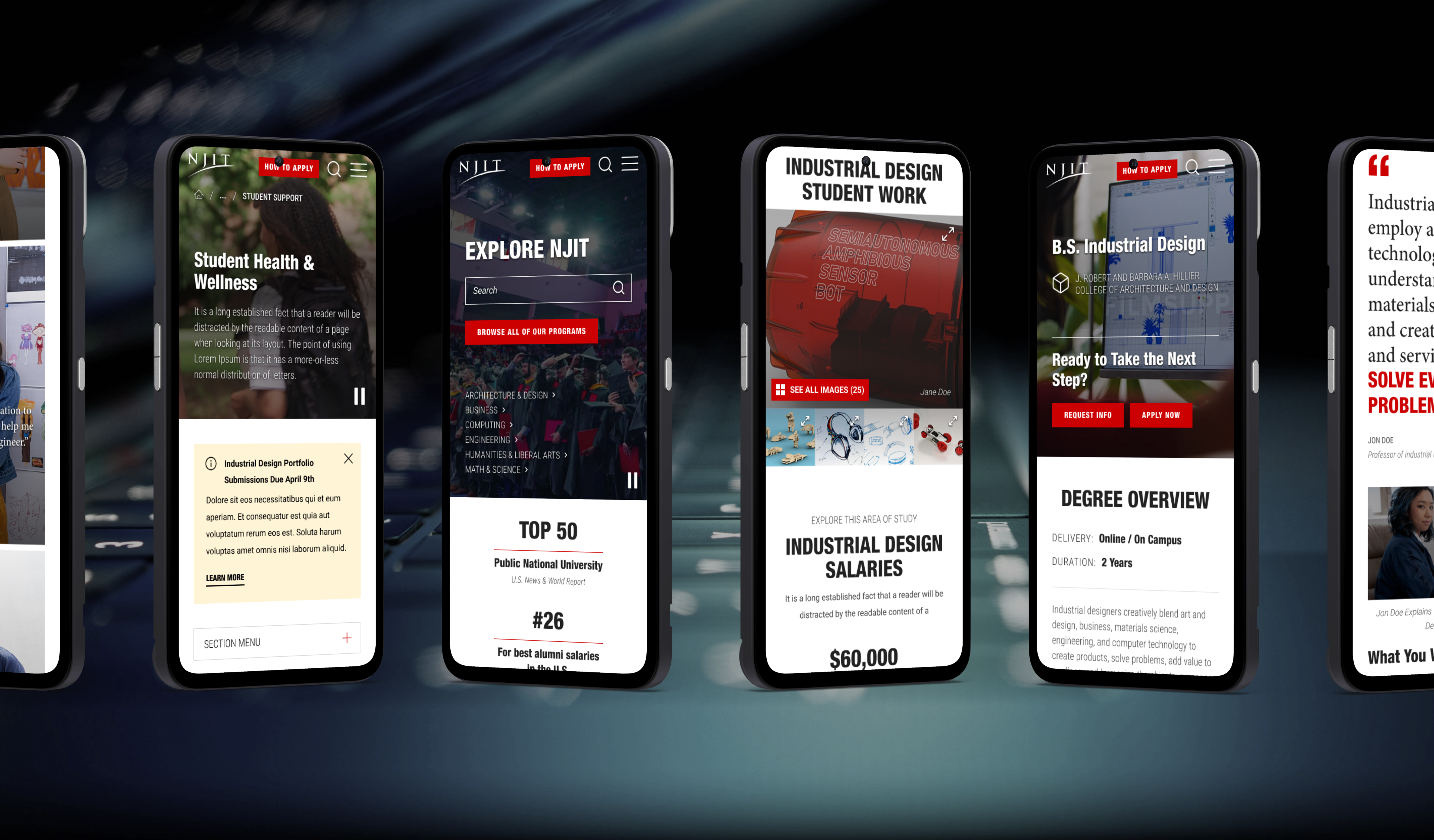
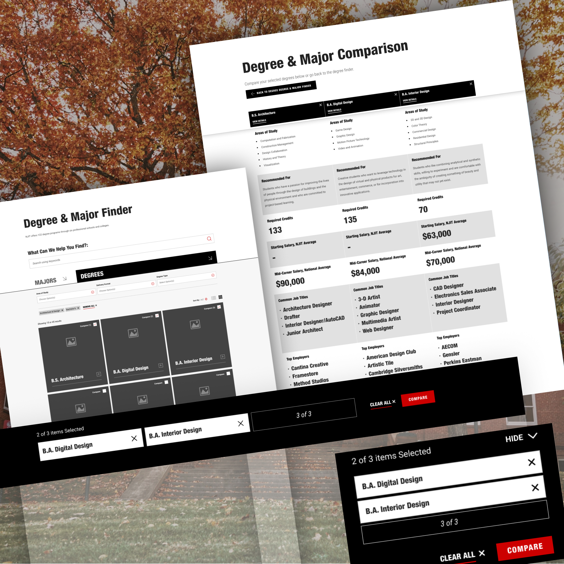
The research we conducted showed that prospective students are acutely ROI-minded. For this reason, I needed to make sure that first: students could effectively find all the offerings available to them, and second: they could easily answer the question 'what's in it for me' when making a decision.
Programs overhaul
Designing with 'ROI' in mind
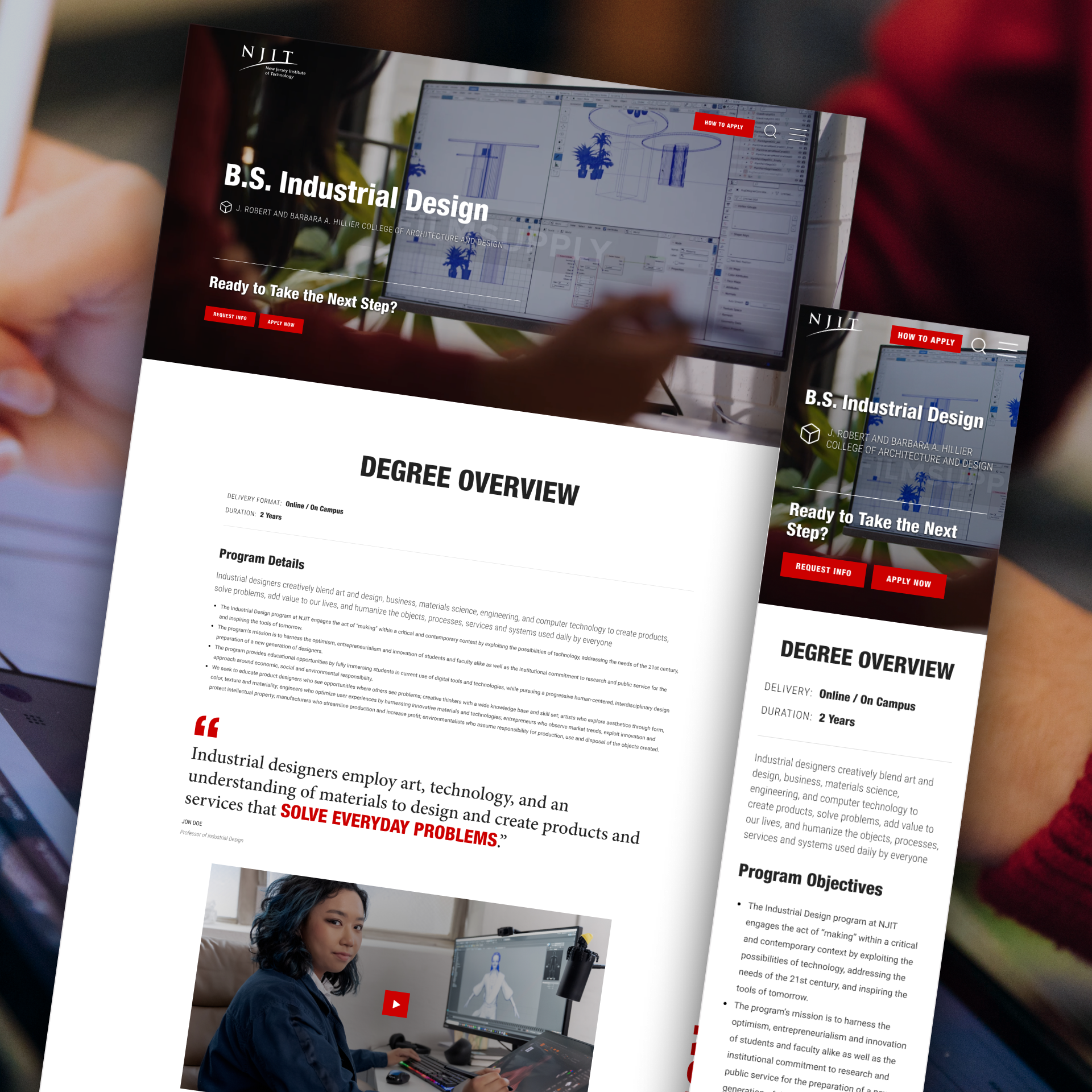
I rebuilt the program discovery experience around three interconnected improvements: improved filtering by area of interest and delivery format, a sticky compare shelf that lets users select programs and holds their selections at the bottom of the screen while they continue browsing, and an improved program comparison table with a new mobile-friendly layout.
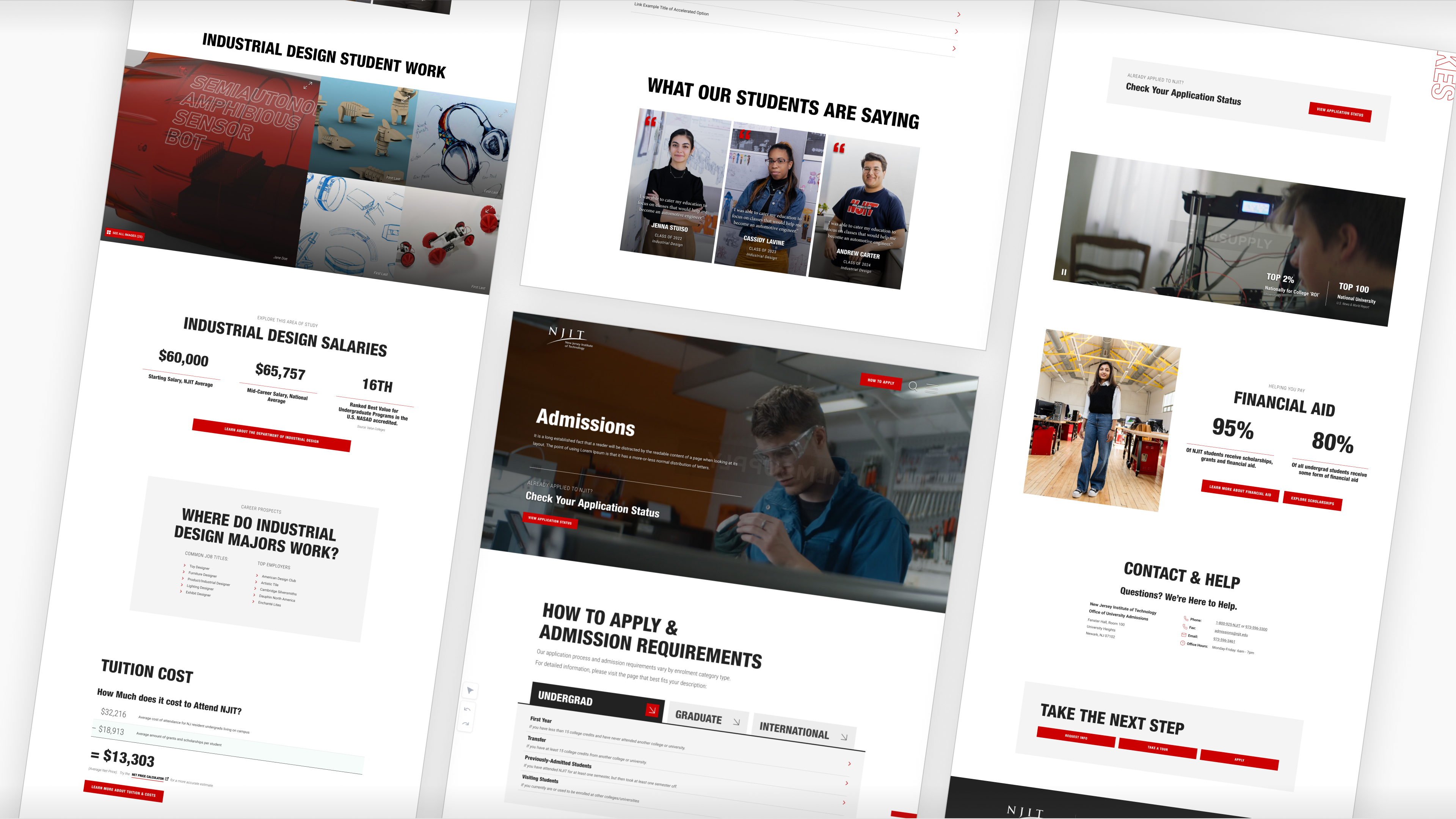
Once a student has picked a program to browse, I made sure to prominently expose them to ROI-centred sections like career prospects, field-of-study salary ranges, top job titles, and top employers.
I paired these sections with real student testimonials to reinforce trust in the program outcomes.
Key Takeaways
Why was this project special
I loved working with NJIT because they had so much un-tapped potential when it came to closing the gap between how they were presenting themselves at the time, versus how they WANTED to be viewed. I knew I could help them make an impact, and that prospect excited me.
From friendly, yet forgettable, to refined & prestigious
NJIT had everything going for them in regards to accolades. I've never worked with a higher educational institution with more concrete proof of their excellence. I had the remarkable opportunity to take a walk around their campus and was able to experience first-hand their top of the line laboratory facilitates, their innumerable imaginative art installations, and best of all, their 'maker' studio. It had never been so clear to me before: NJIT doesn't just 'talk the talk', they truly 'walk the walk'. I felt passionate and excited about bringing that same energy to their web presence.
The best projects for me, are the ones where I can bring the most impact, and largest transformation. In this case, I achieved this by:
Taking NJIT's website from a friendly, yet forgettable identity to a refined, prestigious presence, worthy of its acclaim.
I exponentially increased visibility of NJIT's rankings and other ROI content.
I magnified the 'maker' ethos with introduction of elements like the slogan word mark and weaving in a plethora of student 'maker' videos.
Next Case Study