Napoleon
The Project Challenge
Napoleon wanted to update their website model to integrate direct to consumer e-commerce for 3 different branded divisions. They needed a design that would widen product discovery, prominently demonstrate key features, and facilitate easy comparisons between items, all while simultaneously encouraging up-sell opportunities.
Napoleon is a Canadian manufacturer of premium grills, fireplaces, and HVAC systems, known for craftsmanship and a fiercely loyal owner community, based in Ontario, Canada.
My Roles:
My Process:
- Discovery Workshops
- UX Research & Analysis*
- Mood Board/Tiles*
- Wireframes*
- Prototypes*
- Mockups*
- Dev Hand-off
*Presentations & Revisions
Agency:
Northern Commerce





The Solution
Optimizing the Product Detail Pages
I overhauled the product detail page from a passive showcase into a conversion-focused e-commerce experience, meticulously designed to elevate craftsmanship, build shopper confidence, and drive purchase-ready decisions, all while quietly serving a second audience of dealers with very different needs.
Elevating Trust Signals
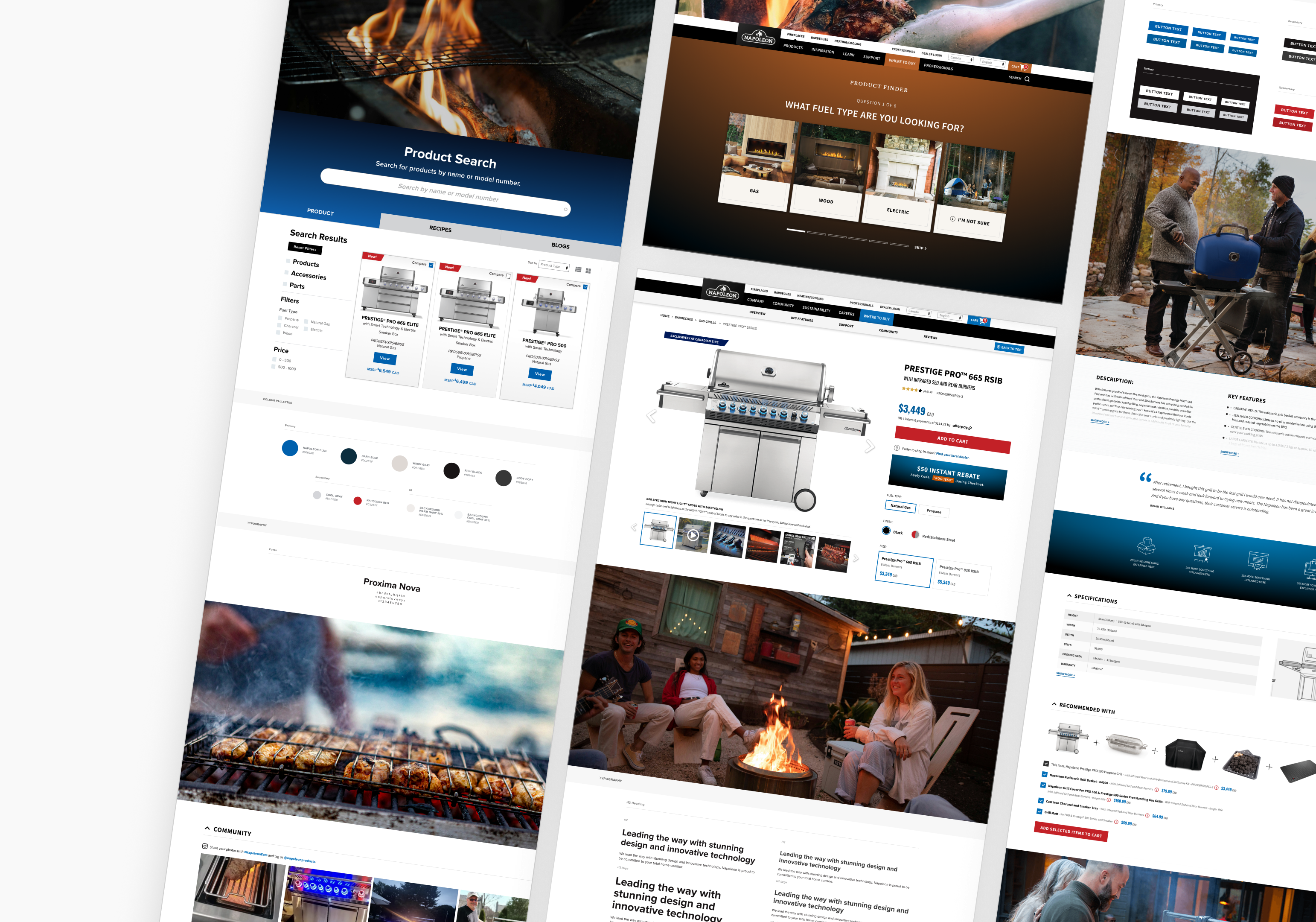
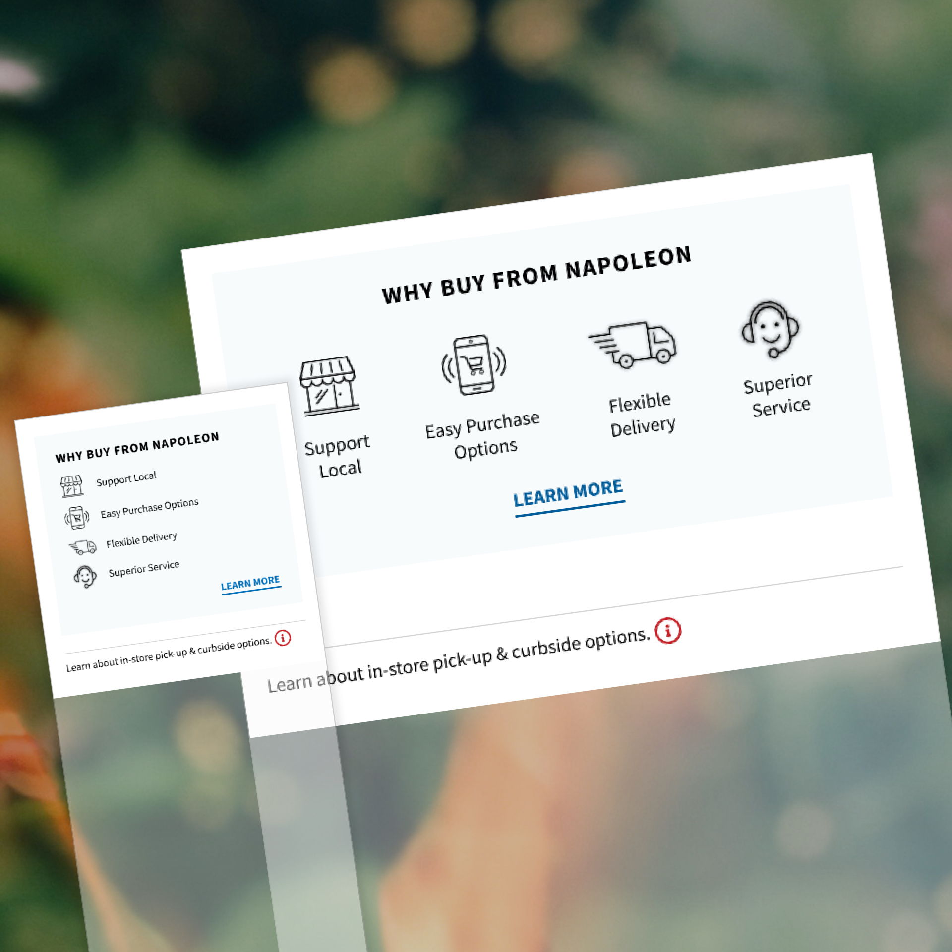
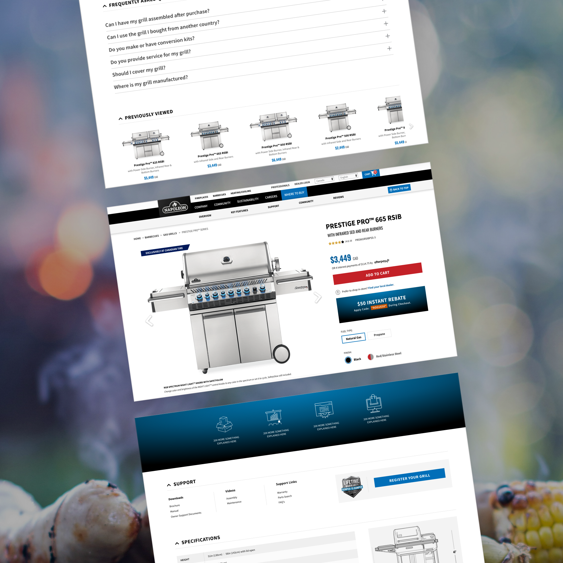
With the site's main goal shifting from product education to direct sales, I reorganized the page hierarchy around that goal, starting with the trust signals. Previously, risk reversal items like flexible delivery and superior customer service had been sitting near the bottom of the page. Our research informed us that these elements represented important decision-making information for consumers, so I elevated their position to be directly below the ‘add to cart’ button.
Improving the Key Features Section
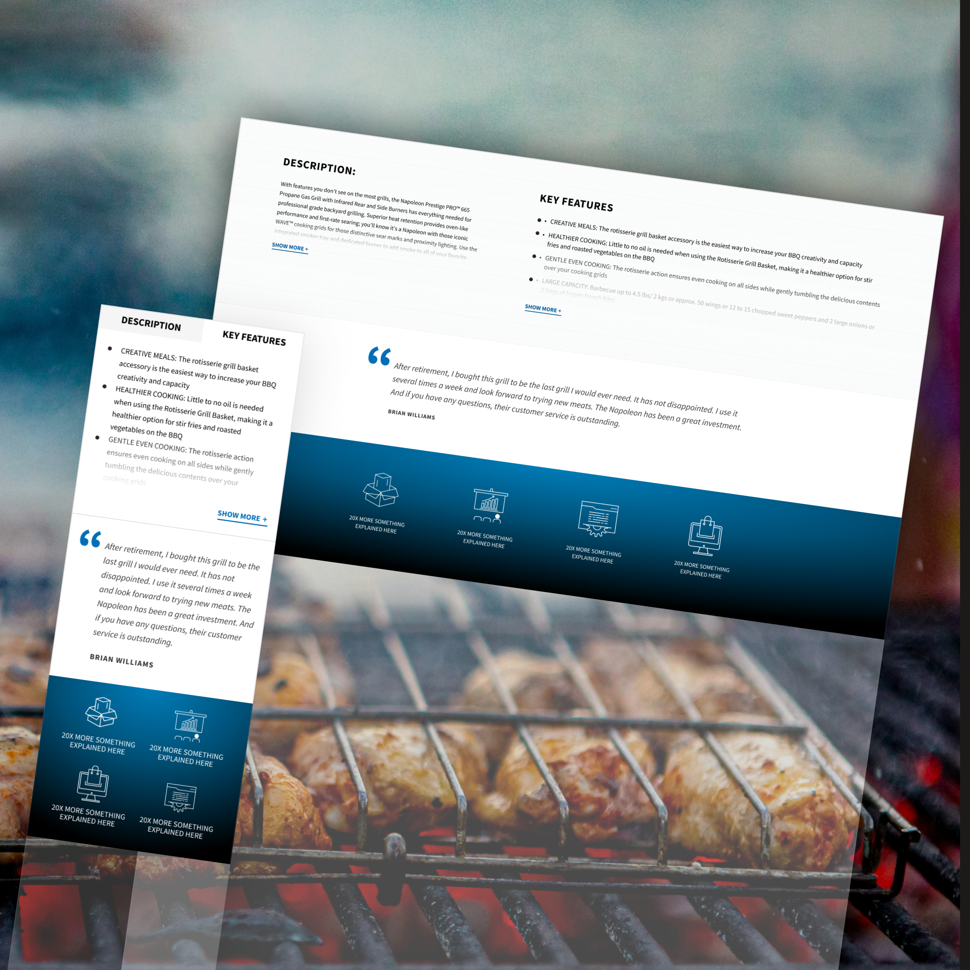
Prior to our engagement, Napoleon had key features of their products spread out in large, banner-like, stacked sections throughout the product detail page. Although these large areas were useful for deeper explanations, our research told us that consumers would lose interest if we didn’t present them with the ‘why’ of the product in an efficient manner.
So, I created a new ‘key features’ section where the users can get an ‘at-a-glance’ understanding of the product differentiators. We showcased the top 4 features before inviting the user to ‘show more’ to see a full list.
This allowed Napoleon to have quick, digestible summaries of the perks of each product, without using an overwhelming amount of page real estate. We kept the large banner sections available for Napoleon to use on an as-needed basis, yet de-prioritized these pieces in the page order.
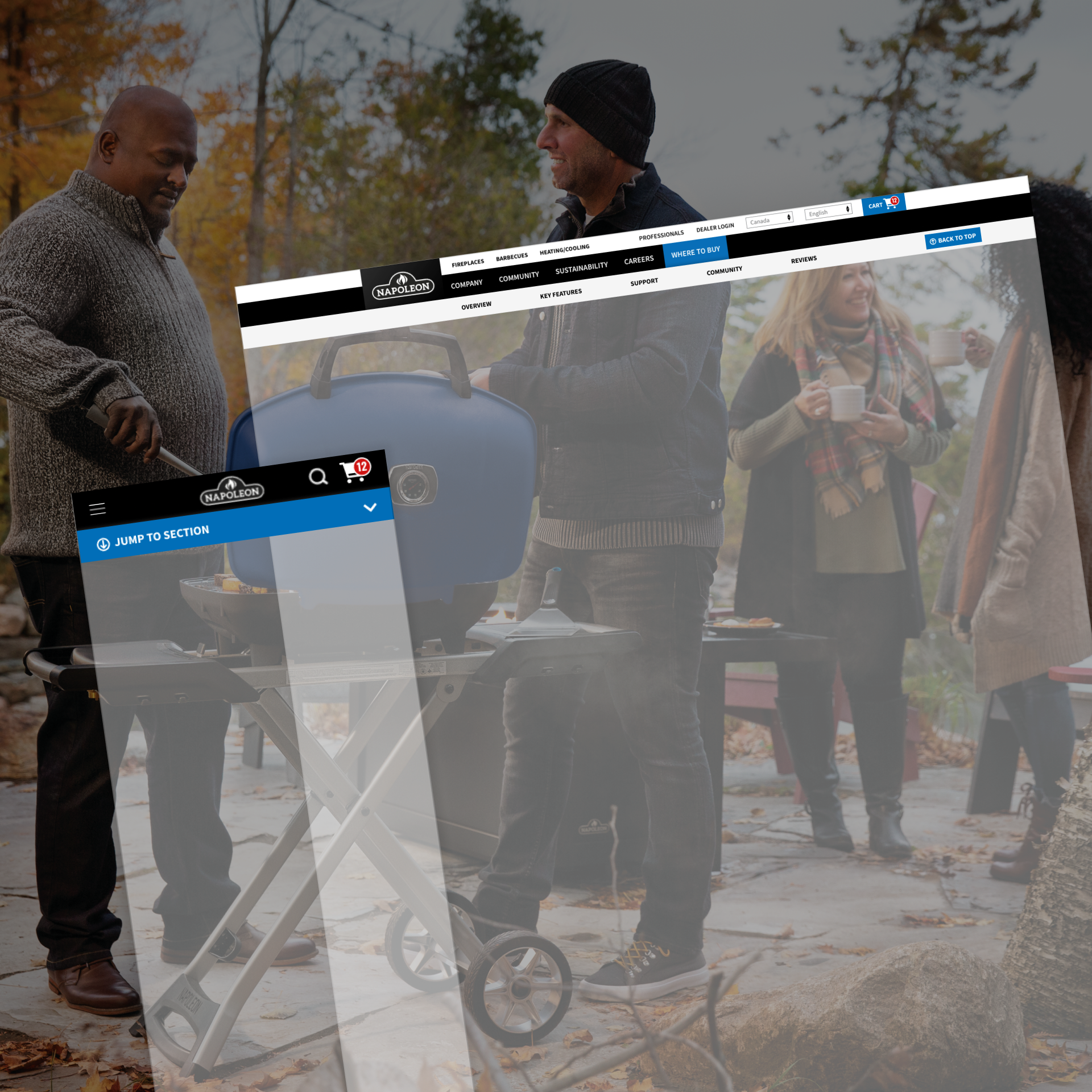
New Sticky Header
I wanted to make navigation of the products as seamless as possible, so first, I divided the page into 5 consistent sections based on user needs, and then I created a sticky jump menu, with back to top functionality that allows the user to quickly move between important information.
Surfacing Up-sell Opportunities
We wanted to make it easy for consumers to not only purchase their main product, but to also add compatible accessories to their order.
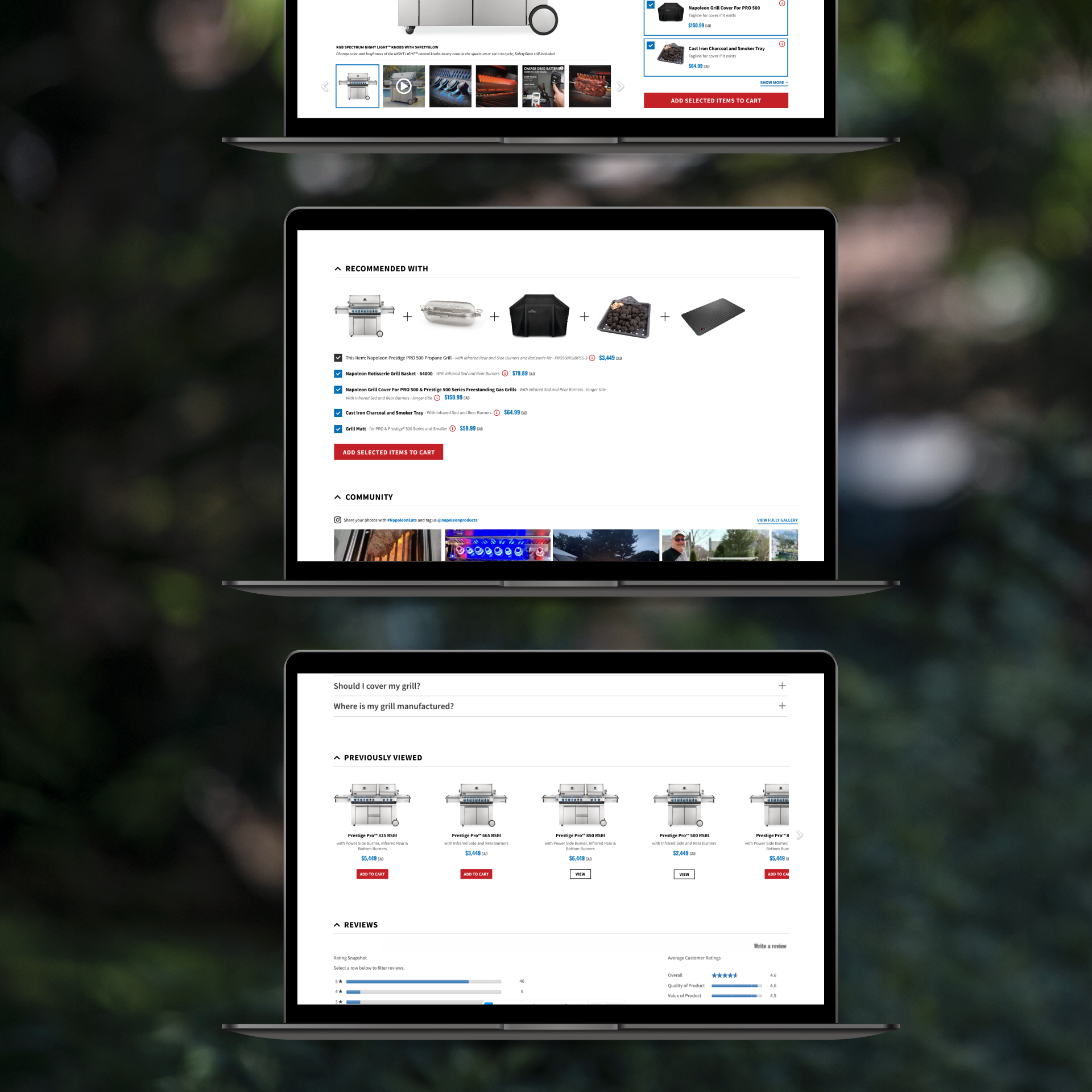
In our main product detail section, I added in a ‘made to fit’ box. Here, we show small, simplified product cards that the user can add to their cart selection by simply checking a box. I also implemented a hover/tappable tooltip where the user can get more details about the product, without having to leave the page.
Throughout the rest of the layout we continually showcase more product choices to our users via our ‘recommended with’ section (which again, allows adding products to an order with a simple checkbox), and our ‘you may also like’ section, which recommends further products based on the user’s browsing history.
Catering to Different Audiences
Although direct consumers were our primary focus on our new product pages, Napoleon still needed to carve out space for their dealers, as they are an important user group that helps Napoleon make indirect sales.
For this reason, I quietly injected key fields like the item SKU and the ‘support’ section into findable, yet unobtrusive areas so that we properly balanced user needs without diluting our content away from the primary audience.
Fluid Checkout System
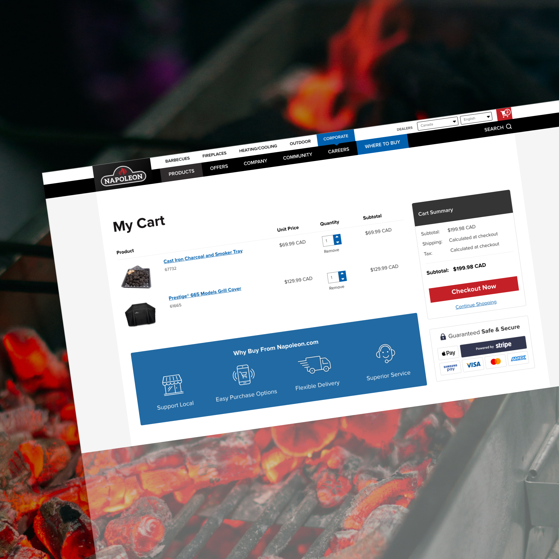
The work didn’t stop at the product page. We refined the cart flow using established UX practices to reduce cart abandonment: an add to cart confirmation that shows exactly what was added without pulling the shopper away from browsing, a clear order summary with shipping and taxes estimated up front, a simple promo code field, guest checkout, and express payment options.
Risk reversal messaging carries through into the cart too, so the reassurance a shopper saw on the product page is still there at the moment they pay. We matched this baseline experience with cart abandonment recovery strategies to maximize conversions.
The Solution
Improving Product Discovery & Comparison
Making the ‘right’ choice easy for the customer.
An unexpected downside to having a plethora of high-quality products to choose from is that consumers can start to experience option-overload. We wanted to make choosing the ‘right’ product easy and fun for Napoleon’s customer base.
Product Finder Tool
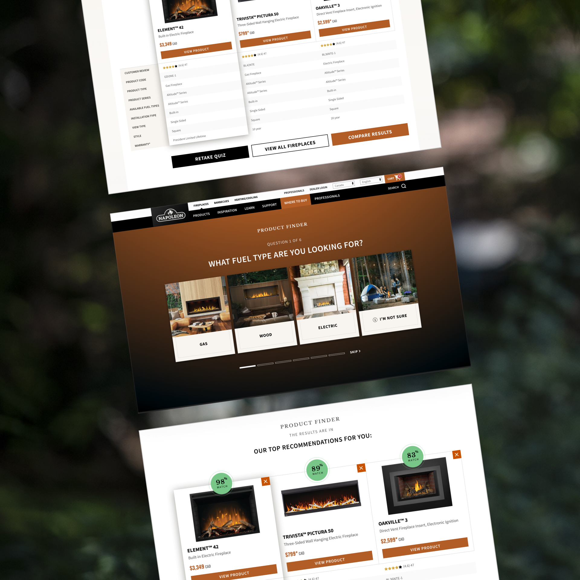
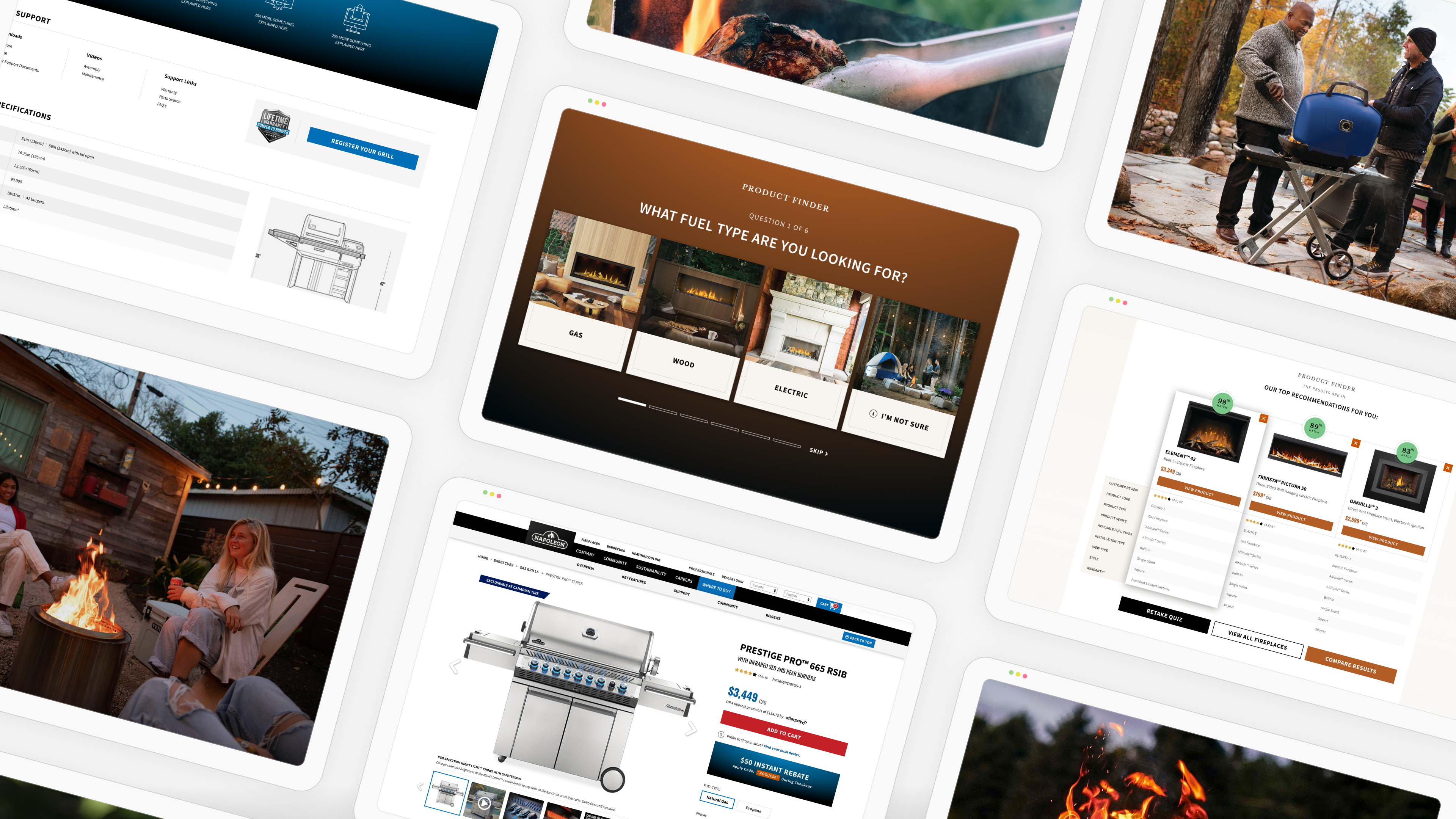
Our research determined that Napoleon had so many great products within several different ‘lines’ or ‘series’ that many shoppers were experiencing decision paralysis. We wanted to remove this barrier to entry in a fun and engaging way, so we created the product finder quiz to encourage the user to find the right fit for them.
Shoppers answer a short series of lifestyle and specification questions, from how they plan to use the product to the space they have available, and then the tool outputs 3 recommendations for you, complete with the match percentage.
Product Comparison Tool
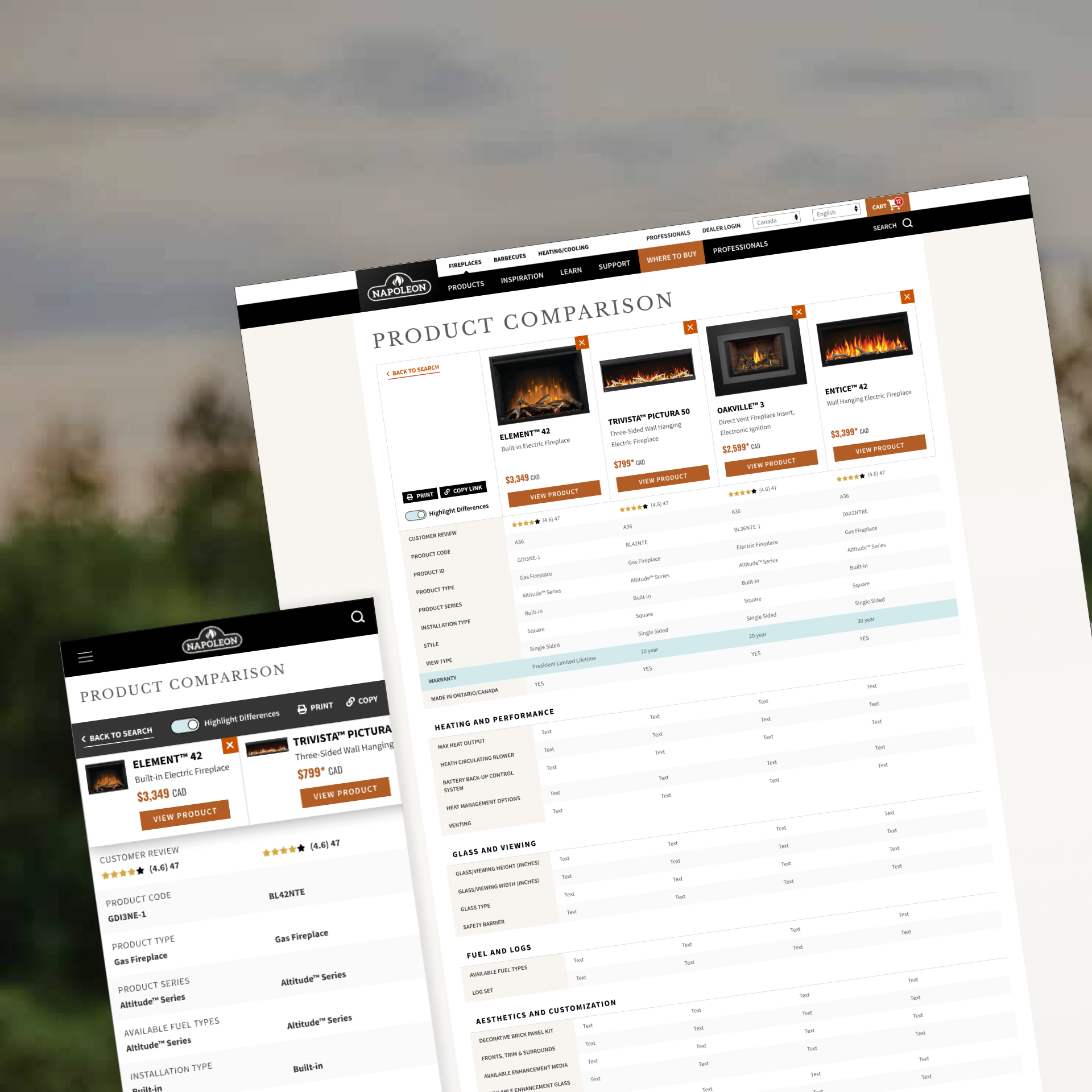
Naturally, once we had helped the user discover products that are compatible with their specific needs, we wanted to facilitate an easy and efficient product comparison, to empower them to make their final decision.
So, we built a comparison tool, complete with ‘highlight differences’ functionality to make differentiators abundantly clear, as well as the ability to send a personalized link to a spouse, friend or family member, so secondary decision makers could quickly get in alignment.
Product Comparison Tool
Comparing direct from product search
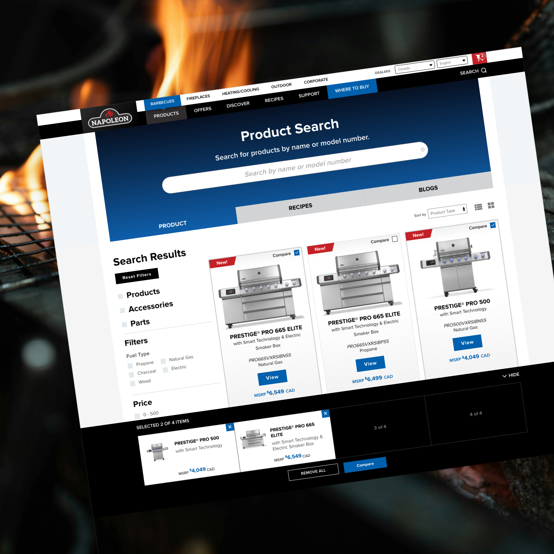
Users can get to our product comparison tool via the product finder quiz, or conveniently placed directly in product search results.
I crafted the experience to make comparison as easy as clicking a checkbox. Users can ‘check’ up to 4 products, and keep track of their picks on a sticky floating ‘shelf’ at the bottom of the page, before submitting items to the compare function.
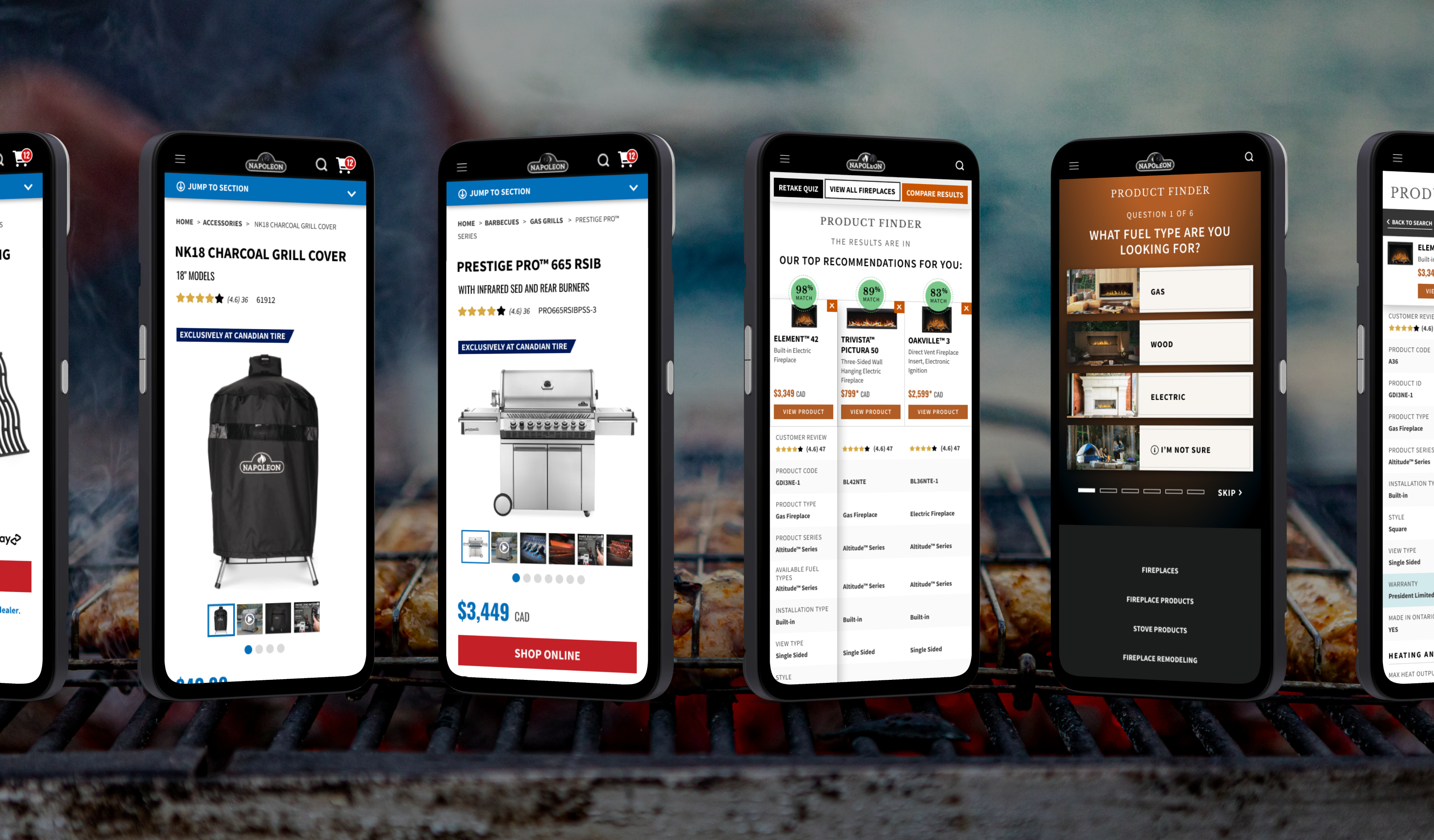
I added a show and hide button to collapse and expand the shelf, which is particularly useful for our mobile users, where real estate is scarce.
The Solution
Selling a Story
Making consumers fall in love with the lifestyle.
I optimized Napoleon’s lifestyle and community stories by injecting them directly onto the product page, ensuring the brand’s products feel aspirational.
Photo Gallery & Social Grids
One of Napoleon’s greatest brand strengths is that it offers a genuinely premium product, backed by authentic goodwill and strong brand affinity among its customers. I wanted to leverage that existing equity to support the product in two distinct ways.
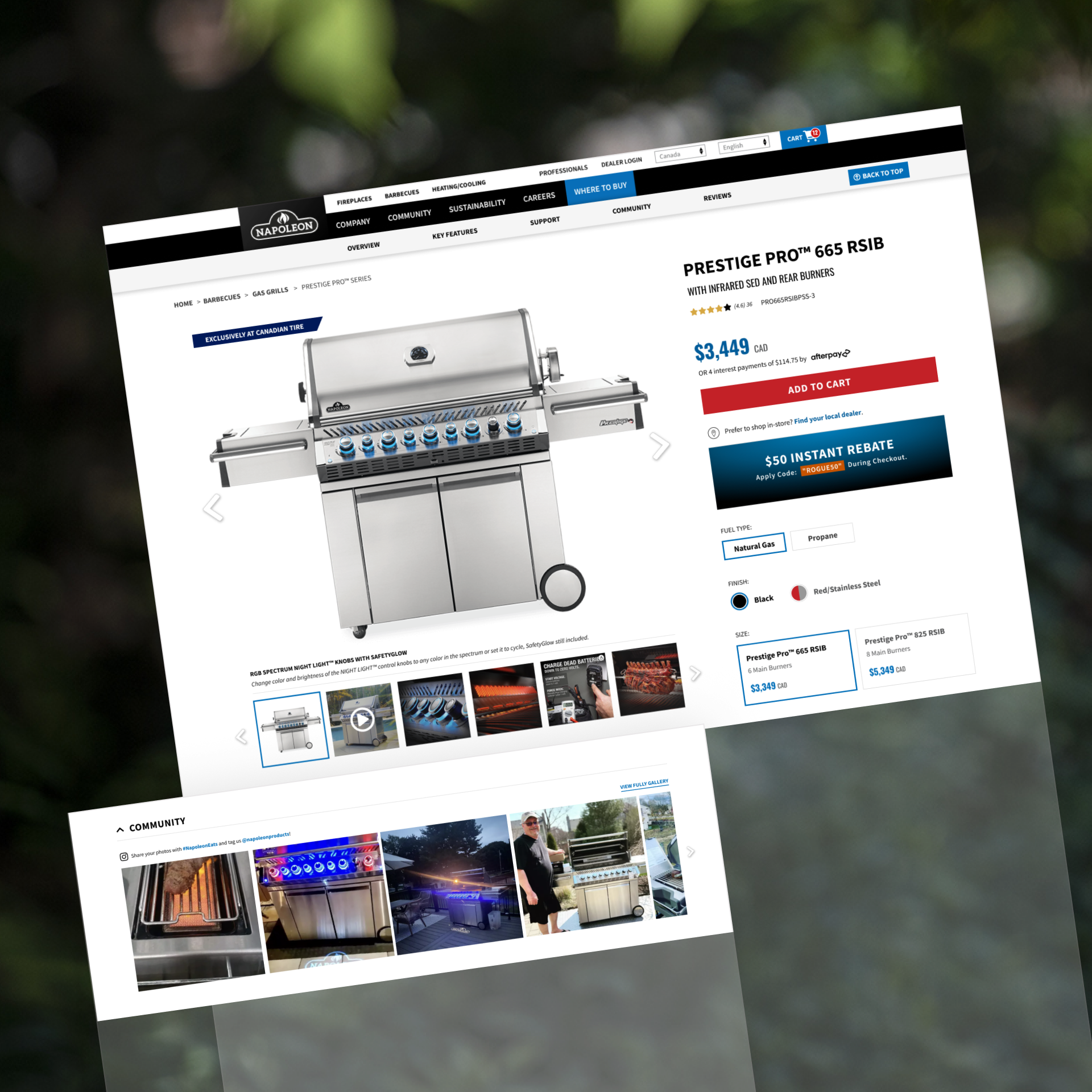
First, I designed a dynamic photo gallery that moves with the user through the product details section. Prior to our work with Napoleon, the product gallery was small and static, making it easy to scroll past. The new approach keeps large, high-quality product imagery continuously in view as consumers move through the details, reinforcing the product visually while they evaluate its features and benefits.
Second, I introduced an Instagram feed that Napoleon could fully manage through the backend. This created an opportunity to bring authentic customer content directly into the product experience, showcasing real-world use while reinforcing the aspirational, social lifestyle associated with the brand and its customers.
The Solution
Design Maintainability, Flexibility, and Consistency
Building for the future.
Napoleon is not a brand that stands still, so we knew their digital experiences would continue to evolve beyond our engagement. With that in mind, every decision needed to scale across divisions and support future growth.
Building a Strong Product Page Base
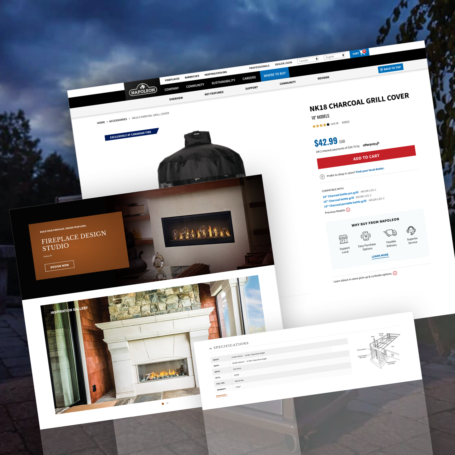
I built the product-page framework around the specific needs of each division, while keeping the underlying structure consistent and scalable.
This allowed us to introduce division-specific functionality where it added real value: a “Compatible With” field for accessories, a detailed specifications table for Fireplaces, and a customization section for exploring log materials, brick kits, and glass media.
Because these needs could be accommodated within the same flexible framework, each division could feel purpose-built without becoming disconnected from the broader Napoleon experience.
Seamless Shifting Between Divisions
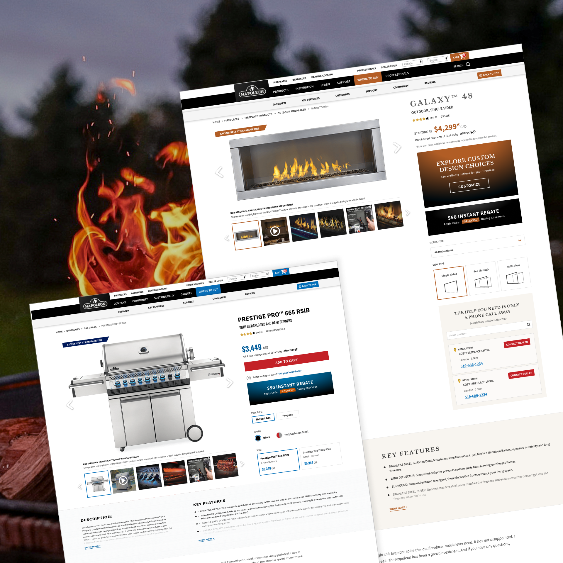
We introduced subtle visual shifts to help users understand which Napoleon division they were exploring, while keeping the overarching brand consistent.
Grills established the core visual language with Napoleon blue, cool greys, and a clean Proxima Nova type system. Fireplaces introduced warmer tones, darker backgrounds, and refined serif headings to create a more elevated, cozy feel.
These changes allowed each division to develop its own character without feeling disconnected from the broader Napoleon brand.
Key Takeaways
Why was this project special
The Napoleon story is one of long-term partnership, built on trust and creativity, that ultimately enabled a standout launch into e-commerce.
The epitome of a long-term partnership
This project was particularly meaningful to me because of the history behind it. The first time I met the Napoleon team was early in my career, at their Ontario office, where I joined a shortlist presentation to answer front-end development questions. Our team ultimately won the business, beginning a long-term partnership that I had the opportunity to watch grow over the years.
I went on to build the front end of Napoleon’s first website, so I knew the brand, its digital ecosystem, and the technical considerations behind it inside and out.
Seven years later, I returned to the same team, this time leading UX/UI. That history gave us an established level of trust from the start. I understood how they worked, could engage comfortably in the technical conversations that were important to their team, and brought a deep understanding of their brand and digital history to the new engagement.
It was especially exciting to help a long-standing client take such a significant step into direct-to-consumer commerce, and to bring everything I had learned from our earlier work into shaping what came next.
Next Case Study