Heritage Wedding
The Objective
Design wedding materials that blend seamlessly into a garden party at a heritage Victorian home, while nodding to what matters most to the couple: the family home hosting the event and their two cats.
These are print artifacts from a wedding that took place at a heritage home called Thornwood in London, ON, Canada.
My Roles:
Agency:
Personal Project / Freelance

The Process
The Inspiration
Vintage storybooks with a modern twist
The visual direction centred on a wavy, illustrated border inspired by old book designs and the flowing florals of art nouveau. I paired this vintage vibe with clean, contemporary accents to infuse a modern flair.

Vintage-inspired garden party with a modern twist
(Plus cats)
The vintage storybook aesthetic suited the heritage character and garden setting of the venue.
From there, I looked for details that could only belong to this couple:
The venue was a family home, so featuring the house itself was an easy choice.
The bride had a vintage art deco-style bridal dress and an engagement ring, which acted as the foundation for the font choices.
Cats were also a must-have. The couple adore their two cats and had custom porcelain figures of each made for the cake topper.
Combined with the mood of the event, these details became the foundation for the full print suite.

The Process
Colour Palette
A pop of pink in nature
Knowing that the full event would take place outside in the estate’s gardens, I wanted to pair an accent colour that naturally pops and complements the natural surroundings.

Petal Pink With Accents
I chose a peachy petal pink as the primary colour, inspired by the contrast a rose brings to a green garden. It also matched the simple palette of the flowers at the centre of each table.
To break up the pink and add dimension to key printed pieces, I introduced a light blue and a violet, both in dusty, vintage shades.

The Process
Typography
Balancing Decorative and Simple
The main heading font needed to capture a vintage, art deco feeling while still reading as modern.

Deco + Simplistic
Inspired by the art deco bridal gown and engagement ring, I picked Zaslia for the main headings to bring in that vintage charm. I paired it with Champagne & Limousines, a clean, simple typeface, to add contrast and ground the designs.
Wordmark
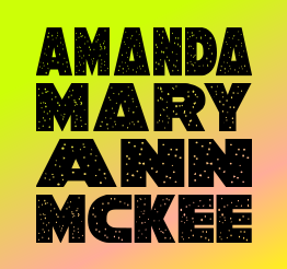
Using Zaslia, I created a wordmark to reuse across every asset: the couple’s names stacked with a custom ampersand and modern dotted lines that would become a visual motif carried throughout the suite.


The Process
Iconography/Logo
Marriage motif
I wanted a motif that symbolised the union of marriage to create a foundational, meaningful tie between different materials.

The Rings
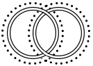
I created a stylised symbol of two connected wedding rings. The lines were simplified for a more modern, abstract feel and shaped to interlock into an infinity sign. A dotted accent line then links the symbol back to the dotted line in the wordmark.

The Process
Save the Date
Adding a personal touch
The save the date is a guest’s first glimpse of the wedding’s style, so it needed to set the tone with a concept that reflected the couple’s personality.
Vintage foliage with a clean modern twist
Cats + Rings + Nature
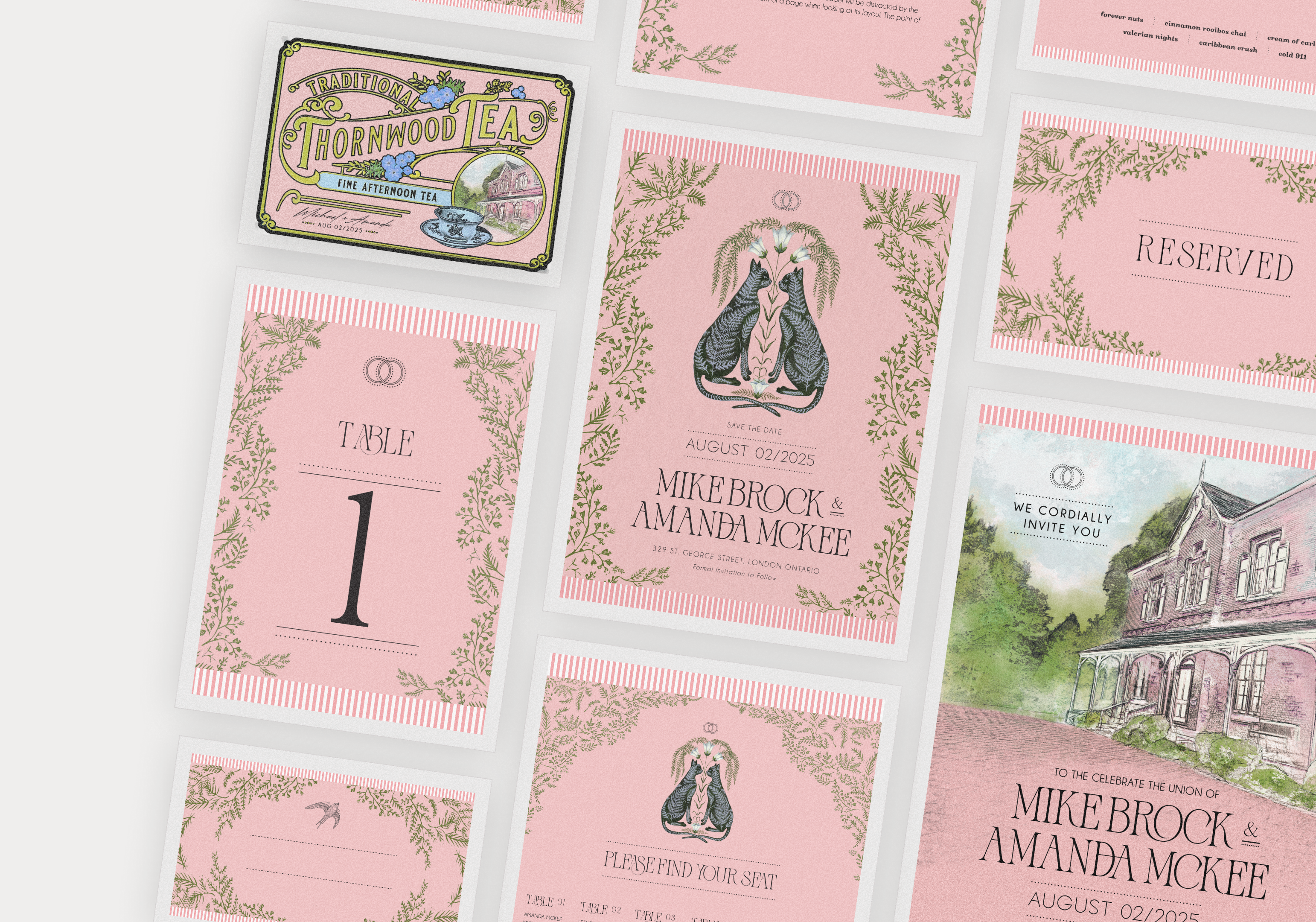
A feline illustration became the centrepiece, a nod to the couple’s love of cats. Around it sat the ring symbol, the wordmark and a wavy, storybook-style leaf illustration that framed the details and pulled everything together.
To tip the balance back toward a modern garden party feel, I added a pink striped border inspired by summer beach umbrellas.


The Process
Invite
Paying homage to the venue
Keeping in mind the objective of incorporating personal touches that could only ever trace back to the couple, I knew I wanted to feature the venue itself.
Thornwood
Thornwood was more than an event space. It was the groom’s family home, so I wanted the house itself to be part of the invite. It introduced guests to the setting before they arrived and gave the invitation a feeling that was entirely unique and authentic.
I turned the house into a sketch and stylised it in the event’s pink palette, then made it the centre of attention. The same motifs used across the suite, including the rings, wordmark and dots, tied the invite together.


The Process
Custom Tea Tin Gift
Gifting a personal favourite
Tea is a familiar choice for a guest gift, so the goal was to give it a personal twist.
Tea Tin Inspiration
Not only does the couple love tea, but they have a beloved tradition of stopping for lunch at a notable high tea spot every summer on their way to the bride’s family cottage. They knew this would make the perfect gift, and the goal was to give it a unique, personal touch.
I drew inspiration from traditional, vintage-inspired English tea tins. A fully custom tin shape wasn’t feasible, so the challenge was to capture that feeling another way.


Incorporating the house
A personal nod
The couple planned to buy plain, modern tins in bulk, so I proposed a custom label to bring in the vintage feel without breaking the bank.
For the label design, I took the base style of the English tea, changed the name to ‘Thornwood’, and incorporated a small visual of the house itself.
To make the gift something attendees could genuinely keep, the couple wanted their names and wedding date present, yet intentionally subtle, so the main design could take centre stage.
Custom Label print
Creating a seamless ‘tin’ look
I had the design set; now it was time to print it. To incorporate a seamless, more realistic feeling for the tin, I printed the label so that the gold accents would be a shiny metallic material. This really elevated the design, transforming a simple, plain base into something more extraordinary.


complete with thank you card
Each tin also included a thank-you note. Writing 100 individual messages wasn’t realistic, so the bride wrote a message by hand with an Apple Pencil, and we added it onto the cards for a personal touch.

The Process
Reception Print Items
For the reception print pieces, I carried the same themes through to keep everything cohesive: pink, cats (and other animals), foliage, stripes and dots.
Name Place cards
The name cards needed a system for the caterers to follow for different food preferences. I used it as an opportunity to bring in more cute animals, building on the original cat theme.


Signage
The cat illustration was the natural accompaniment for larger visuals like the welcome sign, and I continued it in places like the drink and dinner menus.


Key Takeaways
Why was this project special
I love thinking of ways to incorporate authentic, meaningful, unique points of interest into a design.
It’s the personal touches that count
The part of this project I enjoyed most was building the couple’s personality into the print work. The cats, the family home and the garden setting all tie authentically back to their identity, making the printed items like the RSVP and Invite cards meaningful keepsakes.
The custom tea tin label was the highlight, and I loved how it turned out. I enjoyed transforming the plain tin in to something far more special, with the house illustrated on the front and the metallic gold accents.
Next Case Study