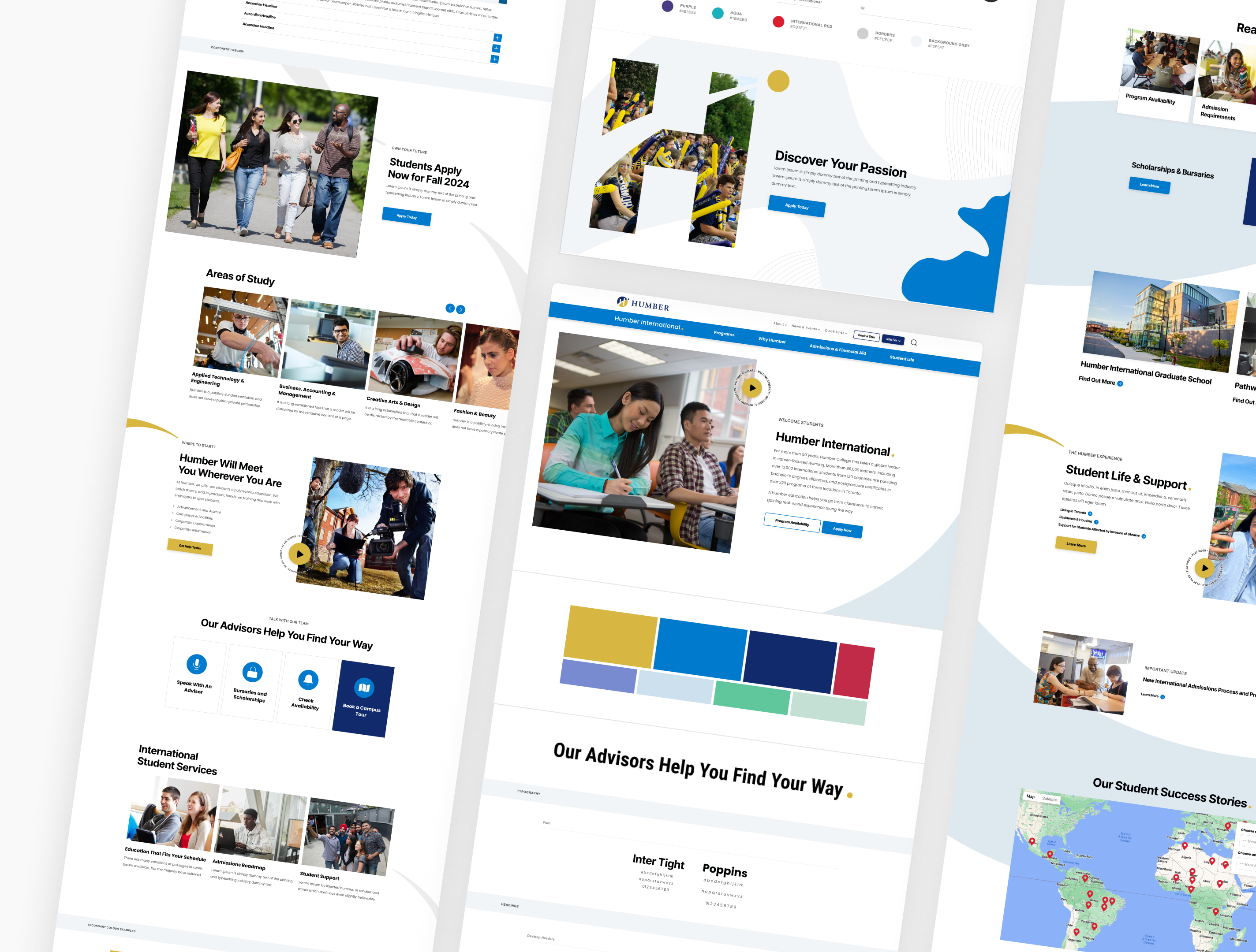

Fanshawe College
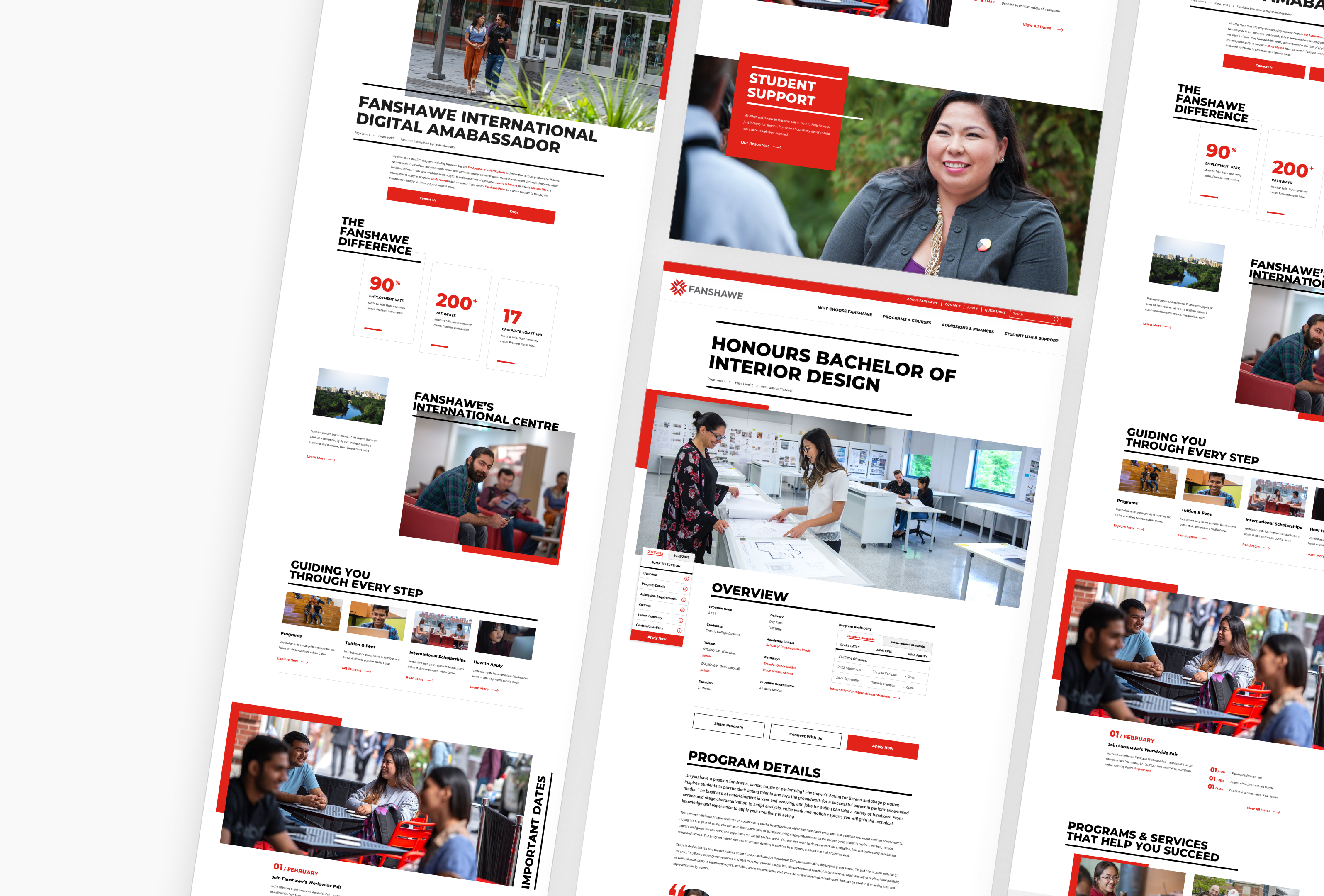
The Project Challenge
Fanshawe College came to us with a clear goal: create a digital experience that captures the bold, vibrant, playful spirit of the institution while improving the journey from exploration to decision.
Fanshawe College, one of Ontario's largest polytechnic institutions offering 220+ programs across multiple campuses in London, Ontario, Canada.
My Roles:
My Process:
- RFP Response Strategy
- Shortlist Pitch
- Discovery Workshops
- UX Research & Analysis*
- Mood Board/Tiles*
- Wireframes*
- Prototypes*
- Mockups*
- Dev Hand-off
*Presentations & Revisions
Agency:
Northern Commerce






The Solution
Refreshed Brand
From Traditional & Conventional To Bold & Expressive.
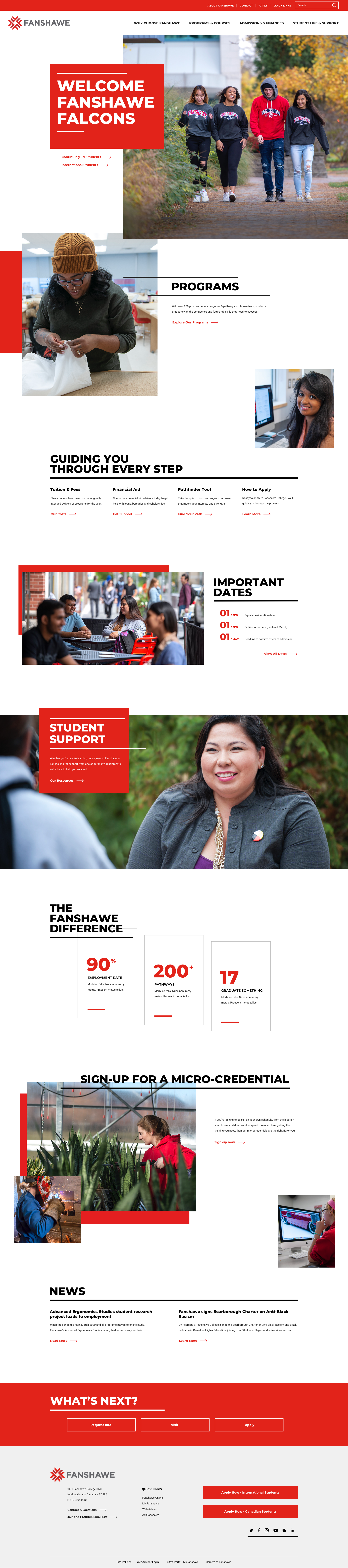
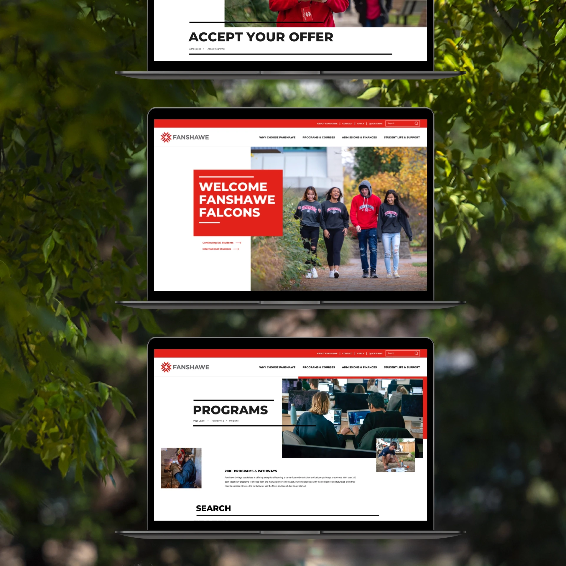
I infused the aliveness I found on the campus into my design direction to position Fanshawe College as a place bursting with creativity, fun, and connection to differentiate them in the competitive landscape.


Fanshawe Red
New Bold Headings
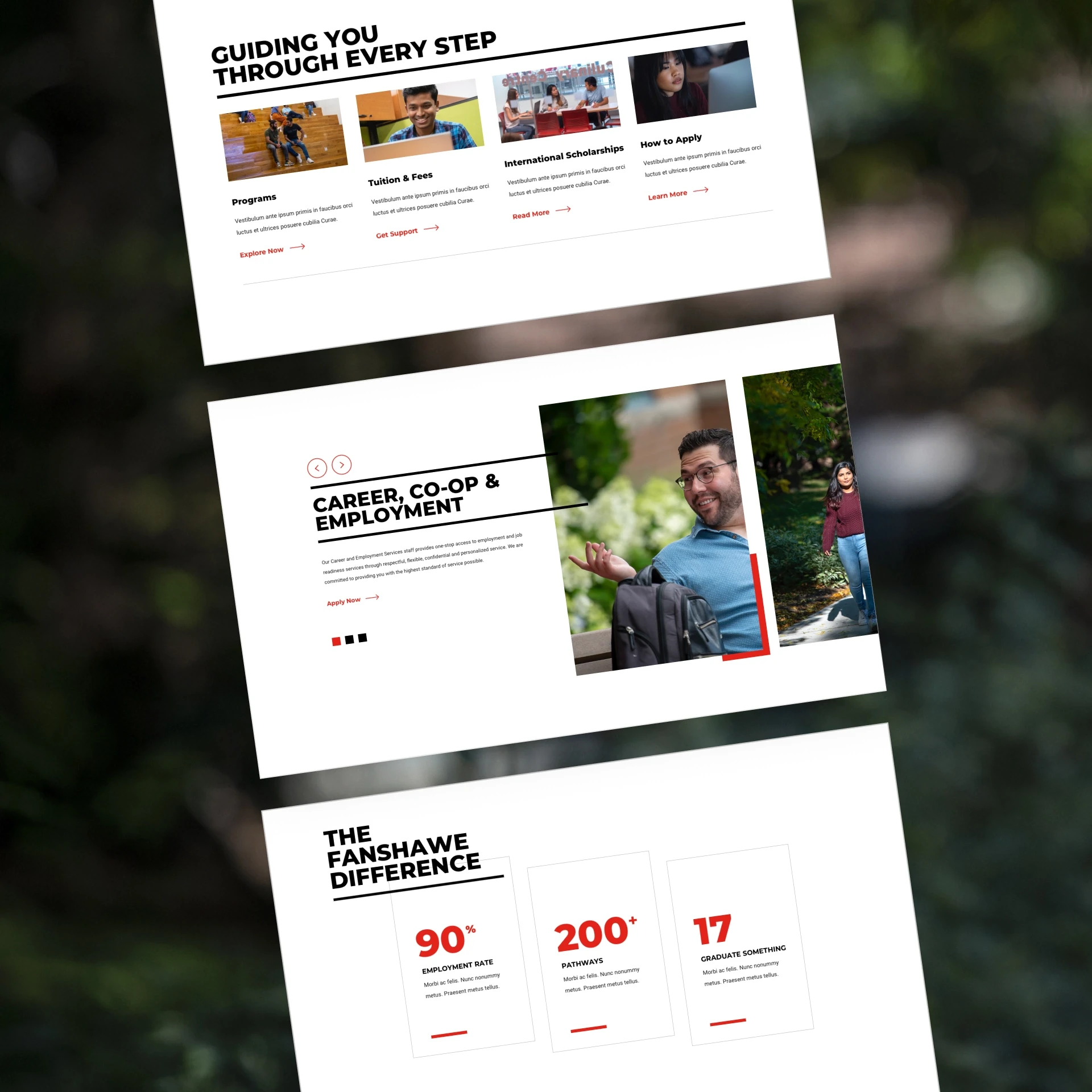
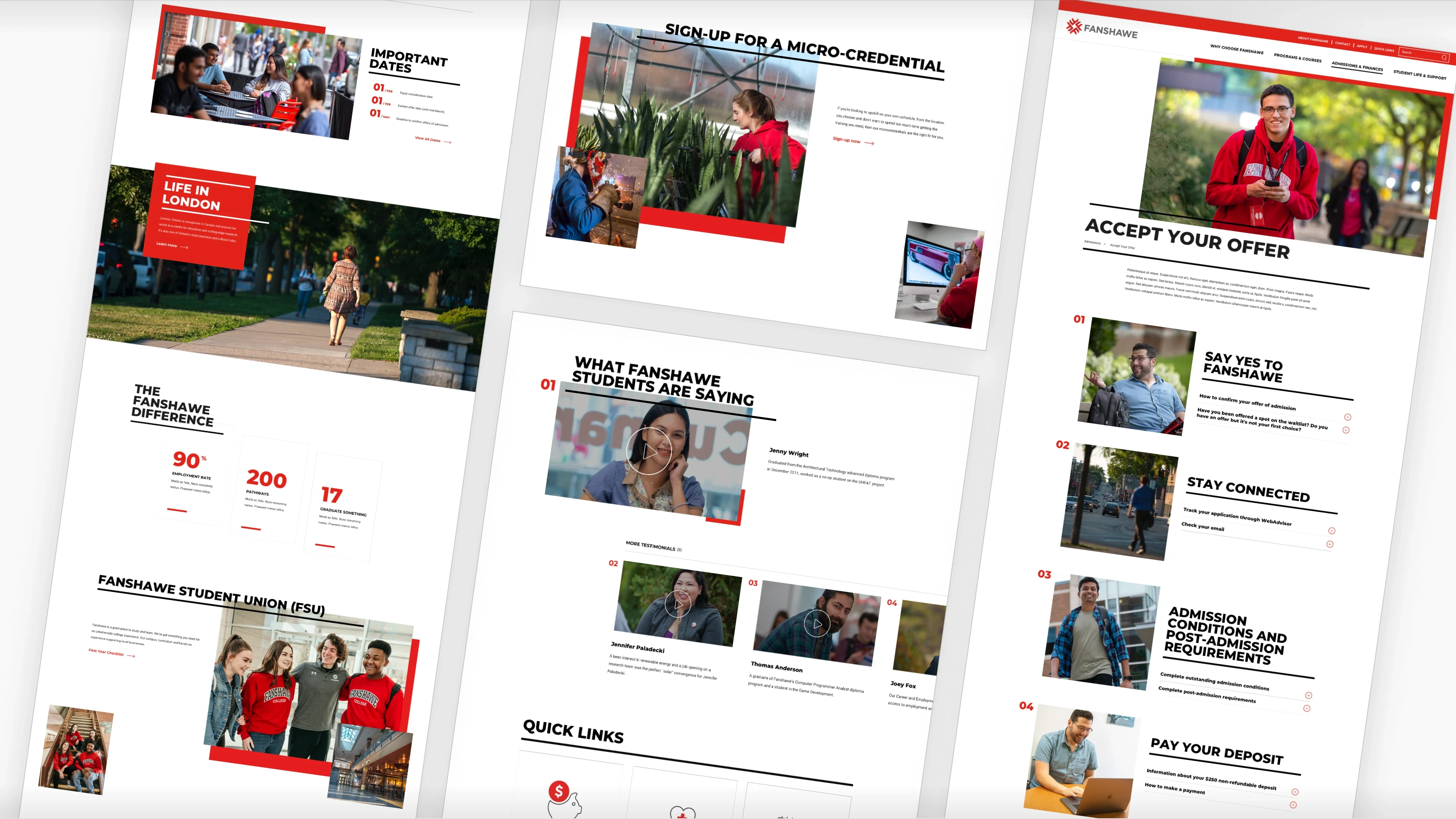
I implemented a bold, friendly, new font & paired it with asymmetrical lines, breaking from the conventional borders of Fanshawe's past website. The accents lead the user's eye to key CTAs and infuse energy onto the page.
Free-Flowing, Editorial Layouts
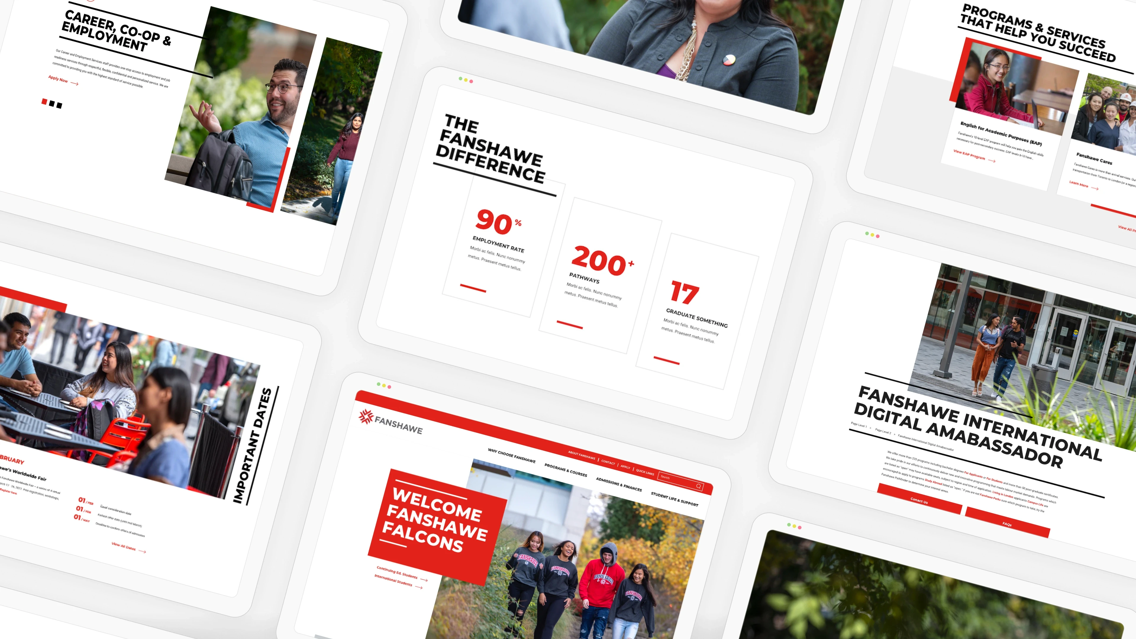
I broke the grid ... deliberately. Rather than organizing content into the predictable columns and containers that define most institutional websites, pages were designed to feel more like a well-curated magazine spread: varied content block sizes, asymmetrical imagery placement, and a sense of movement and freedom throughout. The result is a site that feels alive rather than buttoned-up.

Motion
In my pursuit of connoting the energy of Fanshawe’s vibrant campus, motion was a non-negotiable. I designed shifting red accent shapes used behind featured content blocks to create delight and visual rhythm as users scroll.

The Results
Improved User Journey
An IA rebuilt around student decision-making
I elevated key decision-driving calls to action across the experience, with a focus on program discovery, admissions, and tuition.
Optimizing ProgramS
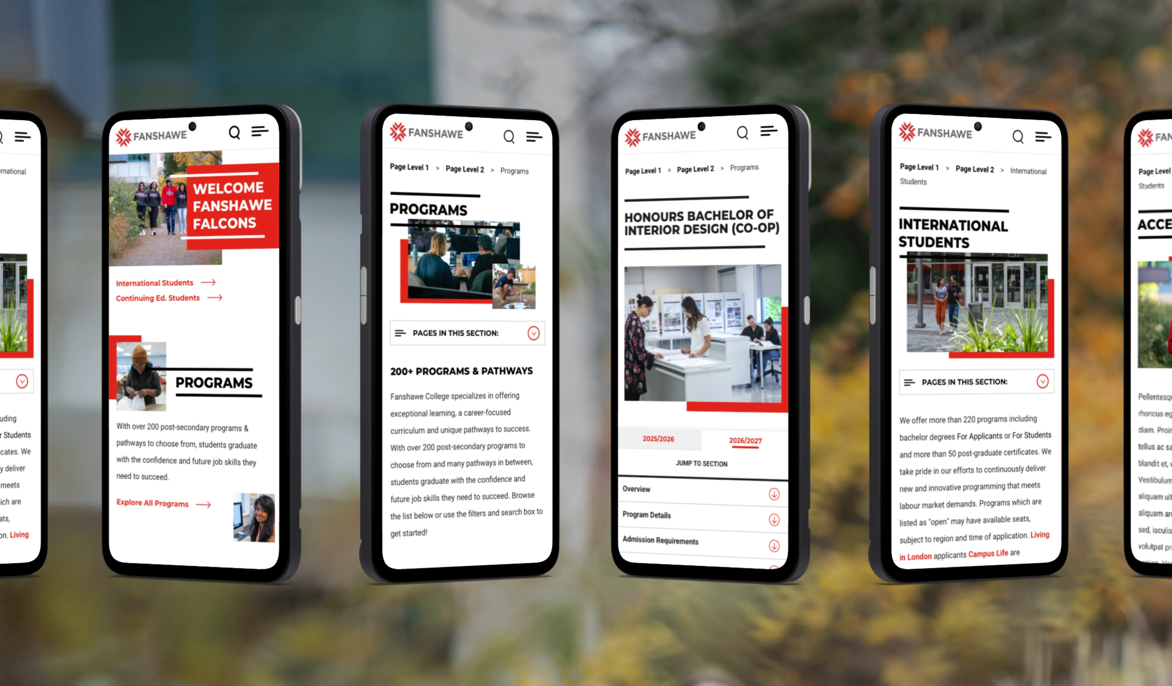
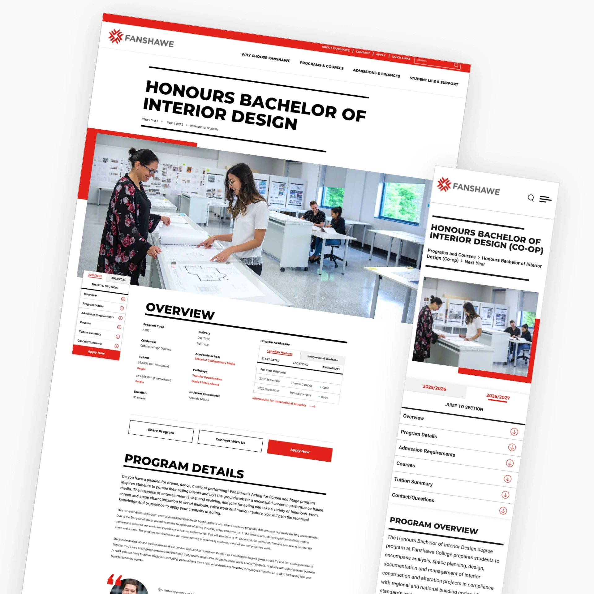
Program detail pages were restructured to prioritize the information students need most when evaluating a program: career outcomes, admission requirements, tuition, and start dates. I paired our structure with a new quick jump menu, expediting the task of getting to key information.
Research-backed layout Re-prioritization
I reframed the information architecture around prospective student goals while also instilling specific pathways to key content for international students. We promoted items that students told us were the most important factors in their decision-making process, while de-prioritizing internal institutional pages.
Key Takeaways
Why was this project special
Hitting a completely novel brand direction 'out of the park' on my first deliverable set the foundation for trust and excitement from the first reveal.
It's like you took the thoughts out of my head and put them on the page
"It's like you took my exact thoughts out of my head and put them on the page." Getting a reaction like this from a client doesn't happen by accident. It's the result of listening hard in discovery and having the conviction to commit fully to a creative direction.
Paired with our exciting new visuals & improved brand tone, I implemented a major overhaul to the website's underlying information architecture. Backed-up by research:
I improved the international student experience by more prominently featuring assets like the live ambassador chat, video testimonials, and adding a dedicated entry CTA high on the homepage.
I elevated the CTAs that actually drive applications, tuition, admissions, and program discovery, so they're visible at the moment students are ready to act instead of buried multiple clicks deep.
I deprioritized the institutional content that was getting in the way of our primary users' top tasks.
Next Case Study