
Humber College
The Project Challenge
Humber's brand felt interchangeable, with no distinct story to set the institution apart in its' competitive landscape. Additionally, Humber needed a research-backed IA that would allow for hundreds of sub-sites to be unified under one global system, while simultaneously providing each the controlled flexibility to solve their unique needs.
Humber College (officially Humber Polytechnic) is one of Canada's largest post-secondary institutions, serving hands-on educational experiences to over 86,000 learners annually in Toronto, Ontario, Canada.
My Roles:
My Process:
- RFP Response Strategy
- Shortlist Pitch
- Discovery Workshops
- UX Research & Analysis*
- Mood Board/Tiles*
- Wireframes*
- Custom Figma Design System Build
- Prototypes*
- Mockups*
- Dev Hand-off
*Presentations & Revisions
Agency:
Northern Commerce





The Solution
Refreshed Brand
From Generic Institution to an Impactful, Authentic, Digital Identity.
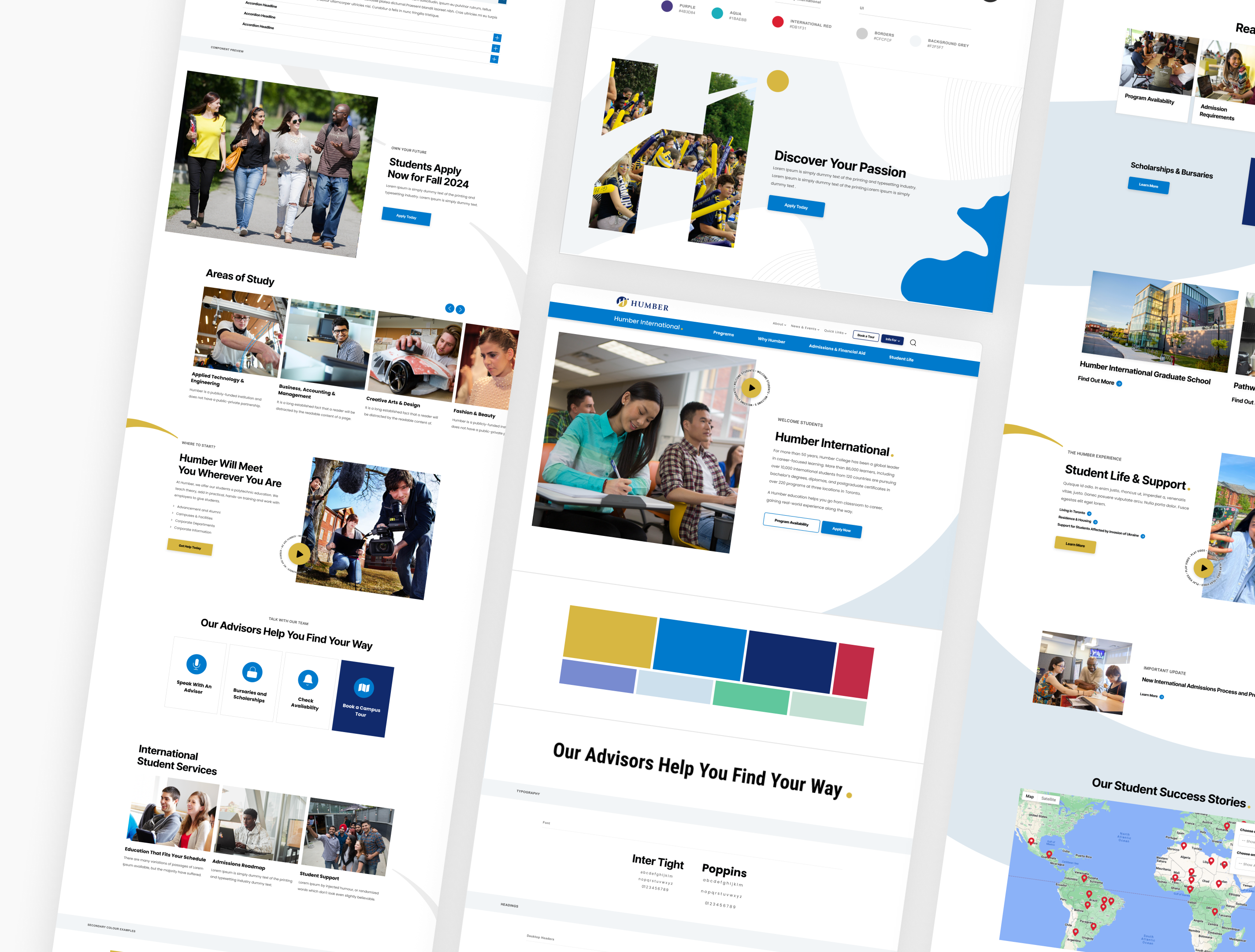
I Introduced new motif elements rooted in Humber's brand history, deployed strategically to direct attention, anchor key CTAs, and add visual hierarchy across the site, all while ensuring our design could easily shift to differing colour palettes within contextual sub-sites.
Building a Narrative
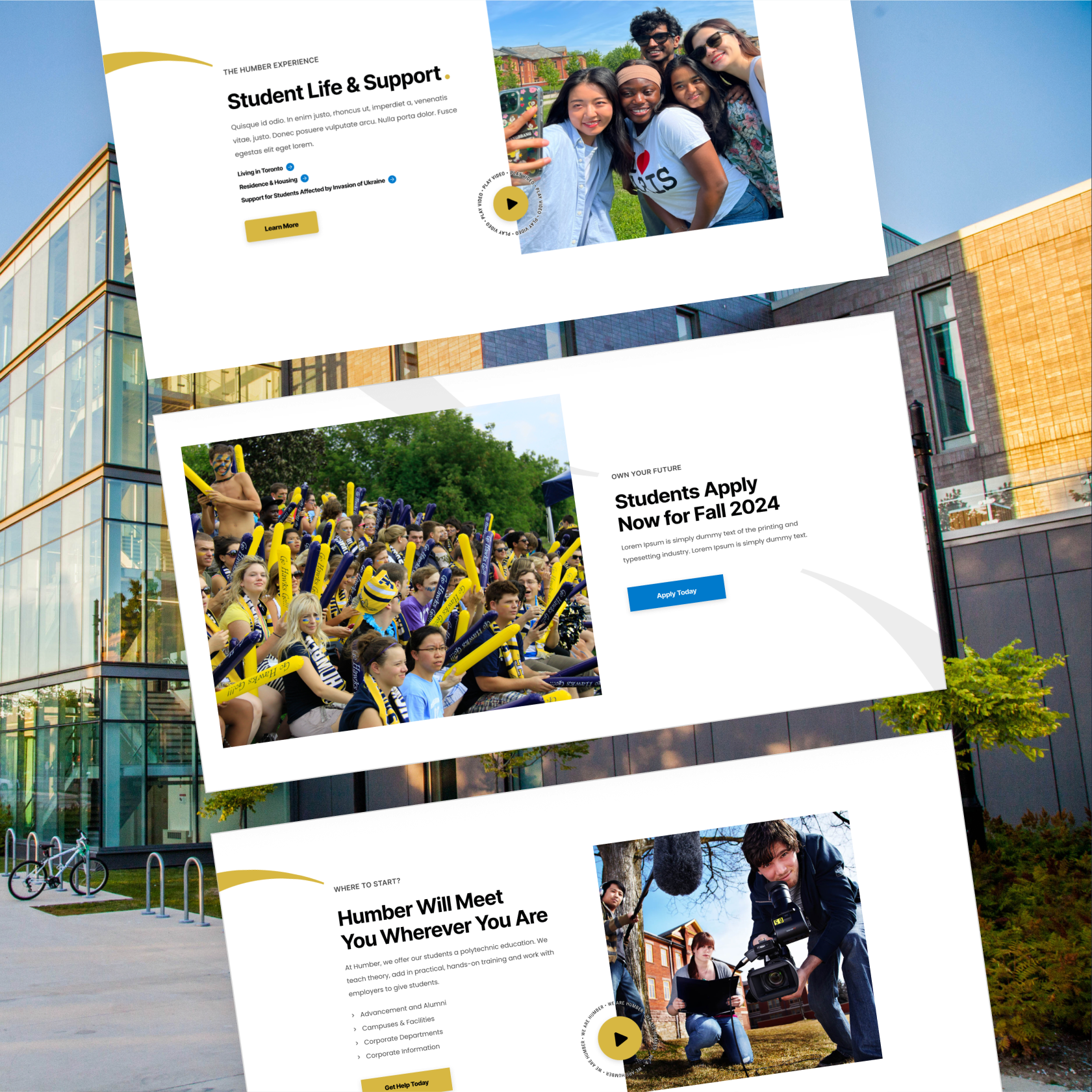
The “Wave”
Humber Polytechnic was named after the Humber River, due to it's geographical proximity and heritage as a major energy source and trade route to early settlers and indigenous populations. The river is synonymous with pathways, connection, movement, & growth which aligns directly to Humber Polytechnic's ethos.
A modern nod to the 'wave' can we found in Humber Polytechnic's existing logo, but I wanted to capitalize on this rich history by embedding this motif into our visual story-telling throughout the pages of the website.

Building a Narrative
The “Wave”
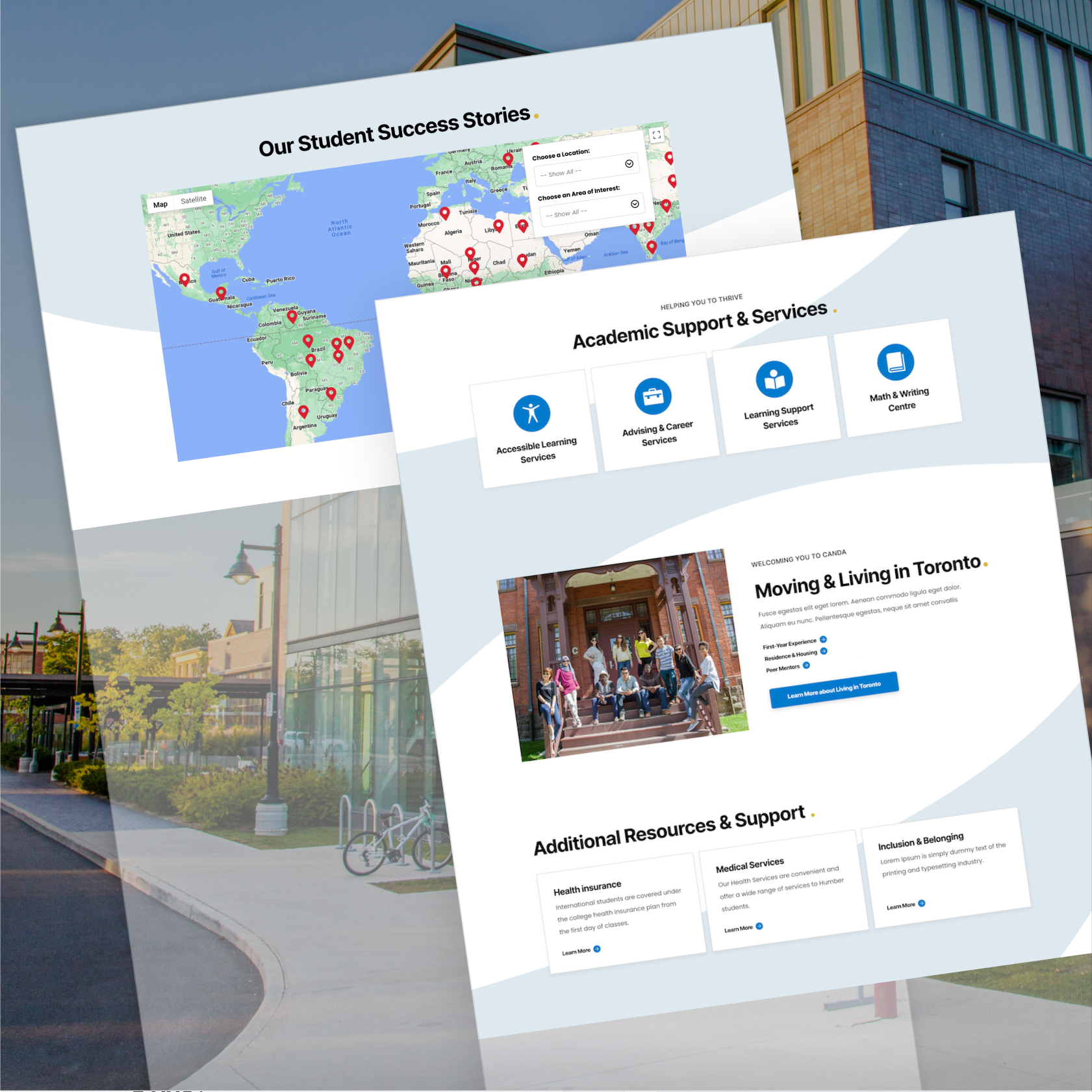
I designed the wave to 'flow' the user down the page, creating an immersive experience, routed in an authentic heritage. Positioned purposefully at the lower edge of key page sections, it catches the user's eye, creating a natural pull toward the next call to action.
Building a Narrative
The “Dot”
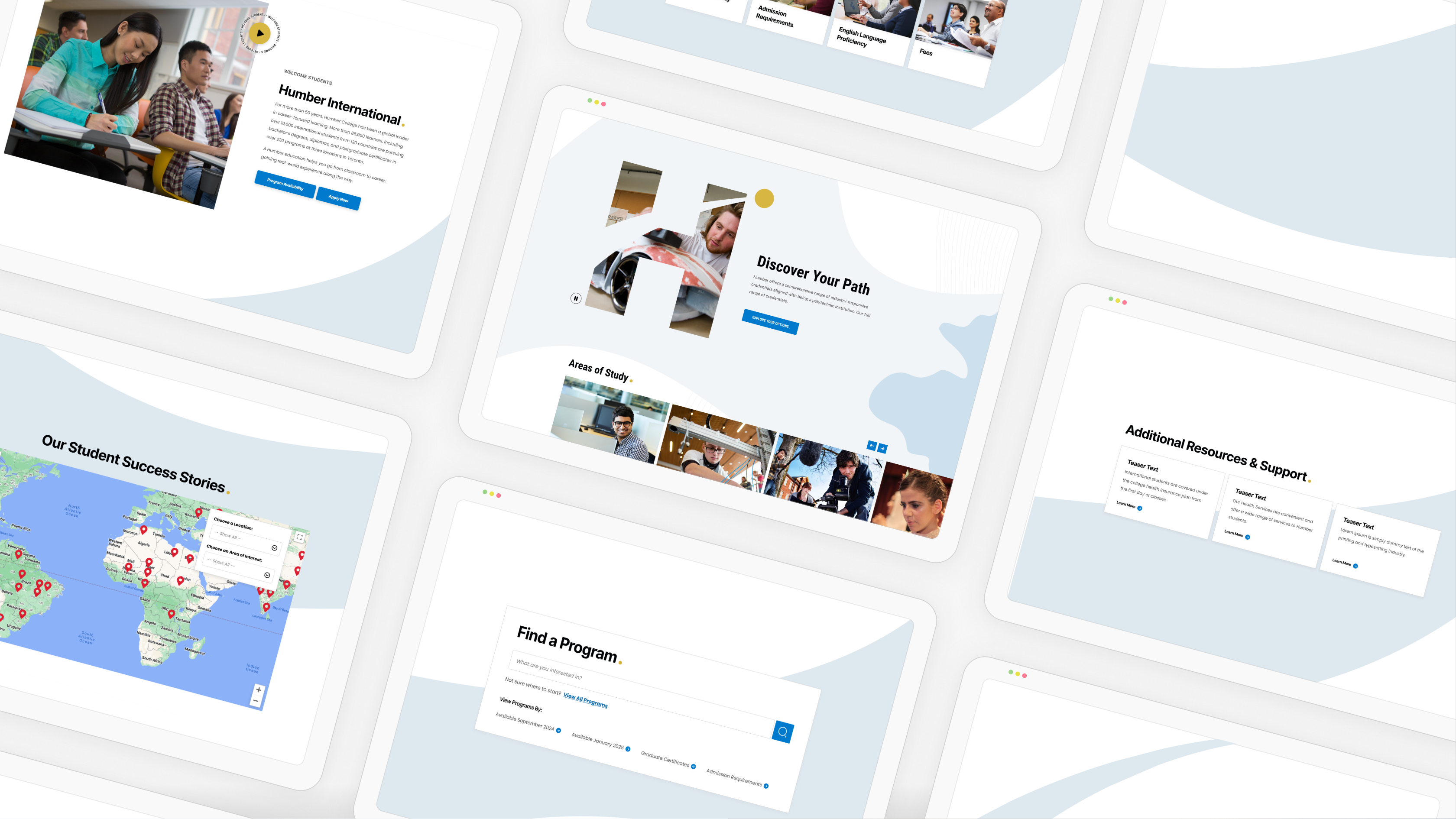
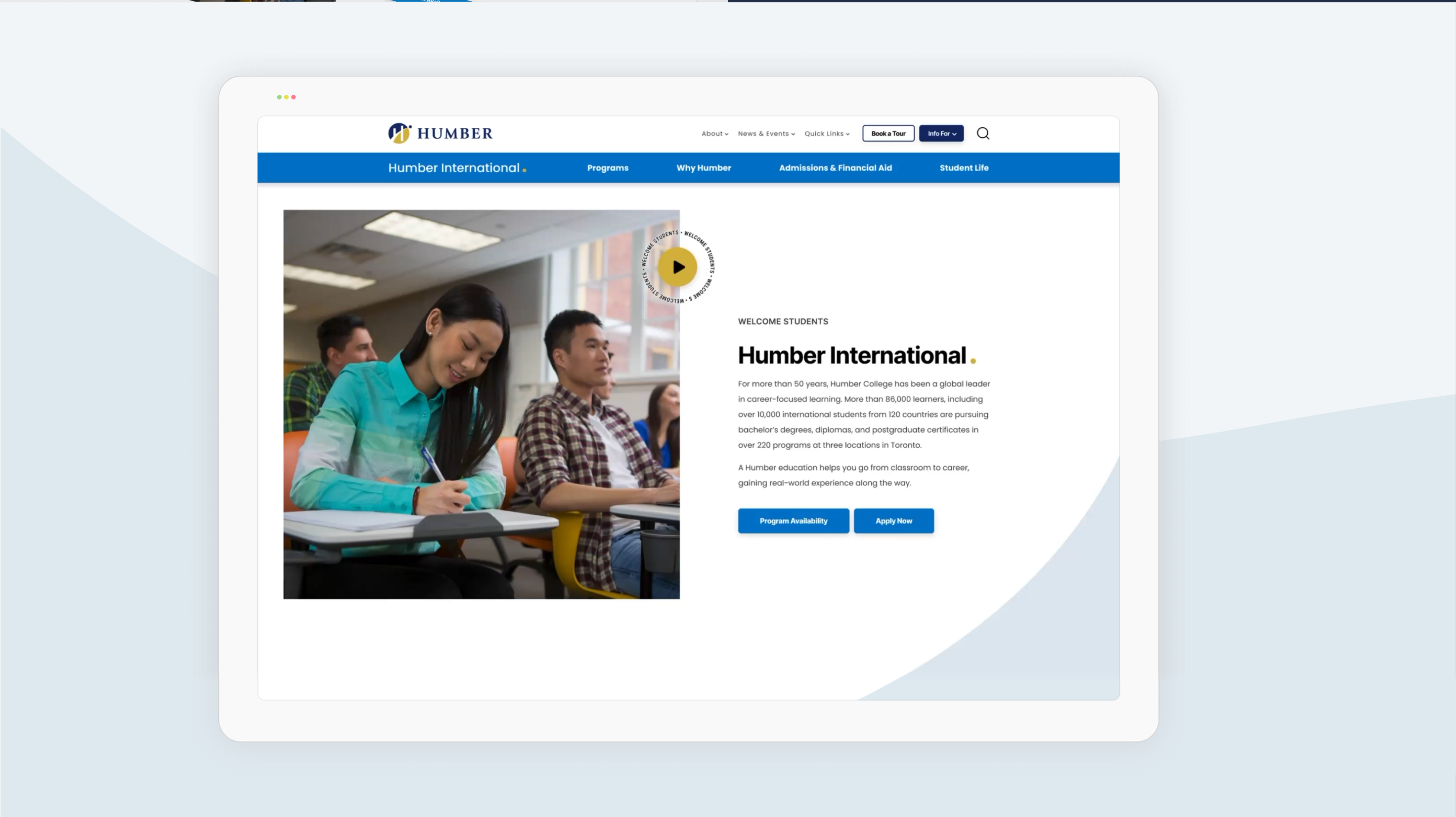
Pairing with the 'wave' motif, and taking inspiration from the Humber Polytechnic logo, I incorporated the 'dot' throughout our page layouts.
Styled with Humber's brand 'gold', I re-imagined the 'dot' as a 'beacon' or 'guiding light' -- akin to the sun shining overtop of the river.

Building a Narrative
The “Dot”
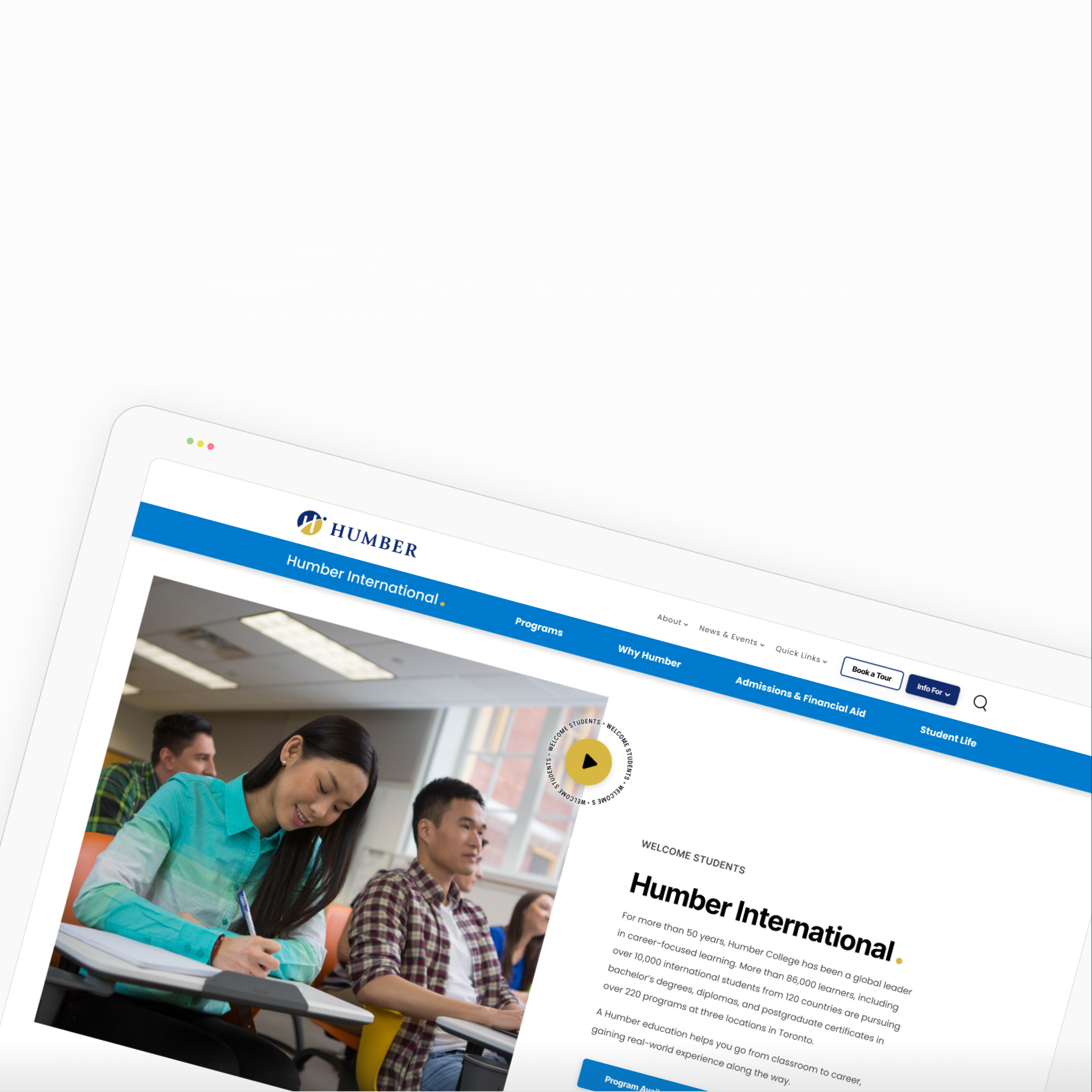
As our 'guiding light', the “dot” leads the user's eye to top task sections, informative videos, and navigational anchor points.
Additionally, the “dot” takes on double meaning. Being used as an impactful emphasis at the end of a declarative statement.
The Solution
Formative Design System
Building a scale-able foundation for the future.
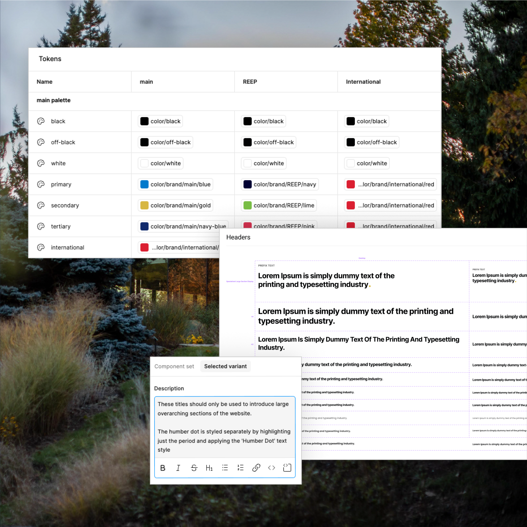
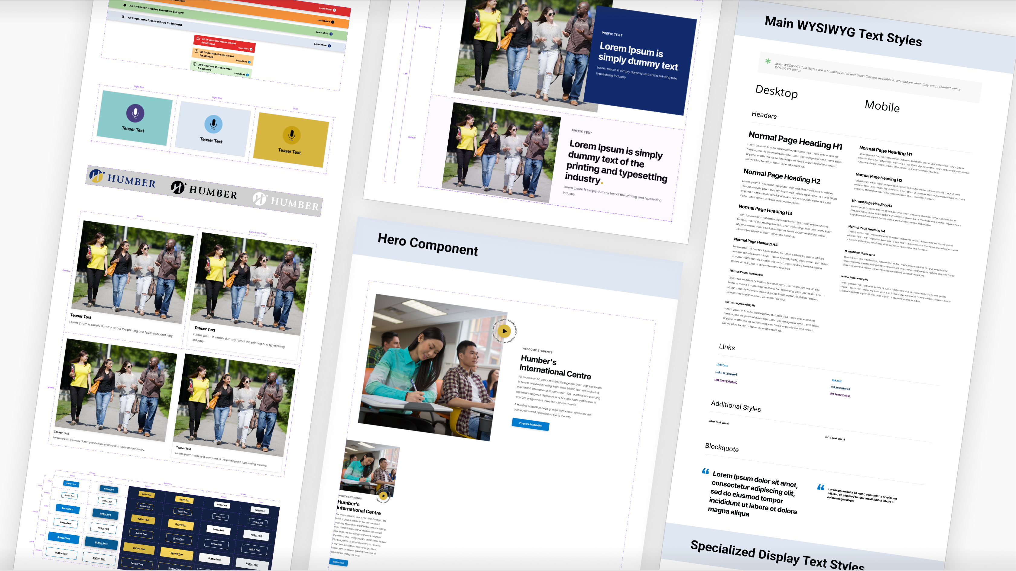
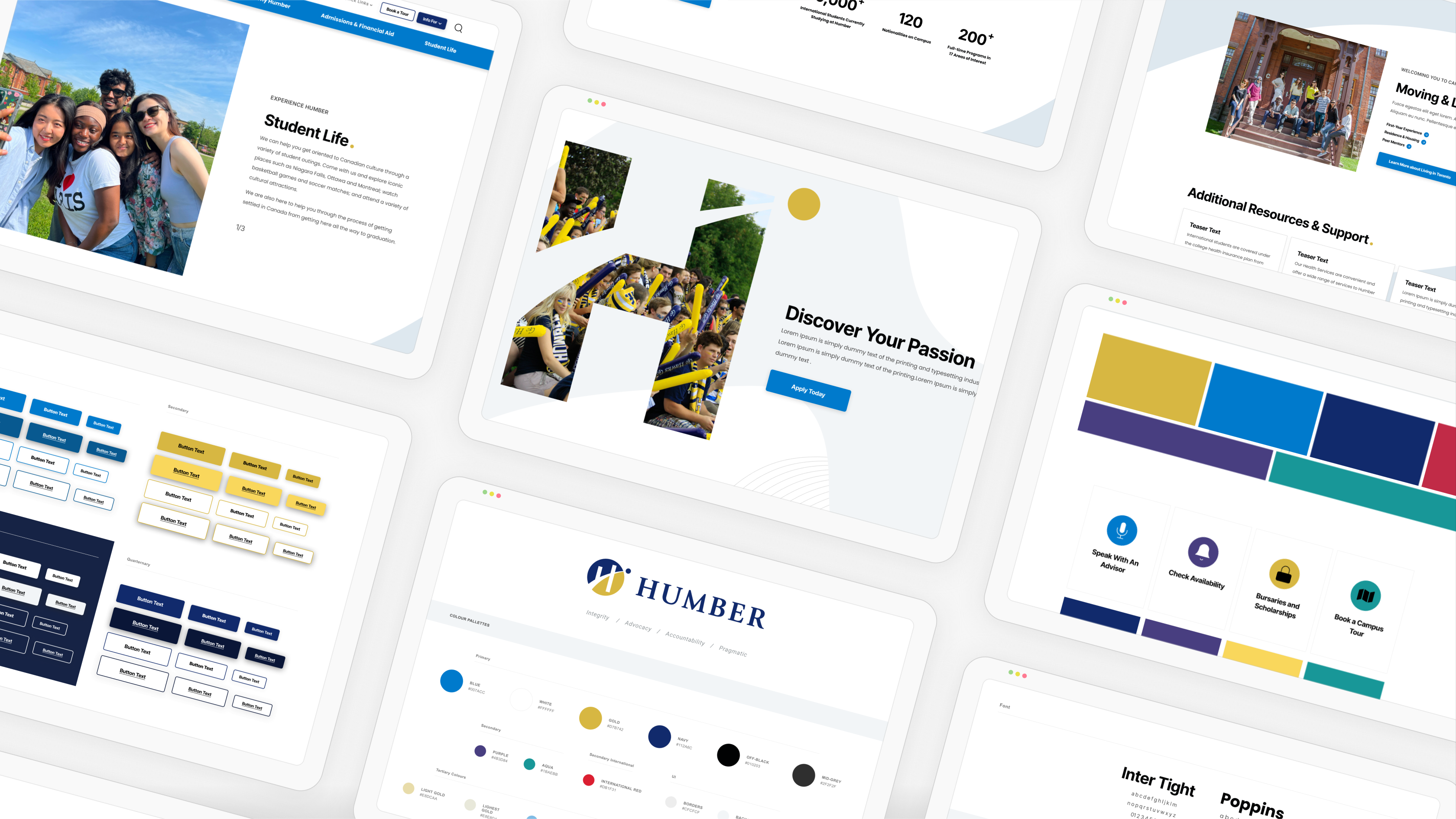
I built a design system that scales to fit different sub brands, while maintaining the integrity of Humber's global visual language, setting up Humber's internal design team for easy maintenance and efficient extension of the UI framework post-hand-off.
Foundational Design System
Built a documented, variant-based Figma design system with responsive components, embedded rules and guideline documentation, and a variable system build around brand 'modes' for easy designing of sub brands in the future.
The Results
Improved User Journey
An new IA informed by global and contextual needs.
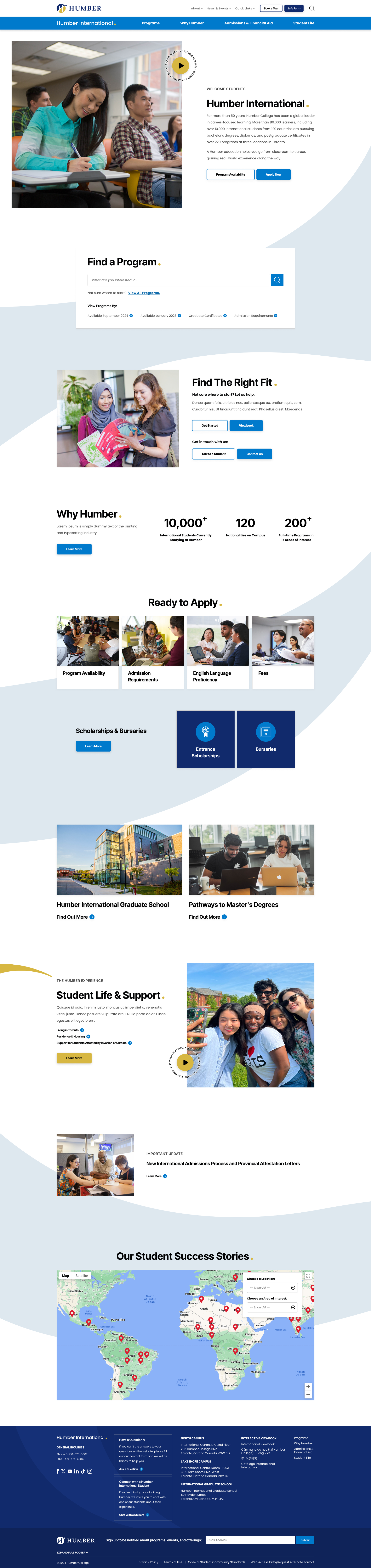
Our new information architecture unified the experience of numerous sub sites, while improving the prominence of Humber's value proposition and brand tone.
Consolidated Navigation
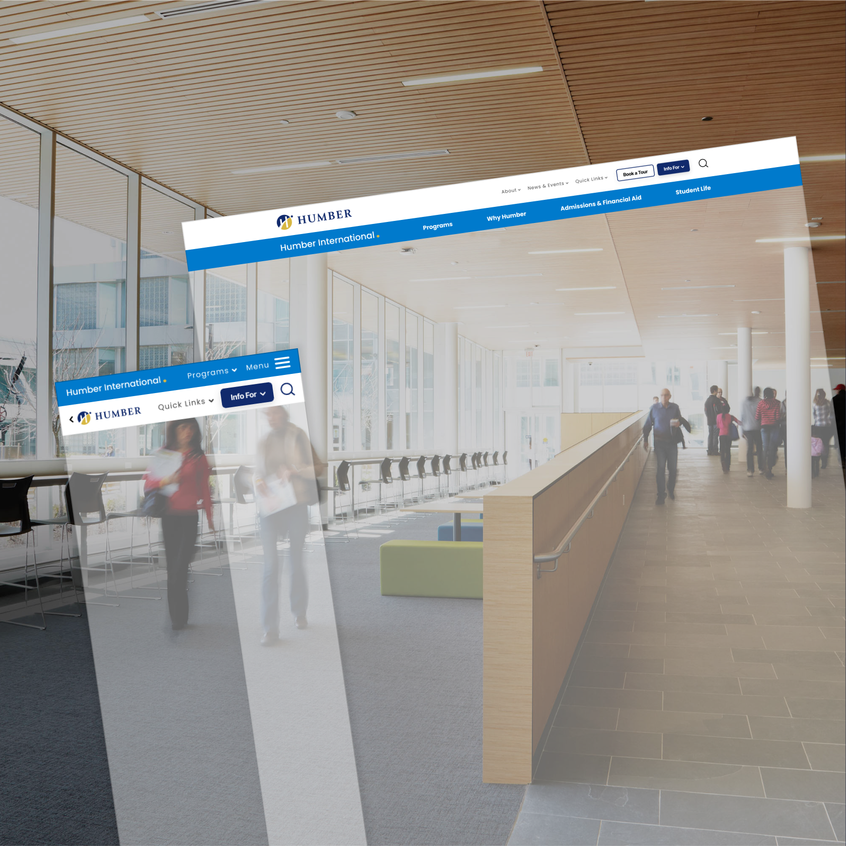
I implemented a new global menu bar, allowing students to orient themselves within any sub-site using Humber's title and "dot" or ‘guiding light’.
We consolidated common informational pages into one global source of truth across the Humber ecosystem, while creating audience-specific pages where necessary. This cut down on audience confusion as we removed outdated and/or duplicate information from our menu system.
Improved International Student Experience
I reoriented pages around both emotional and tactical decision-making content. On the emotional side, I elevated Humber's international success story map, life in the Greater Toronto area, and student support services. On the tactical side, I surfaced key call outs like bursaries, healthcare plans, and visa permit information -- tying it all together with a warmer, more conversational tone rooted around Humber's core value propositions.
Key Takeaways
Why was this project special
Balancing the technical complexities of the project while also crafting an exciting new brand story created the challenge of constantly shifting between left-brain logic and right-brain creativity.
I'm excited about how we could leverage these motifs on our other marketing materials.
Humber's internal communications team was particularly excited about our new expression of the Humber brand in terms of the 'wave' and 'dot'. They noted seeing massive potential in how they could continue to leverage this direction in their marketing endeavours post our website project. I loved the feeling of bringing in this fresh perspective to get their team's creative juices flowing.
Not only did I develop new brand messaging and motifs, but I created & handed over a design system in Figma to make sure that those ideas maintained their integrity for years to come.
This encompasses my main take away of crafting a creative direction reset conceptually while also being able to translate it into the technical, systematic language of variables, components and variants.
Additionally, I relished the challenge of balancing global and contextual architectural needs across multitudes of audience types, while simultaneously wrapping our new layout in a beautiful new package.
Next Case Study