
BC Transit
The Project Challenge
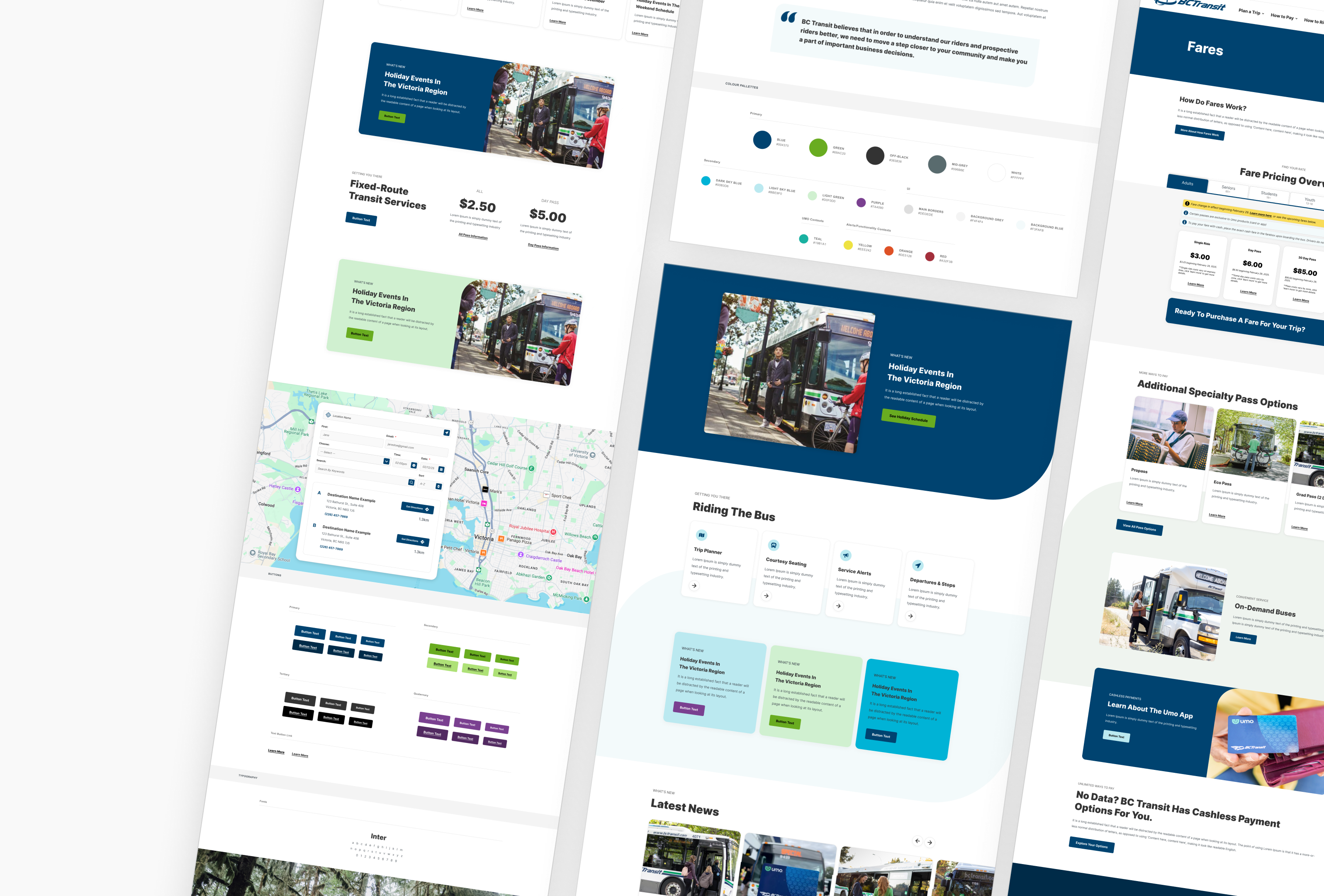
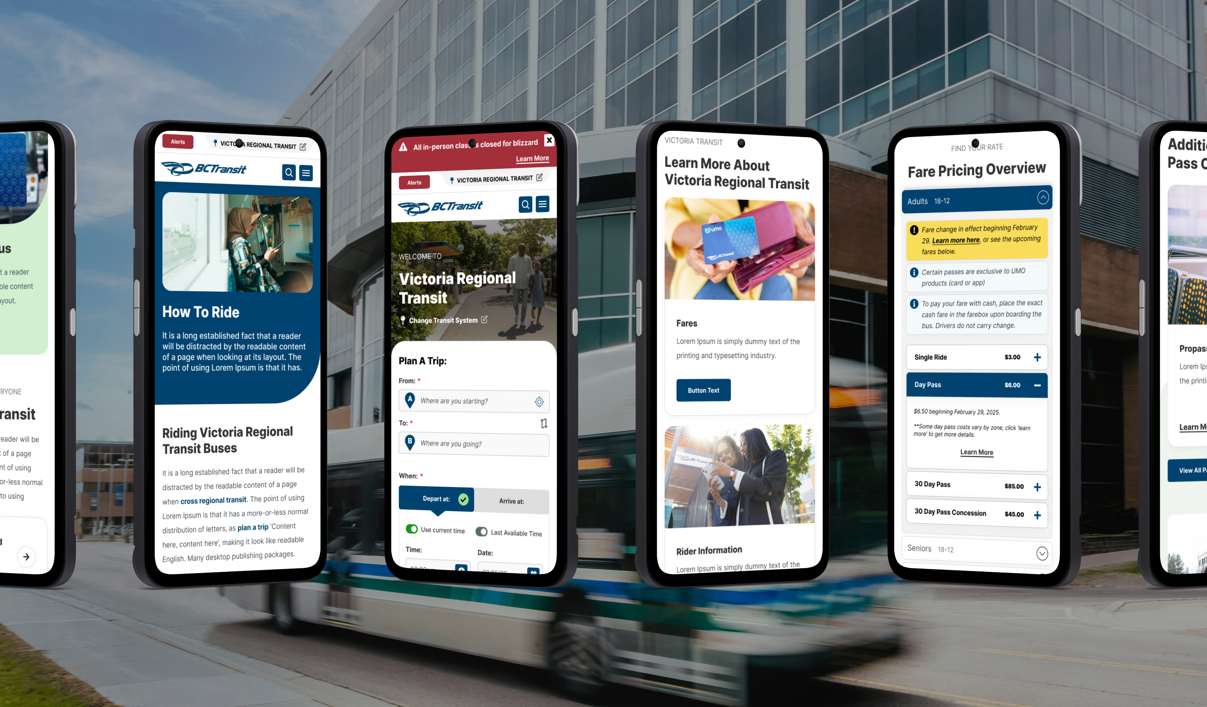
BC Transit needed a research-backed, user-tested, UX overhaul that could serve every type of rider, across every region, on every device, paired with a refreshed brand identity with the range to match their future ambitions.
BC Transit is a provincial public transportation institution serving over 54 million passengers annually in more than 130 communities across British Columbia, Canada.
My Roles:
My Process:
- RFP Response Strategy
- Shortlist Pitch
- Discovery Workshops
- UX Research & Analysis*
- Mood Board/Tiles*
- Wireframes*
- Prototypes*
- Mockups*
- Dev Hand-off
*Presentations & Revisions
Agency:
Northern Commerce






The Solution
Refreshed Brand
From Stagnant to In-Motion.
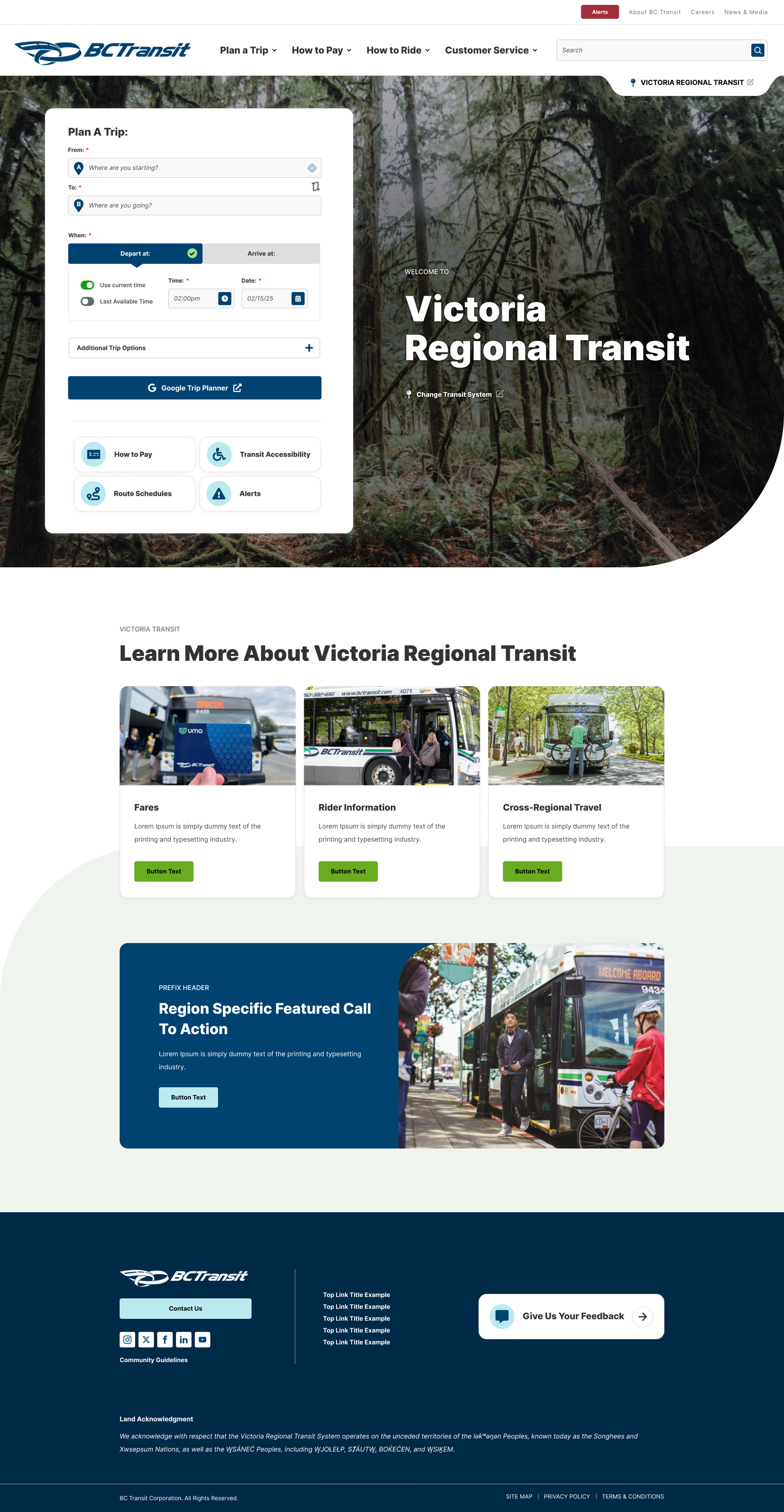
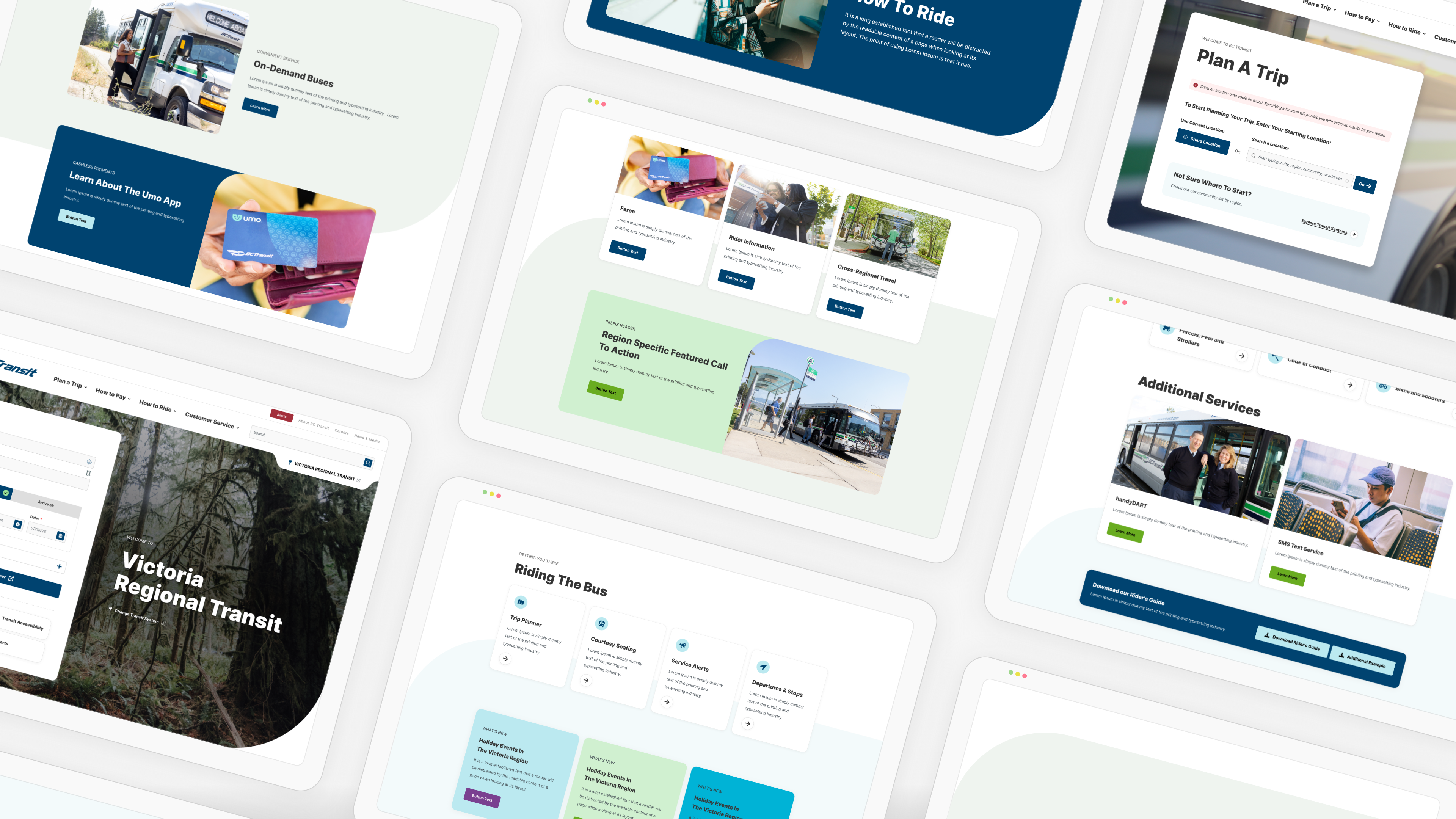
Rooted in BC Transit's own logo and ethos, I refreshed the brand by introducing a movement-inspired motif and an expanded secondary palette, giving the brand a wider spectrum to play with for their upcoming marketing initiatives.
introducing a New, dynamic Motif
The ‘Curve’
The existing website was stuck in the early 2000s. BC Transit's ambitions were not. Alongside the redesign, the team had a lineup of technological upgrades on the horizon: new payment app partnerships, expanded routes, and more.
The site's stagnant energy did not match where the brand was headed, so I infused the new design with a motif built for the road ahead.
‘The Curve’
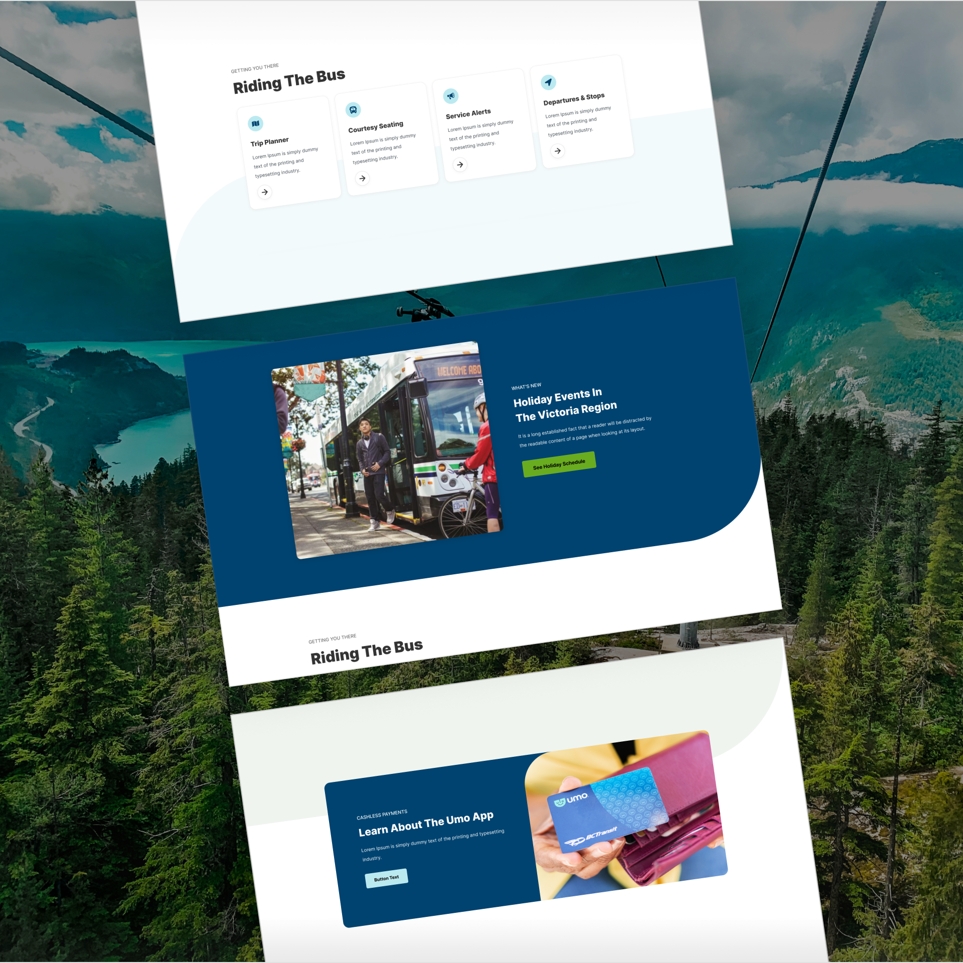
I implemented a 'curve', as a visual motif. The rationale was two-fold: first, it is a direct callback to the brand's own logo, which features a stylized, curved 'B'.
Second, a curve is the visual language of movement. For a public transit authority, the connotation of moving the community forward was imperative to exemplify.
The motif appears throughout the site on featured cards, subtle backgrounds, and the edges of hero sections, always flowing the users eye forward into the next section or key call outs.
New Secondary Colours
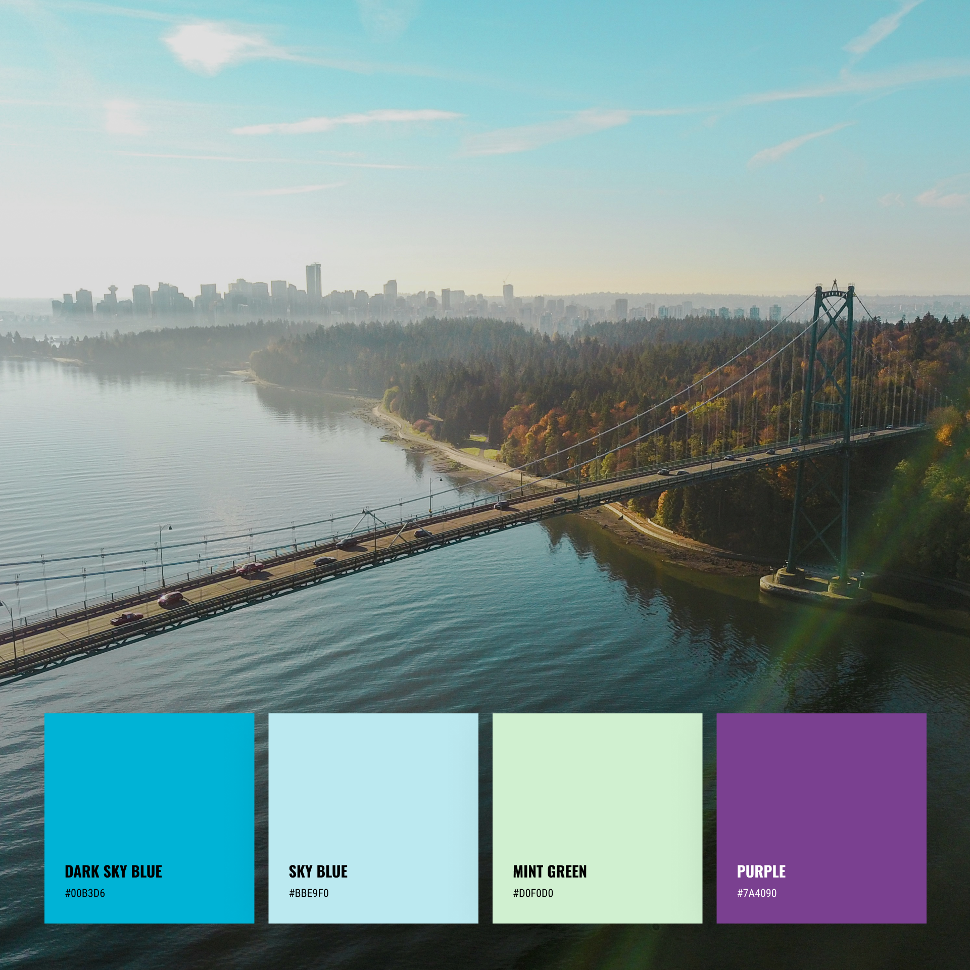
BC Transit's internal marketing team felt boxed in by their single navy brand colour. Functional, but limiting, especially with a slate of high-visibility campaigns on the horizon to support new endeavours launching alongside the website.
I expanded the palette with more saturated blue tones, a mint green, and a purple, all chosen to work harmoniously alongside the existing navy while giving BC Transit substantially more visual range to grow into.

The Solution
Overhauling ‘Fares’ UX
Addressing Information Overload
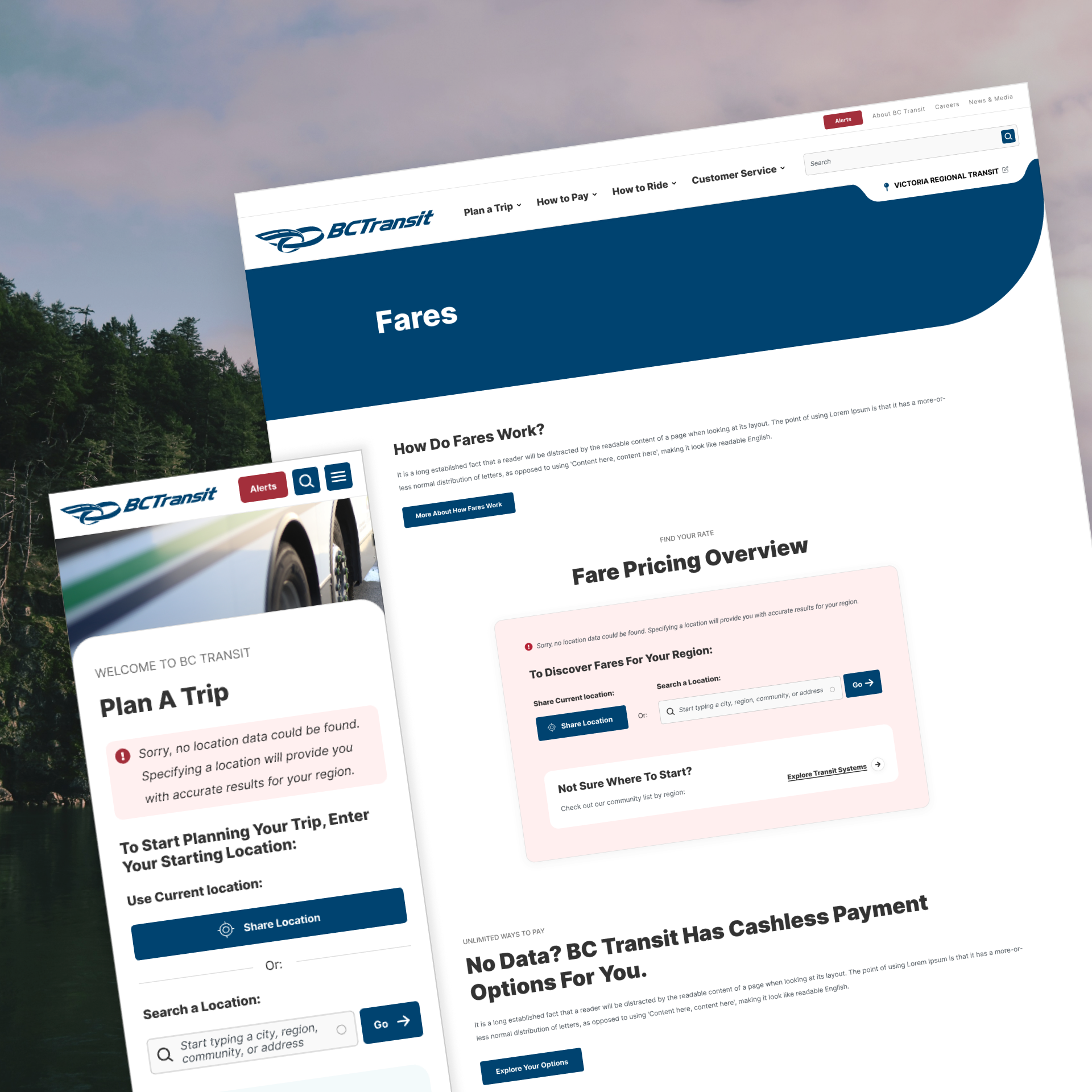
The fares page was one of the most critical improvements in the entire project. I built it entirely around progressive disclosure: users receive information in digestible layers, moving from a high-level overview toward specific details only once they needed them.
Improved approach to regional details
Fares carry a specific kind of complexity: passes, ticket structures, and discounts differ from region to region, while other information stays universal. I implemented a globally applicable regional prompt that sits above the fares table, keeping universal information visible at all times while signalling that more specific pricing information can be found once the user selects their region. Users are never blocked from browsing, and don’t need to sort through any fare information that doesn’t apply to them.
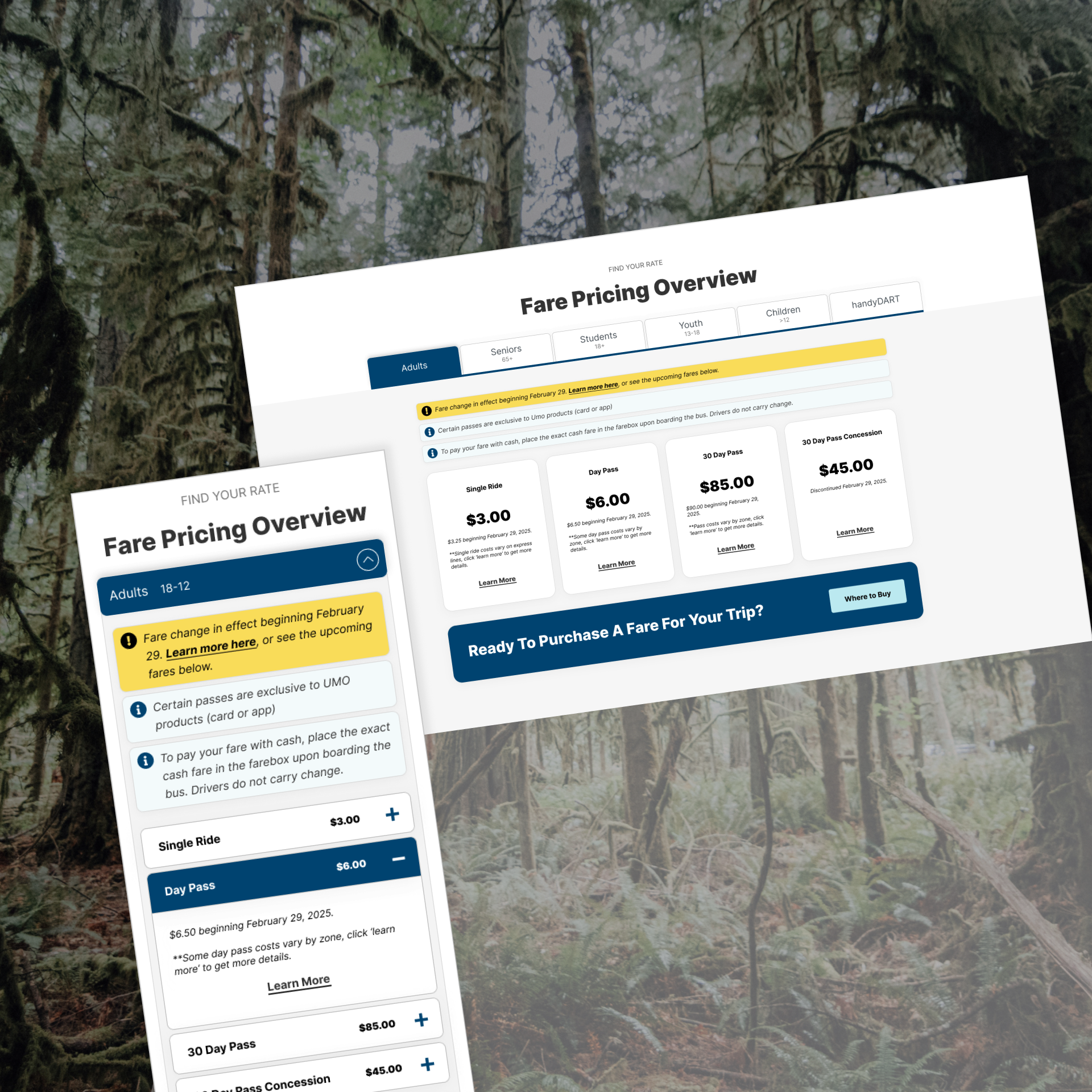
a new Fares Table
Solving for information-overload
I implemented a new Fares layout that forces one decision up front: which type of rider are you? Adult, student, child, senior, and others each get their own tab, filtering the page down to only the passes and pricing that apply.
Within each tab, riders see a top-level card view of every available pass and ticket type: a quick, scannable inventory of what's even possible before they commit to going deeper.
Within each audience tab type, I also inserted opportunities for persona-independent alerts like fare changes, and top task call to actions like ‘where to buy’ so that these important items are highly visible at all times.
Improved Page UX
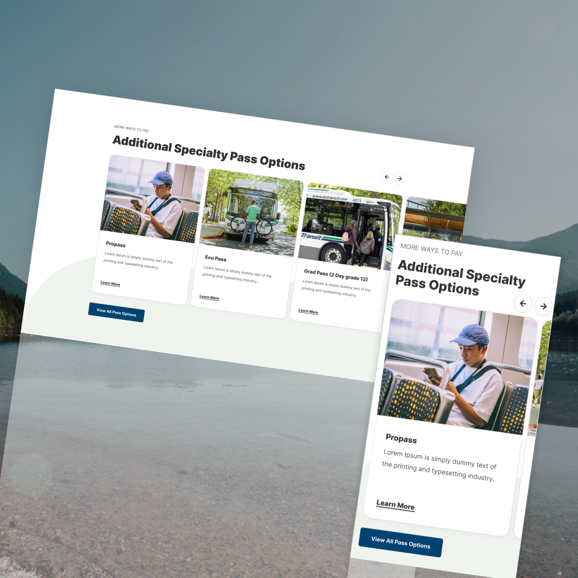
Specialty Passes
I designed the main fares table intentionally to showcase the most popular tickets and passes: the ones roughly 90% of riders are actively searching for.
De-prioritized, yet still available below it, is a dedicated section that surfaces specialty and niche passes, giving BC Transit room to showcase the full breadth of their fare options without cluttering the primary experience for the majority of users who will never need them.
The Solution
Overhauling ‘Route Schedules’ UX
‘Don’t Make Me Remember’
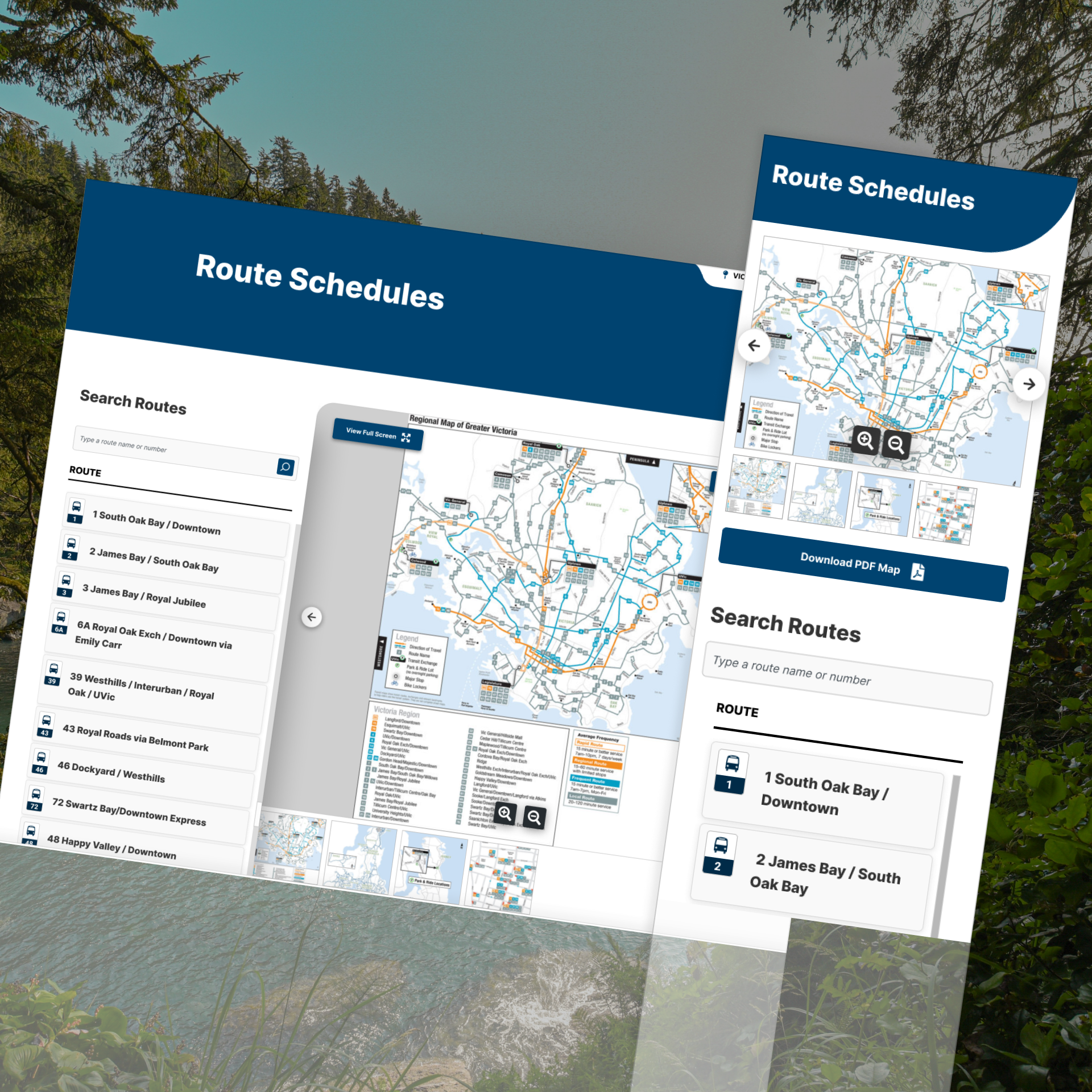
The route overview page was rebuilt around one foundational principle: never make a rider hold information in one place and carry it somewhere else. Every layout decision, including the ones shaped by real project constraints, was made to keep the map and the route list working together at all times.
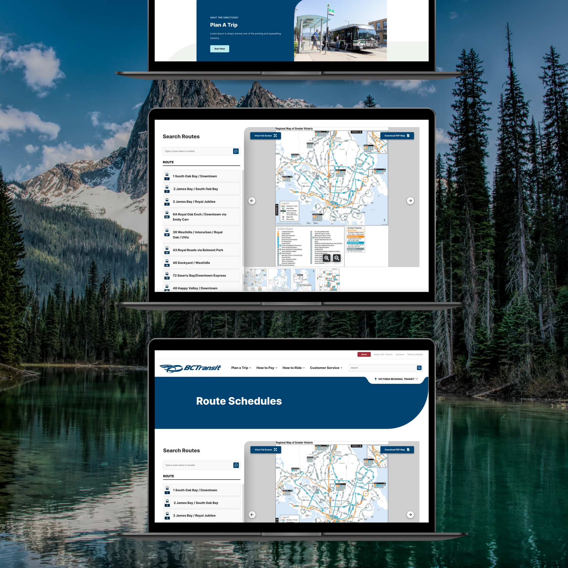
a FIXED MAP VIEWPORT
Solving for 'Scroll and Remember'
Project scope required us to use PDFs for route maps, so my job became engineering the most user-friendly PDF viewing experience possible within that constraint. On the previous site, the PDF took up the entire top of the screen, forcing riders to scroll before they could ever see the route list. It was inefficient, and it was cognitively demanding: riders had to memorize map areas before searching for them by name.
I locked the PDF into a fixed screen layout where the user always has a portion of the list and the map in view.
A FILTERABLE ROUTE LIST
Search or Scroll, Without Losing Your Place
The route list works two ways at once. Riders can filter by route name or number using an auto-complete search input, or scroll the full list via an overflow function that keeps the map viewport locked in place.
Either path keeps both surfaces visible: riders can identify a route on the map, then look it up on the list, or vice versa, without ever losing their spatial context.
A SITE-WIDE ROUTE TOKEN
a visual language Built for the future
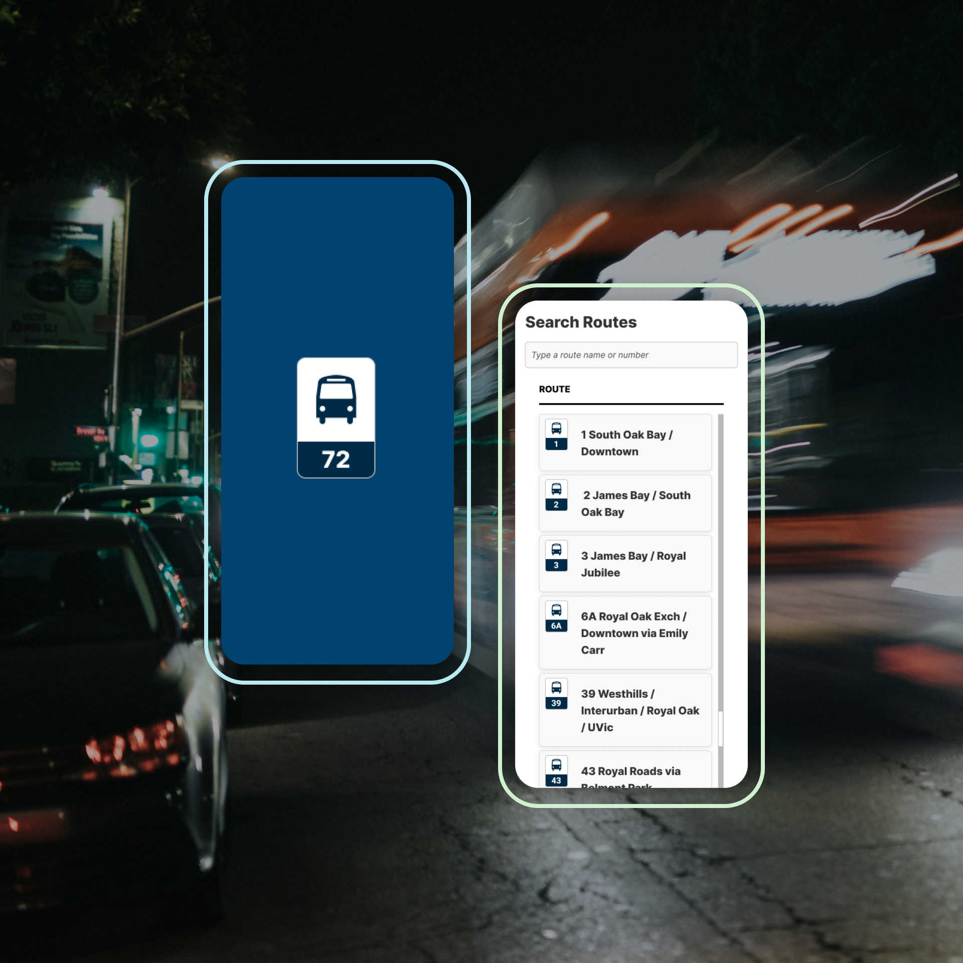
Beyond the scope of the project, BC Transit had plans to expand the site to cover subway lines, ferries, and other modes of transportation. Designing for that future became imperative from day one, so I introduced a site-wide route token: a small, standardized visual identifier for every route.
The system was built to scale, with different icons and colours designated for each future transportation type as the site grows.
The Solution
Overhauling the ‘Route Detail’ UX
Focused Trip Information
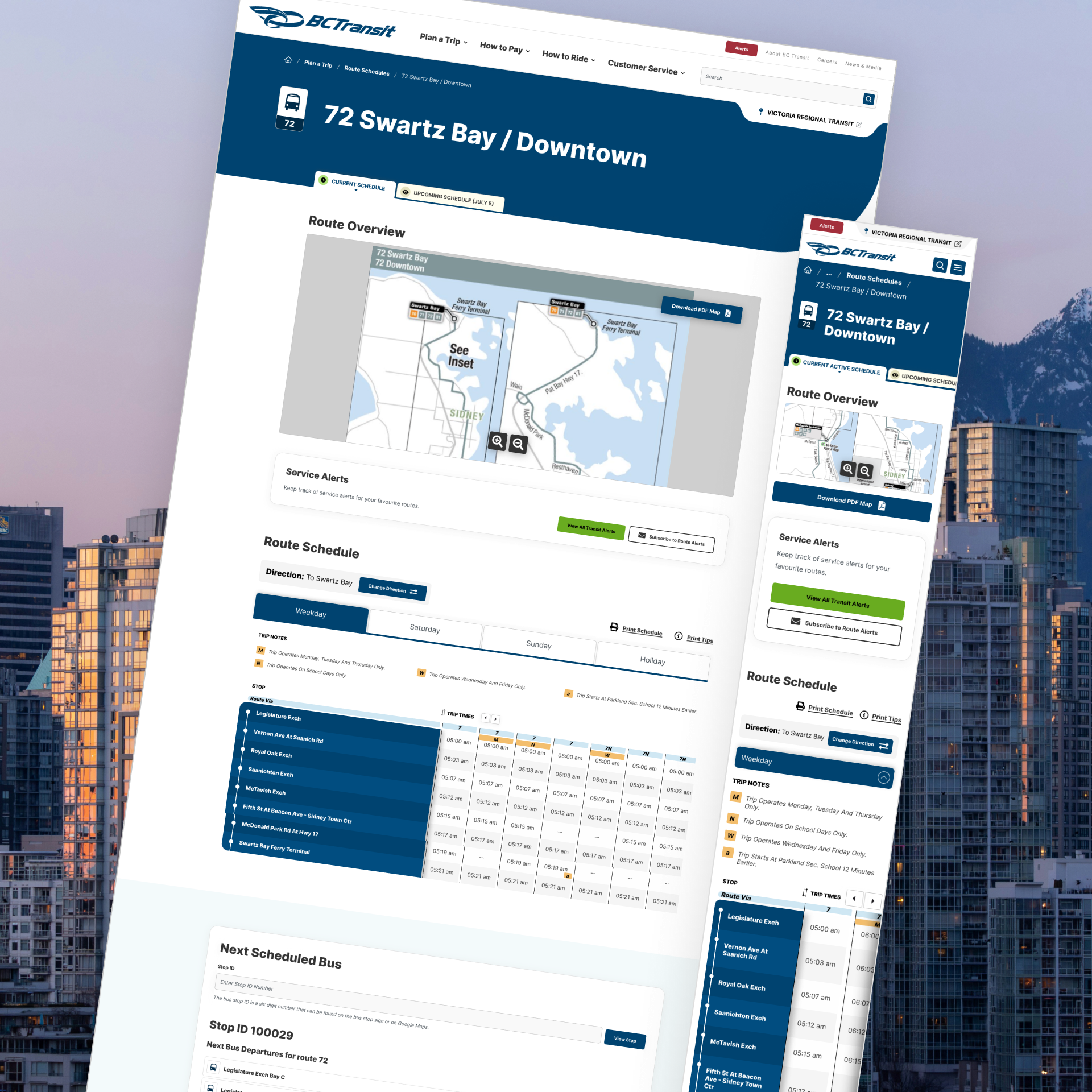
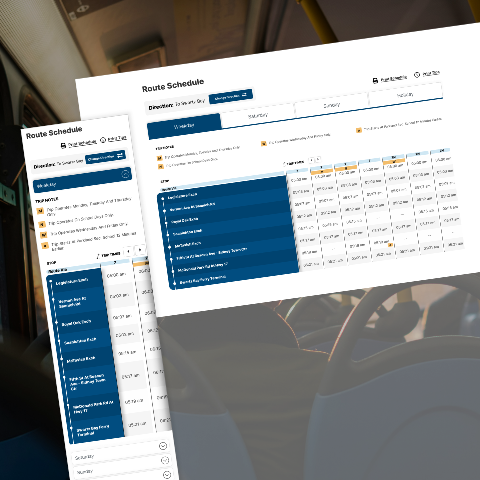
Riders rarely need the full schedule. I rebuilt the route detail page to filter down to what matters for each rider's specific trip.
SCHEDULE TYPE FILTERING
I implemented a new layout where before a rider sees any timetable, they filter by schedule type: weekday, Saturday, Sunday, or holiday. It is the same filtering principle shaping the fares page: show only necessary information to mitigate information overload.
CLEANER LEGENDS AND TRIP NOTES
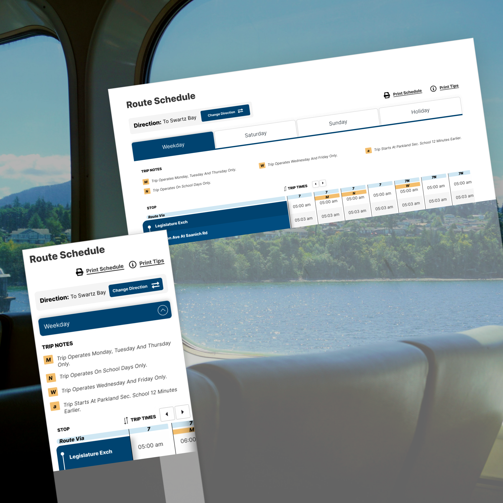
Once inside a schedule type, I designed a refined implementation of legend letters and 'route via' information, placed contextually rather than crowded at the top of the page. A dedicated area for trip notes keeps supporting details available without competing with the schedule itself.
A vertically SCROLLABLE TIMETABLE
Traditional full-width schedule tables force riders to parse hundreds of departures they will never take. I designed a vertically scrollable ‘trip’-based timetable where stop names stay fixed to the left side of the screen while individual ‘trips’ scroll vertically. Each column represents one complete ‘trip’, showing stop times in sequence from top to bottom.
The result is a timetable that surfaces the exact trips around a rider's expected departure while hiding the unnecessary parts of the schedule. Stops staying anchored on the left keeps riders oriented in the flow of their trip while they look up times.
Accessibility was embedded from the start. Riders can scroll through trips freely, or use accessible navigation arrows to step one trip at a time, ensuring the layout works seamlessly for anyone using keyboard-only navigation or assistive technology.
Phase 2
The Solution
Developing a "Blue Sky" Trip Planner Experience
Boundless Possibilities to Improve the UX
The most sought-after features on any transit website: real-time bus locations, in-site trip generation, and live arrival predictions, all sit behind serious cost and technical barriers. In our 'main' project we designed within these constraints, but BC Transit wanted to explore what could happen if they didn't have to. So, I designed a low-fidelity prototype of a fully integrated trip planner application, accompanied by a technical implementation and cost plan created by my team.
One integrated application
Riders on a transit websites consistently seek four top tasks: planning a trip, browsing routes, checking alerts, and viewing real time bus arrivals.
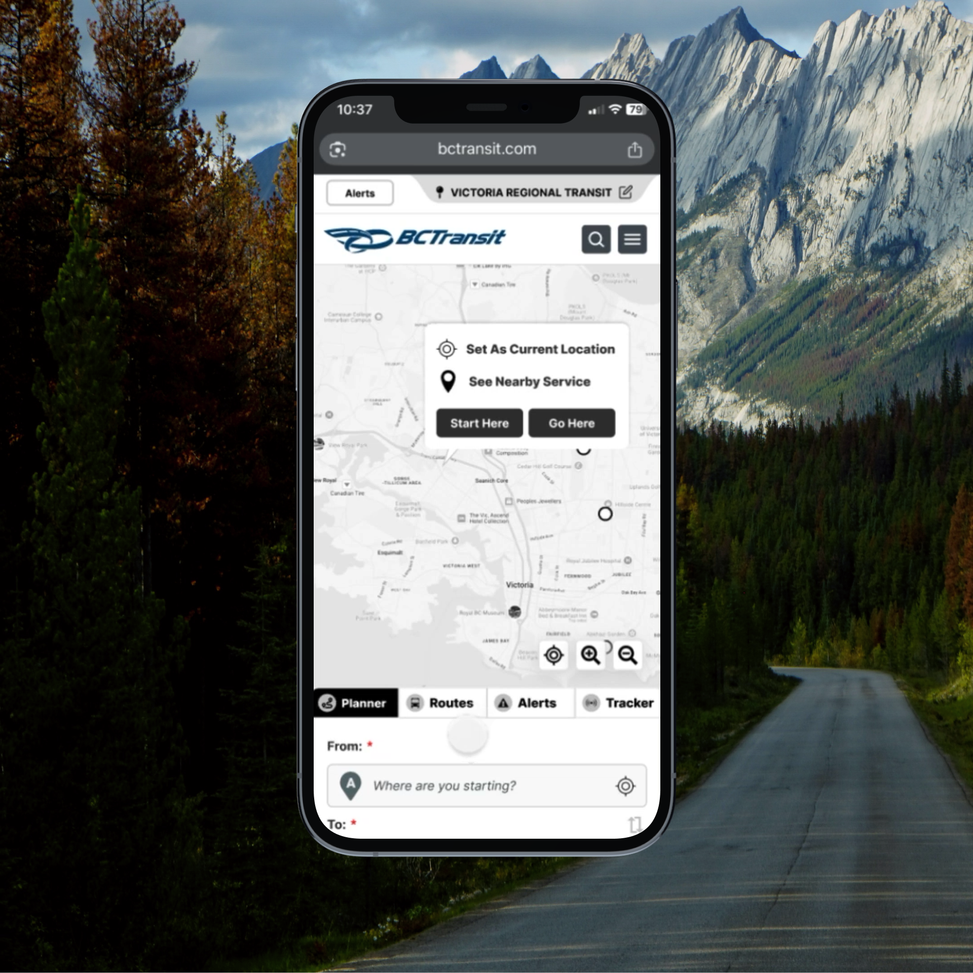
Most transit websites fragment these tasks across multiple pages, forcing riders to context-switch. My approach was designing a single integrated application, anchored by four tabs sitting directly below one large, dynamic, interactive map: Trip Planner, Routes, Alerts, and Bus Tracker. Each tab reshapes the map for its specific use cases while preserving one consistent mental model. Global top tasks like payment and accessibility information live in a persistent footer, ensuring they’re never more than a scroll away.
TRIP PLANNER
convenient ways to start your trip
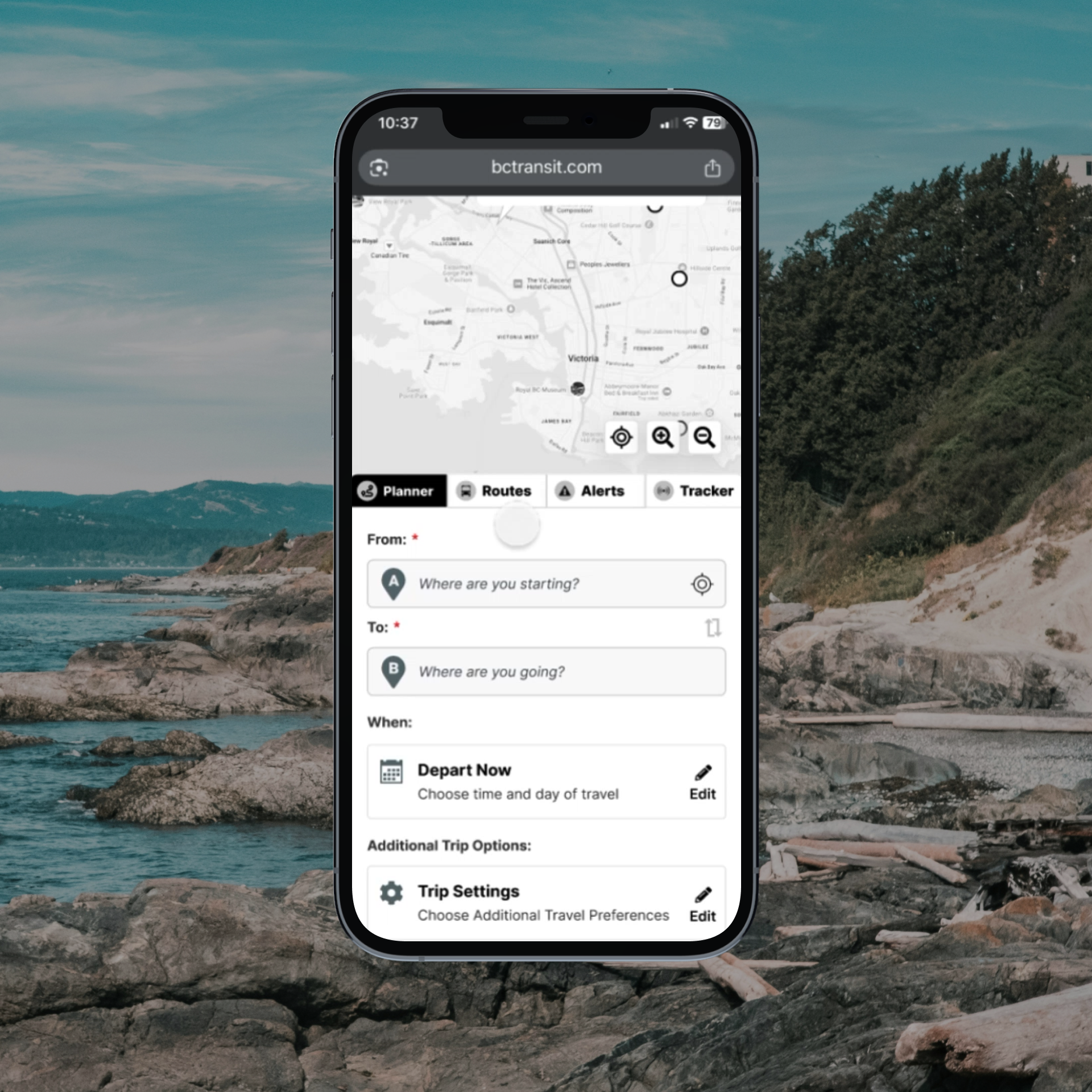
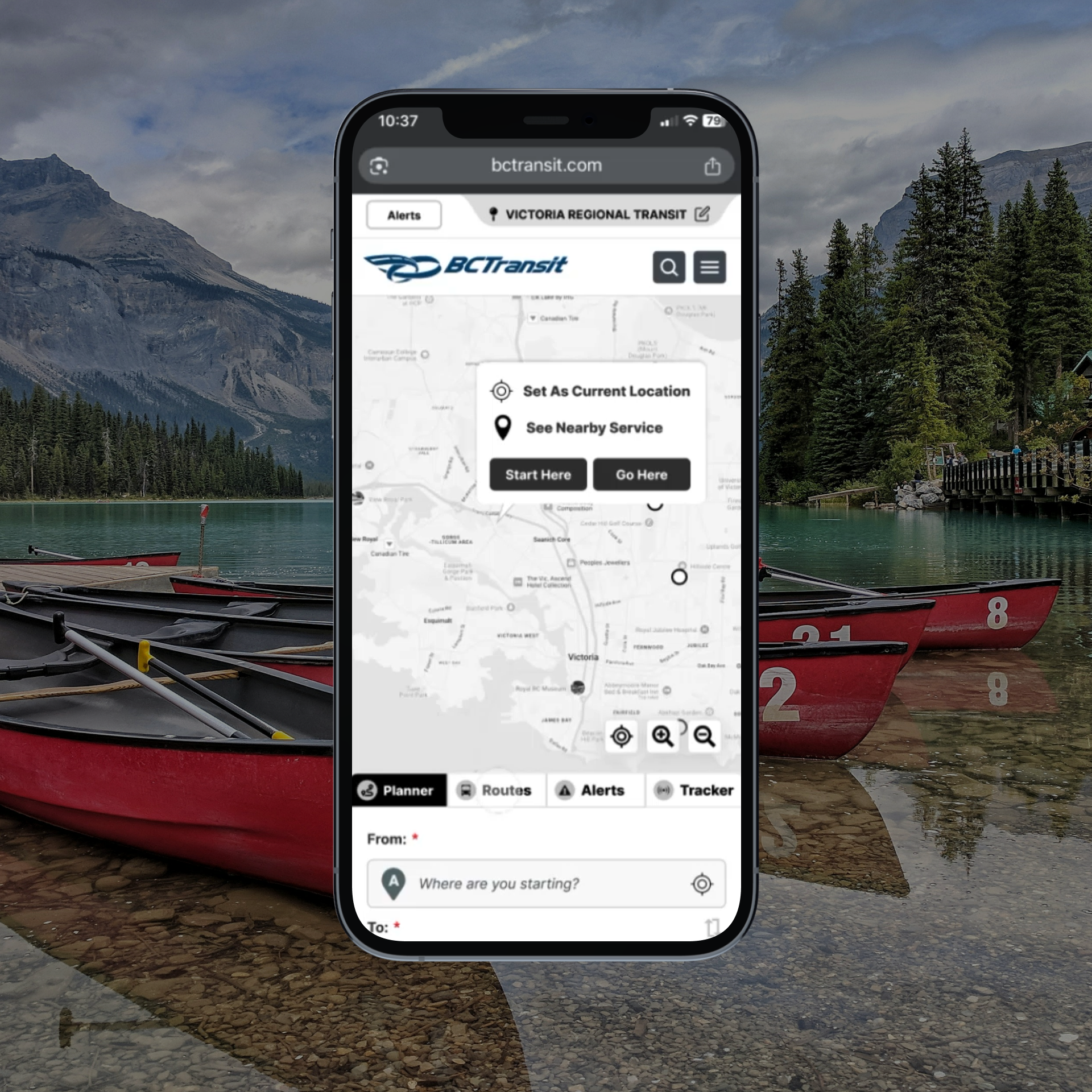
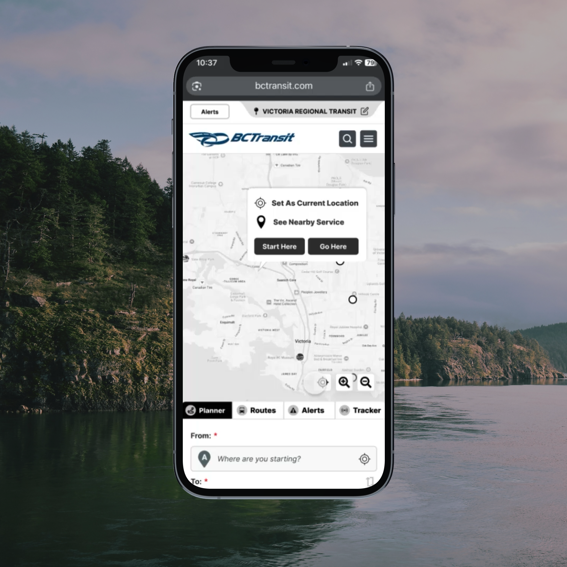
The Trip Planner is the most essential task for BC Transit’s riders. I knew I had to improve the usability, giving users efficient pathways to their destinations.
To plan a trip, users can:
Use the live coordinates button
Click directly on the map, setting the point as the start point or end point
Or, manually type in where they would like to go
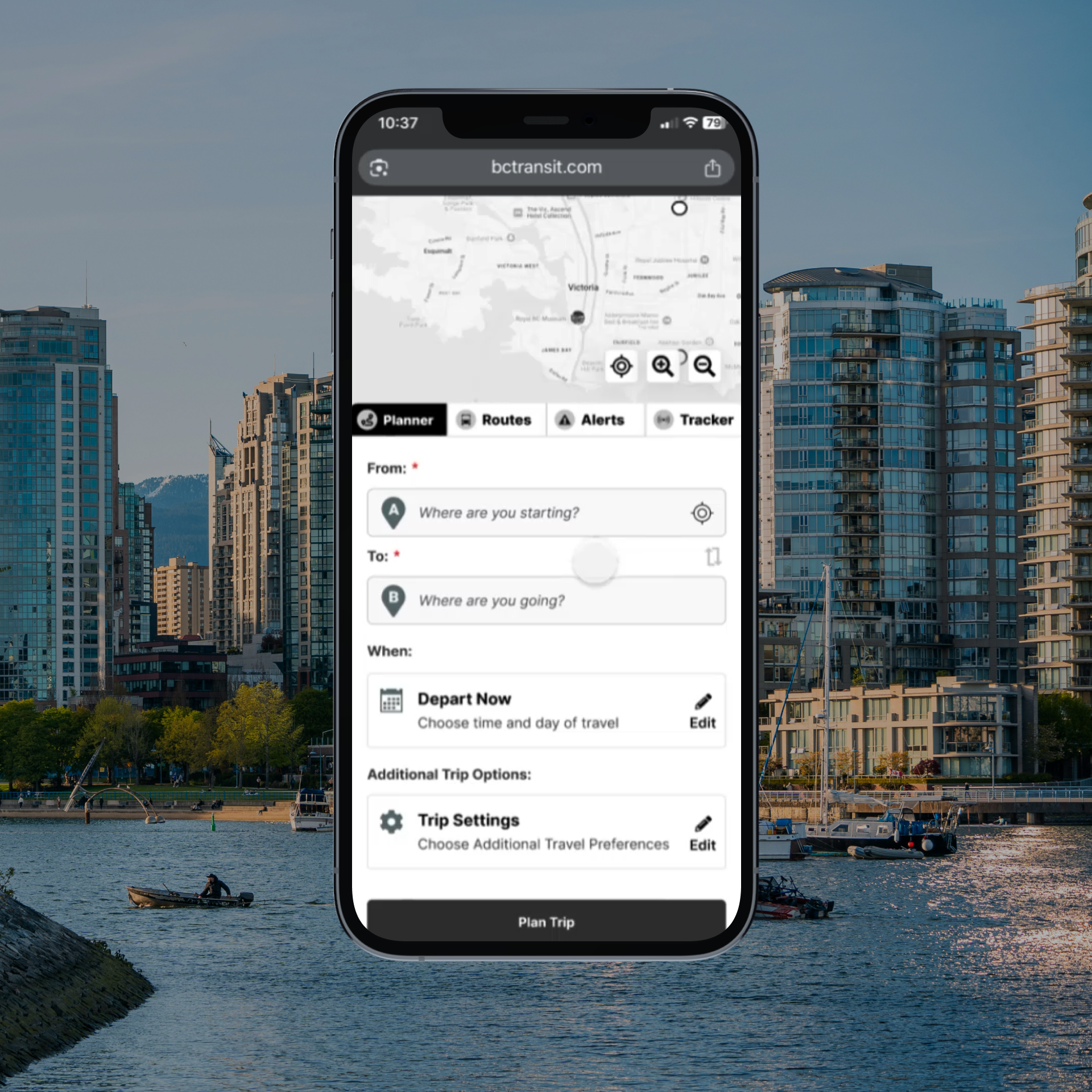
Alongside the text fields, I added in auto-complete, favourites, and recent searches for easy access of common trip points. The rider can further customize their trip in our 'Trip Settings' to account for preferences like minimizing transfers, and showing routes with accessible services.
Designing for the future, I indicated where users would choose what modes of transportation they are willing to include.
TRIP PLANNER
‘one-stop-shop’ for trip information
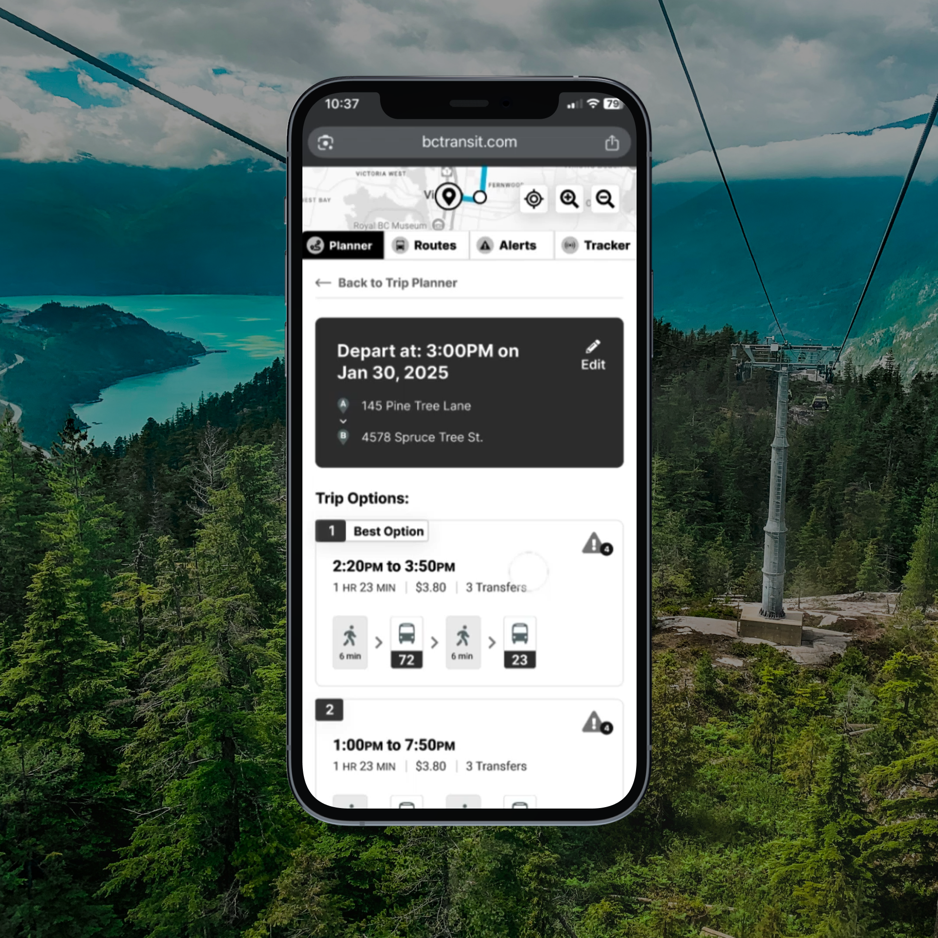
Research revealed a core drawback of the previous planner: contextual information rarely surfaced at the moment riders needed it, forcing them to leave the trip flow to find it. I designed a new interface to make the journey more intuitive:
Riders see top trip details before choosing a route, with alerts surfaced alongside, mitigating commitment to a path only to discover a road closure mid-trip,
Iconography using global route tokens and walking symbols lets riders visualize transfers and transportation modes at a glance -- ideal for riders who prefer a less interrupted trip,
And, a quick cost and time breakdown closes the loop, giving riders everything they need to choose the best path.
TRIP PLANNER
Step-by-Step directions and visuals
Once a rider selects a trip option, their route appears on the map with live bus positions they can track.
Below, riders see step-by-step navigation in plain language. Alerts and live arrival times sit inside the directions themselves, so riders never have to leave the trip context.
To make visualizing a trip even easier, every stop includes a quick-view button that jumps to the map above zoomed to the exact location: no manual panning, or scrolling back up the page.
Routes
integrated, reliable, live data
The Routes tab surfaces every bus line on the interactive map at once, giving riders an at-a-glance view of the full network. Below, an autocomplete search filters to a specific route, and a favouriting mechanism pins frequently used routes to the top of the list for one-tap access.
Selecting a route reshapes the map to focus on that line, with live bus positions and clickable, favouritable stops. Below, riders can subscribe to alerts, favourite the route, and see its cadence at a glance.
Every stop is listed with real-time arrival information and a refresh option, addressing one of the most requested features in our research: confidence that what riders see reflects up-to-date data.
Alerts
A central hub for important notices
Research told us riders wanted alerts surfaced contextually, exactly where affected routes and stops appear, but also wanted a centralized hub for pre-trip verification. Phase 2 delivers both.
Alerts appear inline across every tab, and the dedicated Alerts tab surfaces every route with an active alert, prioritizing the rider's favourites at the top, alongside system-wide advisories.
Tracker
Real-Time data
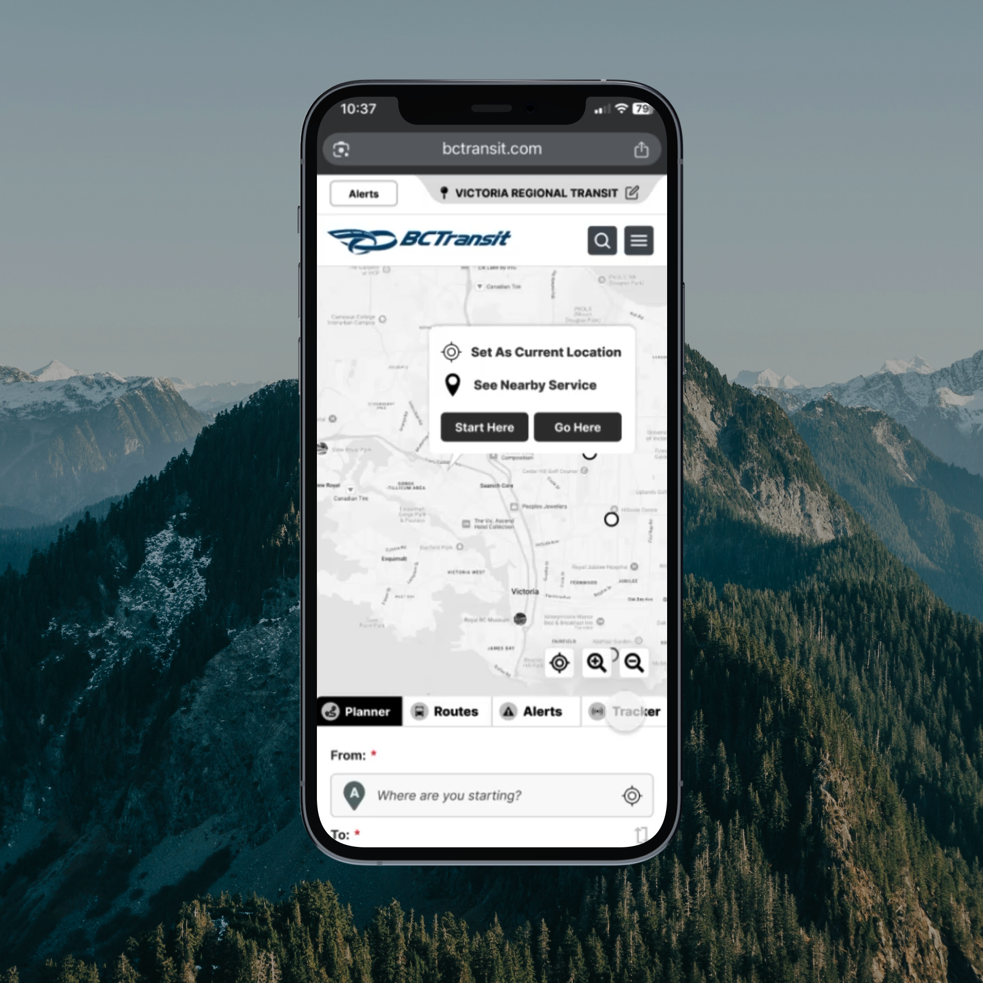
The 'Tracker' section was born from our research, which confirmed an imperative need for reliable, real-time, arrival data.
On the interactive map, riders can click any bus icon to track its progress, or any stop to monitor incoming buses. Favourited stops surface here automatically, so a rider can easily check the stop they plan on heading towards, understanding how much time they have to make it to their starting point.
Key Takeaways
Why was this project special
With this client, I got to use my creativity in two completely different avenues. In one way, I had to be innovative to compensate for scope constraints, and in the other, I had to answer the question: what would you do if there were no limitations?
From constrained boundaries to unbridled freedom
It's not often as a designer that you get to execute the same project twice, from two completely opposing lenses. Phase 1 was a masterclass in designing thoughtfully within tight parameters, where I got to work closely with client-side accessibility experts, my own team's technical lead, and balance all of this with the demands of the highly engaged patrons of the BC region. While Phase 1 focused on delivering the most, with the least flexibility, Phase 2 flipped this concept on its head, leaving no barriers except my own imagination itself. I think every designer secretly dreams of what they would create, if only they were given 'carte blanche', and I revelled in the prospect of proving I wouldn't waste the opportunity.
Both phases ran on the same rigour: deep user research, a large-scale competitive analysis of transit authorities worldwide, and post-design usability testing that confirmed our pages were delivering on the top tasks riders came to complete.
This project was rife with technical complexities like the regional systems, the strict accessibility needs, and the imperative criterion for innovation in regard to outdated informational structures on all devices.
This is one of my favourite projects because not only did I walk away feeling I had massively improved upon the existing experience despite the immense complexities, but the client also shared rave reviews from a public that they had previously told us does not shy away from pointing out inadequacies.
Next Case Study