
100 Kellogg Lane
The Project Challenge
100 Kellogg Lane needed a digital presence as electrifying as the tactile energy of its distinctive venues in person, paired with a global event ecosystem built to convert discovery and excitement into visits.
100 Kellogg Lane is a sprawling entertainment complex that encompasses local markets, cultural events, theme park attractions, dining, and hotel amenities, in London, Ontario, Canada.
My Roles:
My Process:
- RFP Response Strategy
- Shortlist Pitch
- Discovery Workshops
- UX Research & Analysis*
- Mood Board/Tiles*
- Wireframes*
- Prototypes*
- Mockups*
- Dev Hand-off
*Presentations & Revisions
Agency:
Northern Commerce



The Solution
3 Refreshed Brands
From Bland to Electric.
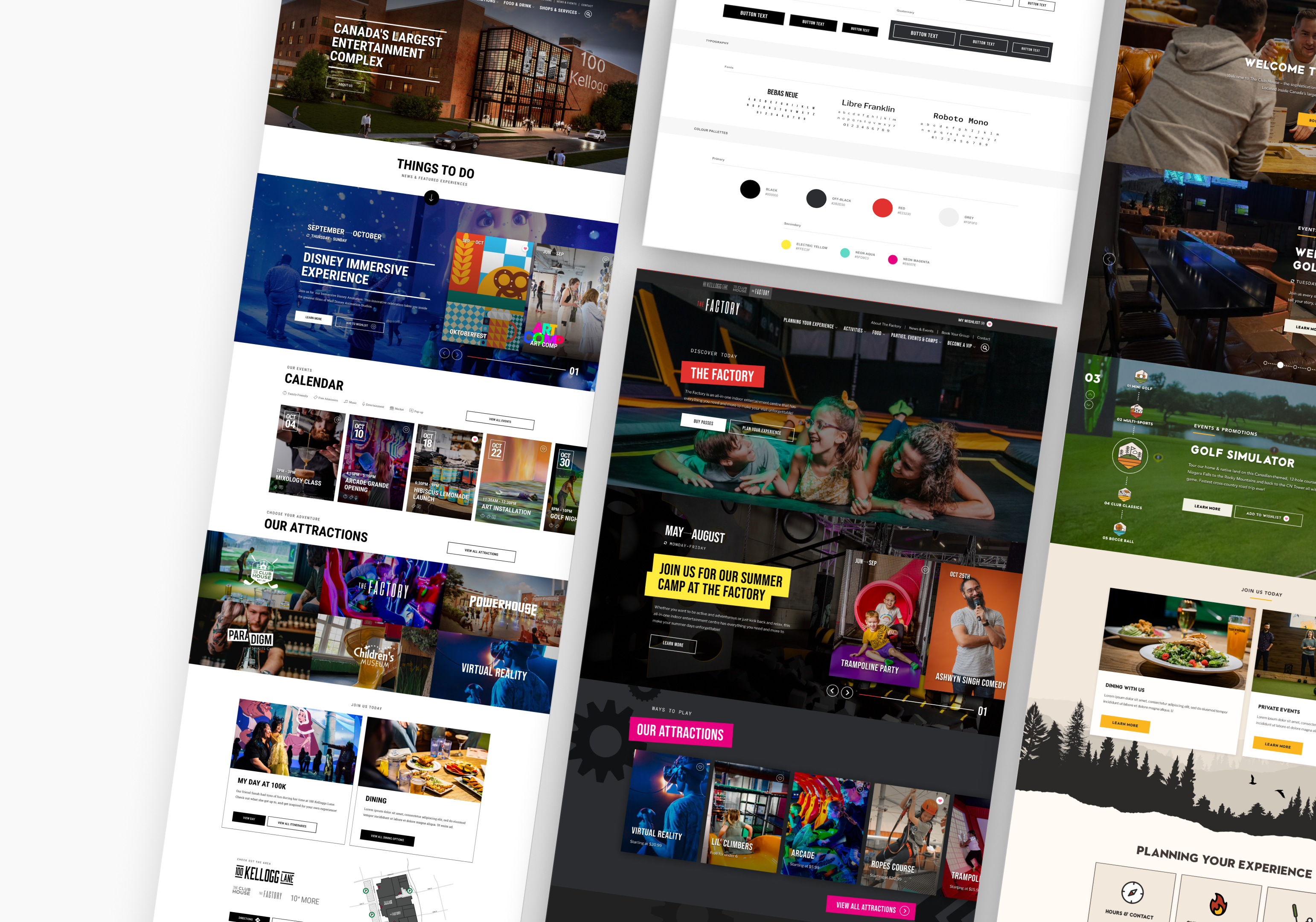
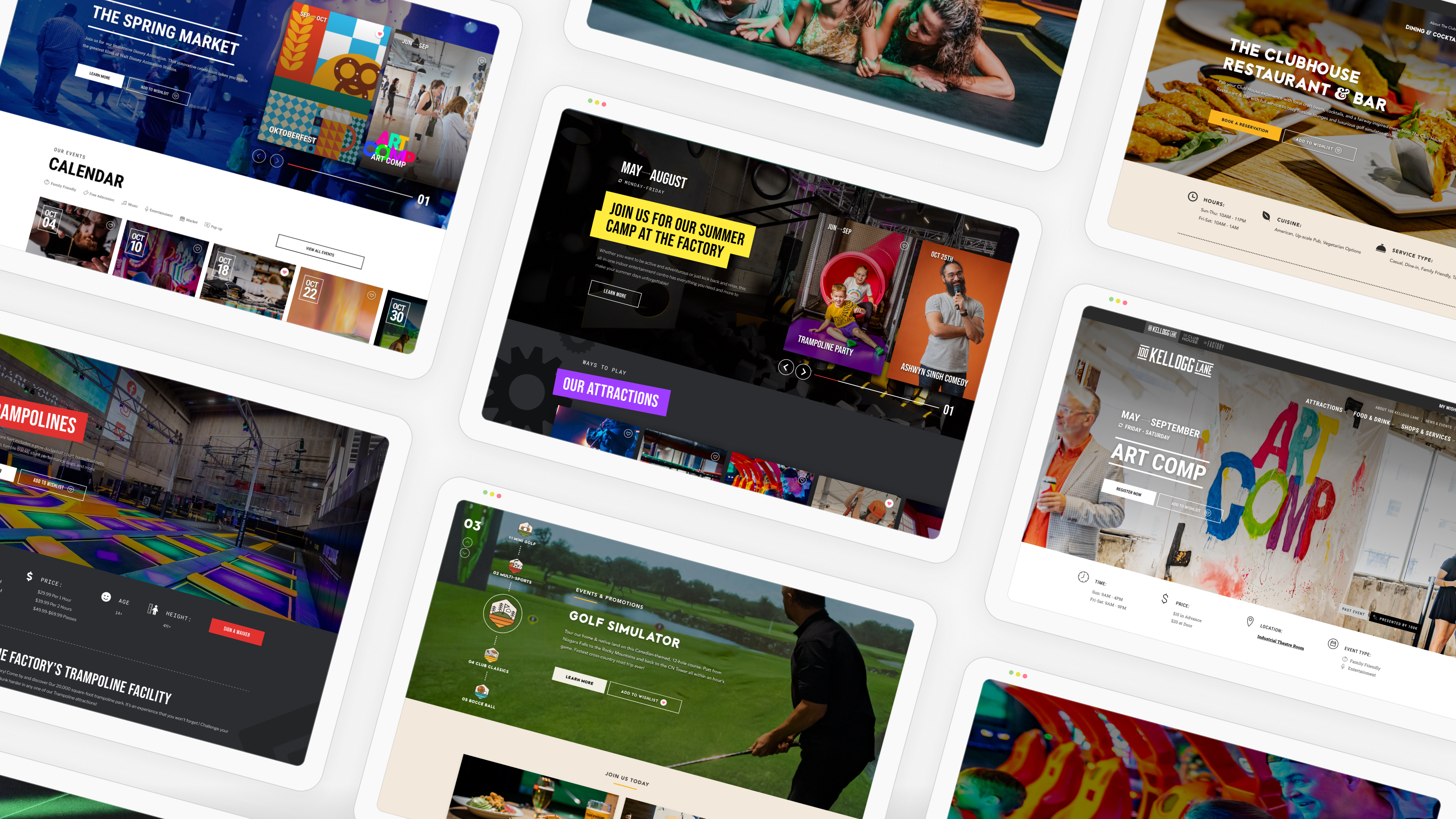
I designed three distinct brand identities, each authentic to its venue's personality, transforming generic, boilerplate layouts into immersive, visually charged experiences that build real anticipation to visit.
100 Kellogg Lane
A picture is worth a thousand words
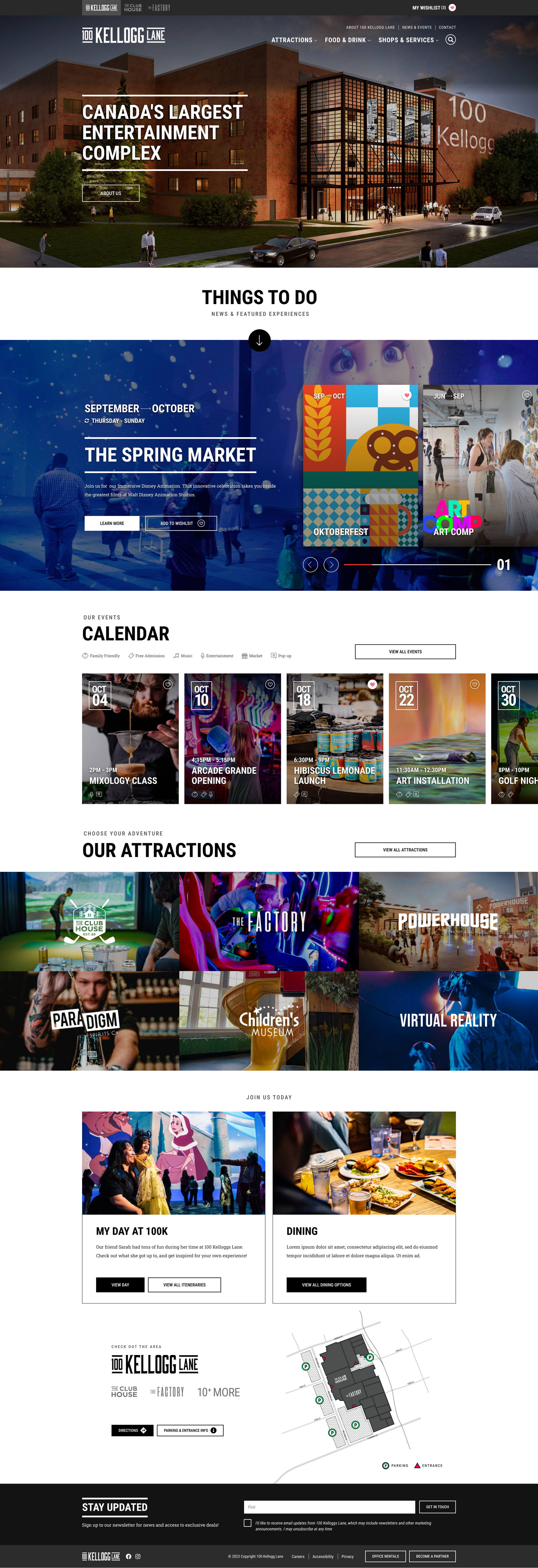
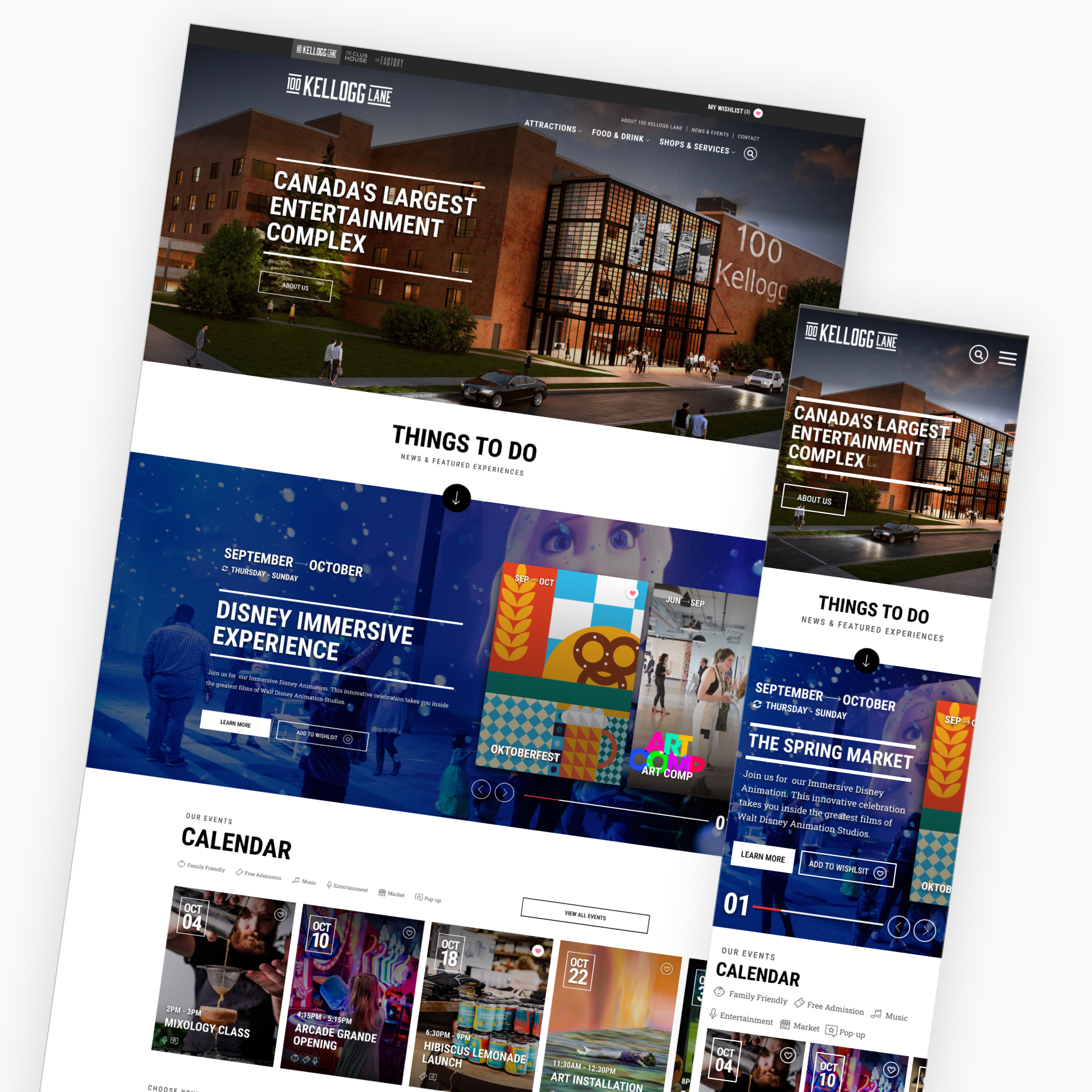
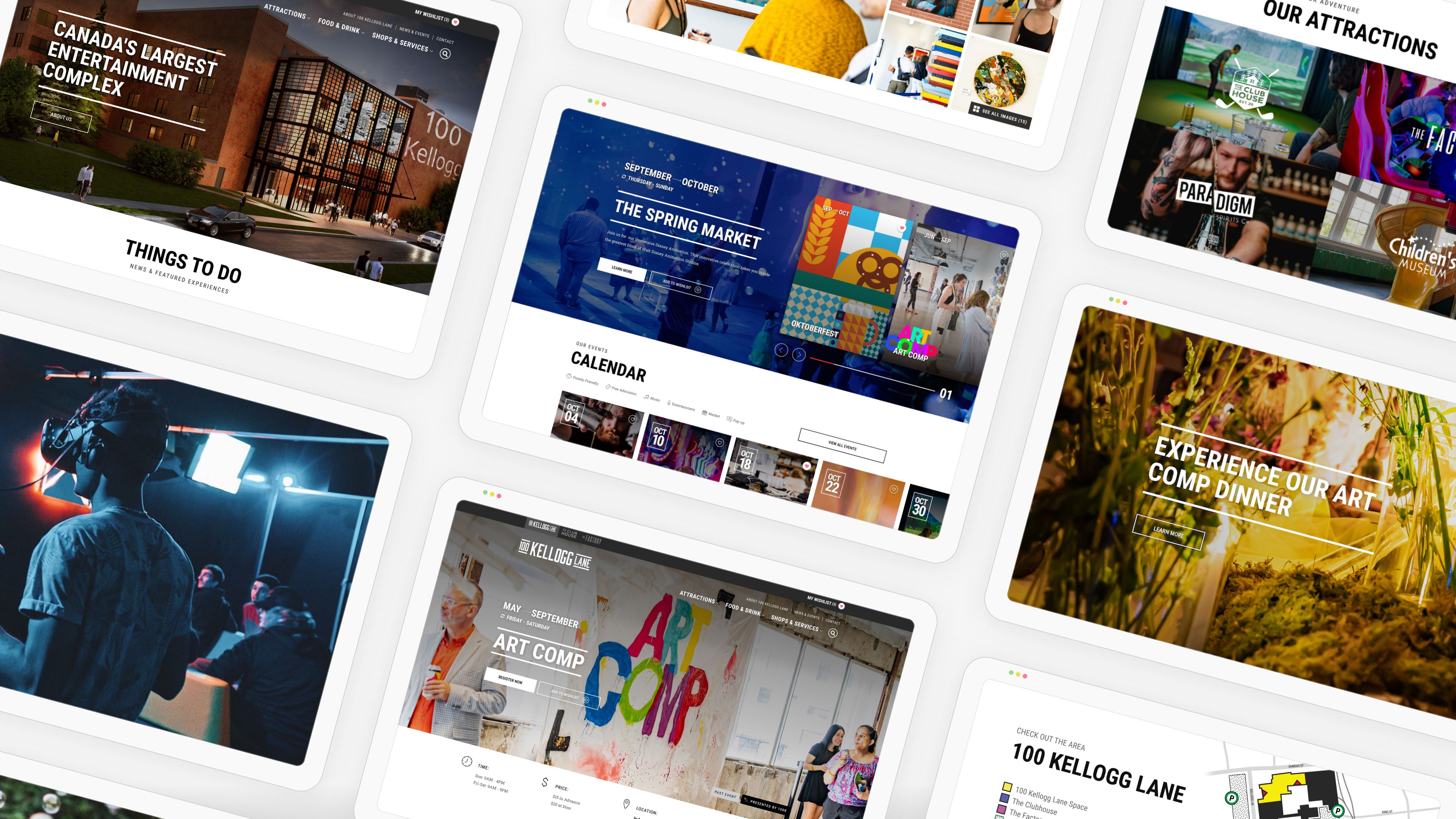
Our ‘main’ gateway website is 100 Kellogg Lane. I curated the base design aesthetic to be intentionally clean, modern, and simple so that it could act as a muted canvas on which to elevate the visuals of other distinct brands and experiences.
I paired this simple, yet refined, base with oversized imagery embedded in innovative structures to let the energy of the event, attraction, or sub venue itself evoke excitement and demand attention.

The Factory
From beige to neon
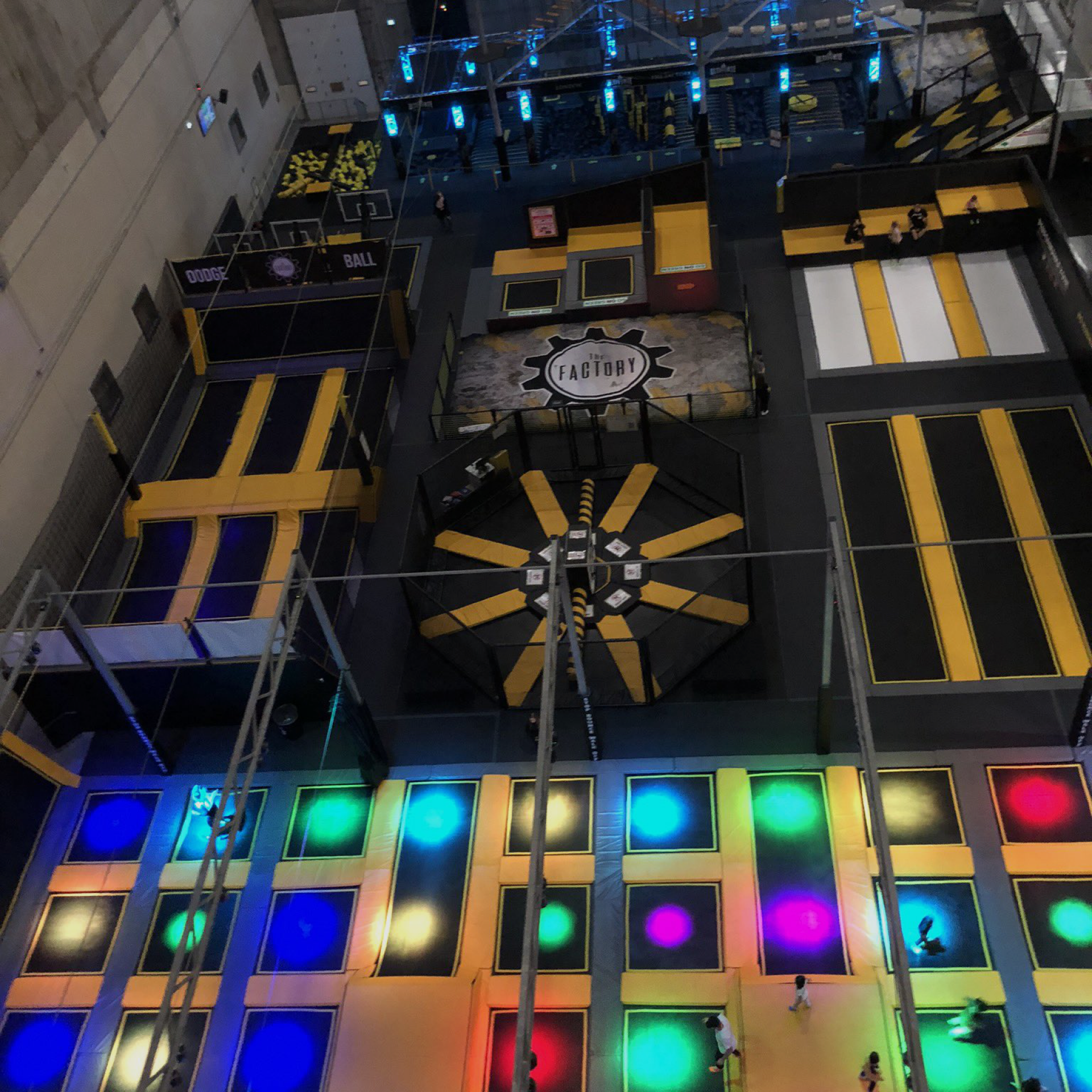
The Factory, an indoor adventure park overflowing with trampolines, arcade games and warrior courses within the 100 Kellogg Lane district is a true embodiment of ‘sensory overload’. But, if you visited their existing website, you would never know it.
Clad in a generic font, bland layout and a muted brand palette of beige, grey, black and red, I saw a huge opportunity to bring that same electric aliveness I felt in person to the design.
The Factory
Inspiration: The Arcade & Cartoons
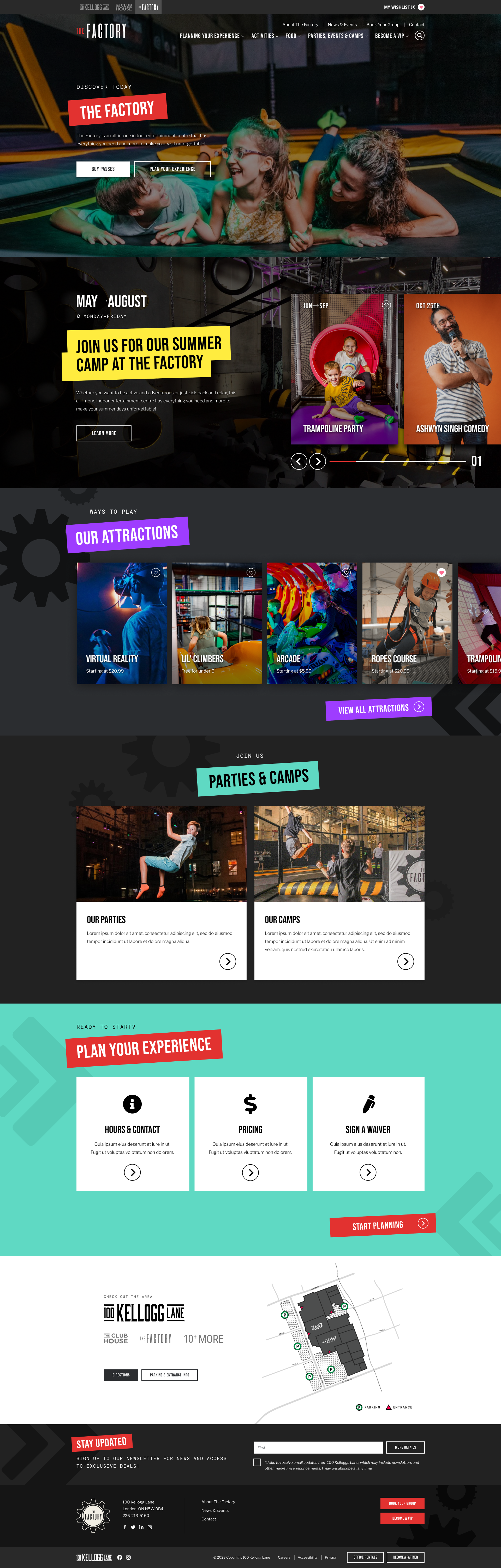
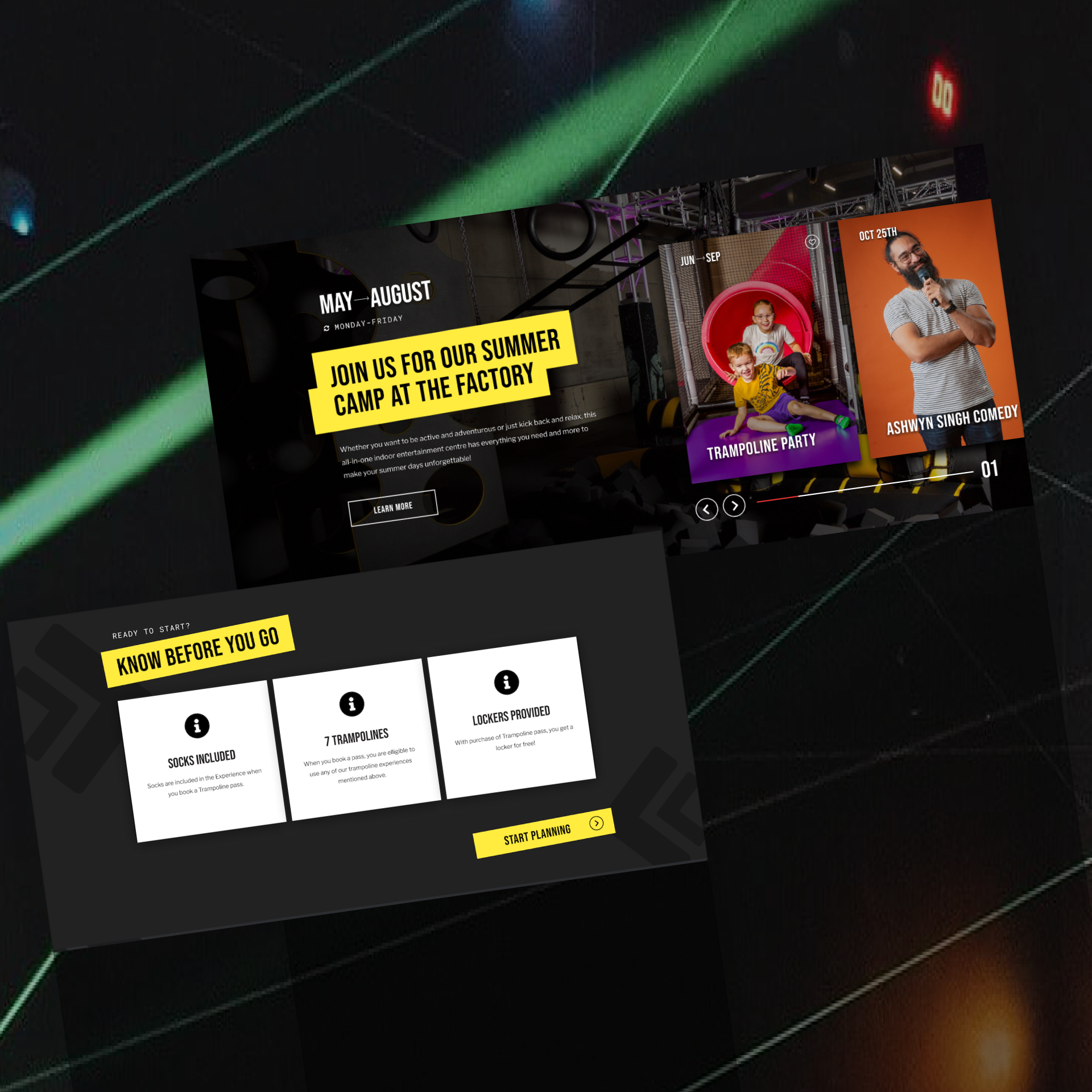
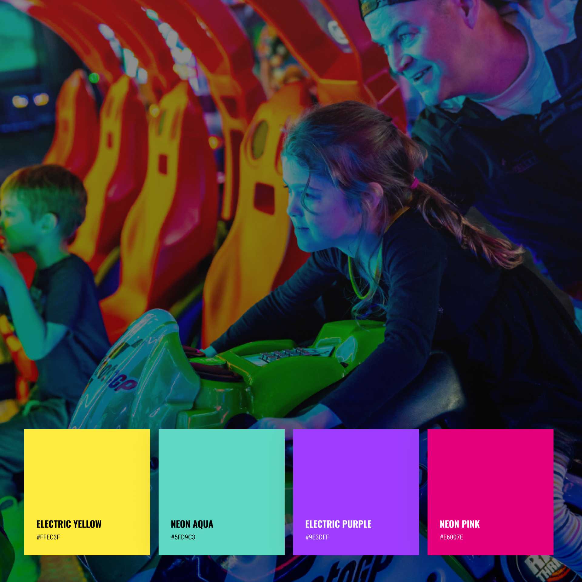
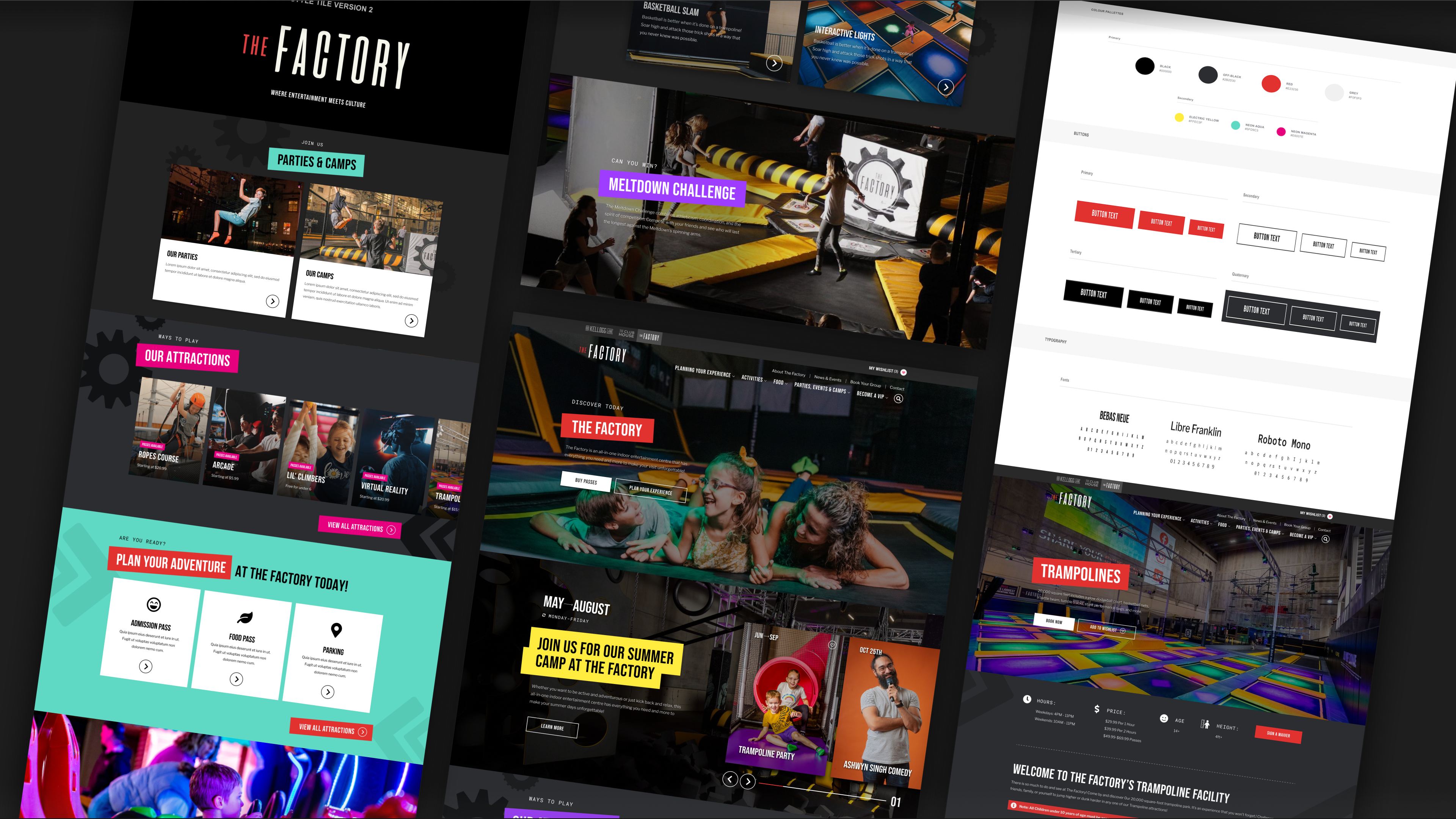
When I walked through The Factory’s facilities, it was impossible not to become immersed in a world of flashing lights, neon colours, and unexpected shapes. I cultivated inspiration from the effervescence of the areas like the arcade and implemented a new neon colour palette atop of a ‘dark mode’ base to evoke that same vibrancy.
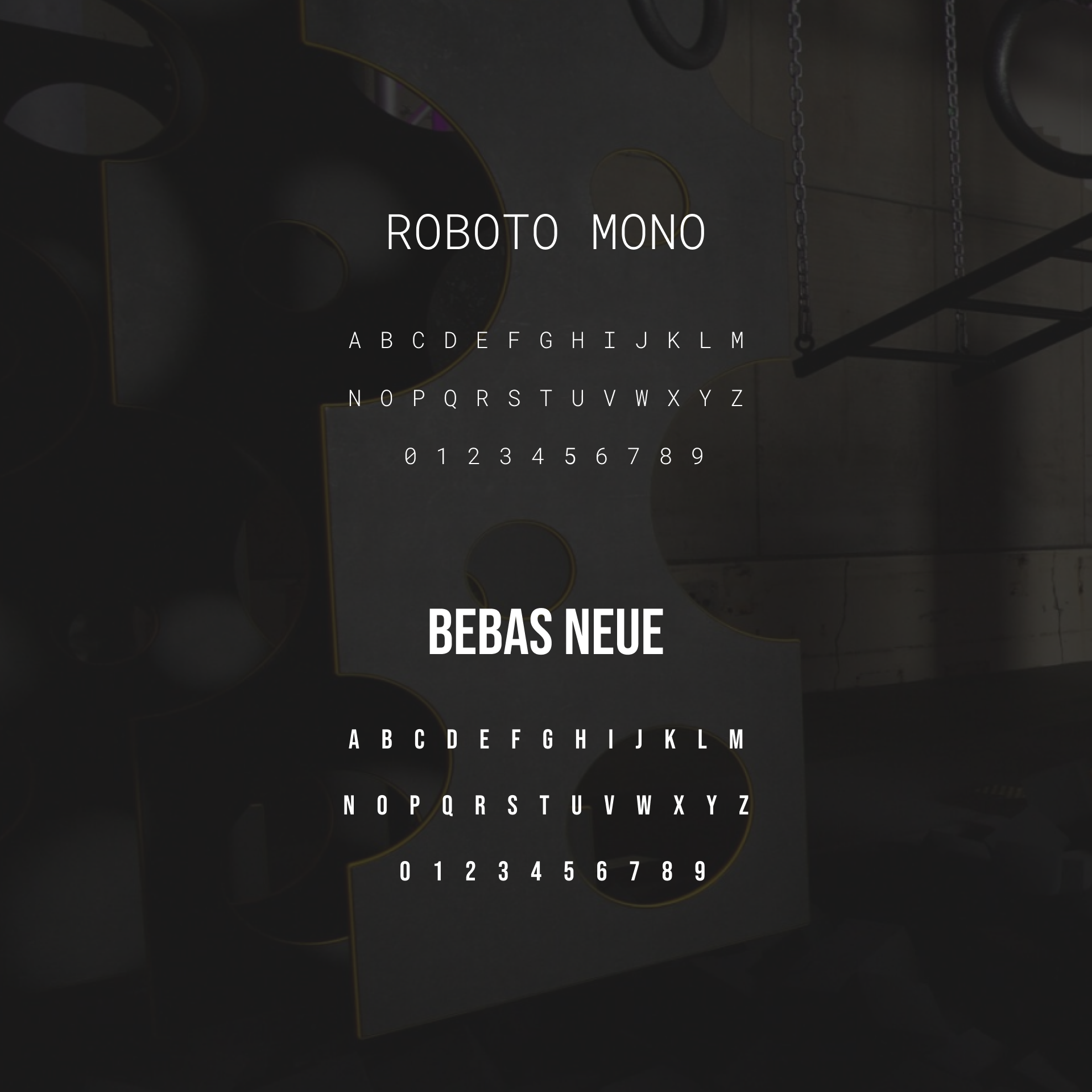
For our typography, I was inspired by the free-spirited playfulness of childhood cartoons, incorporating an intentional tilt to our featured titles to encapsulate the emotion of unbridled playfulness.
I paired these elements with funky shape motifs that lead the users eye down the page and foster visual texture.

The Clubhouse
From Camping to ‘Glamping’
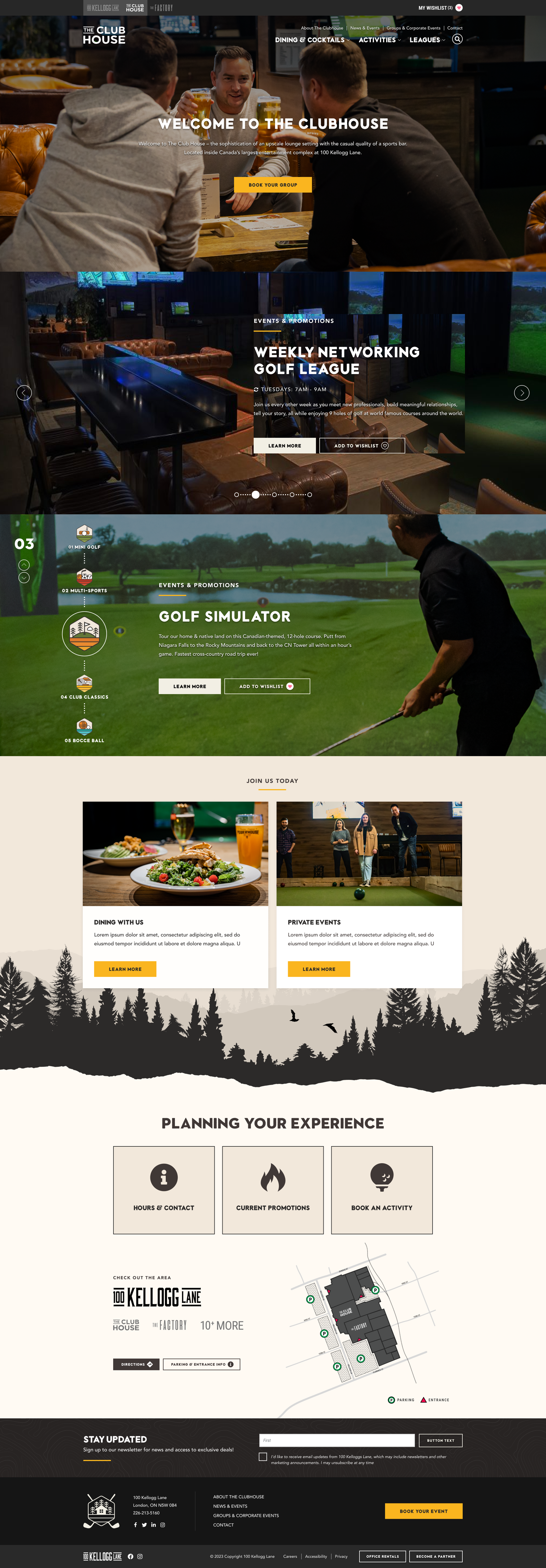
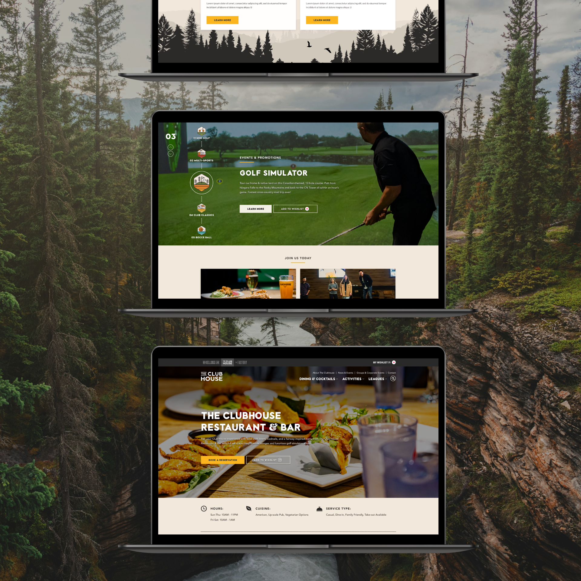
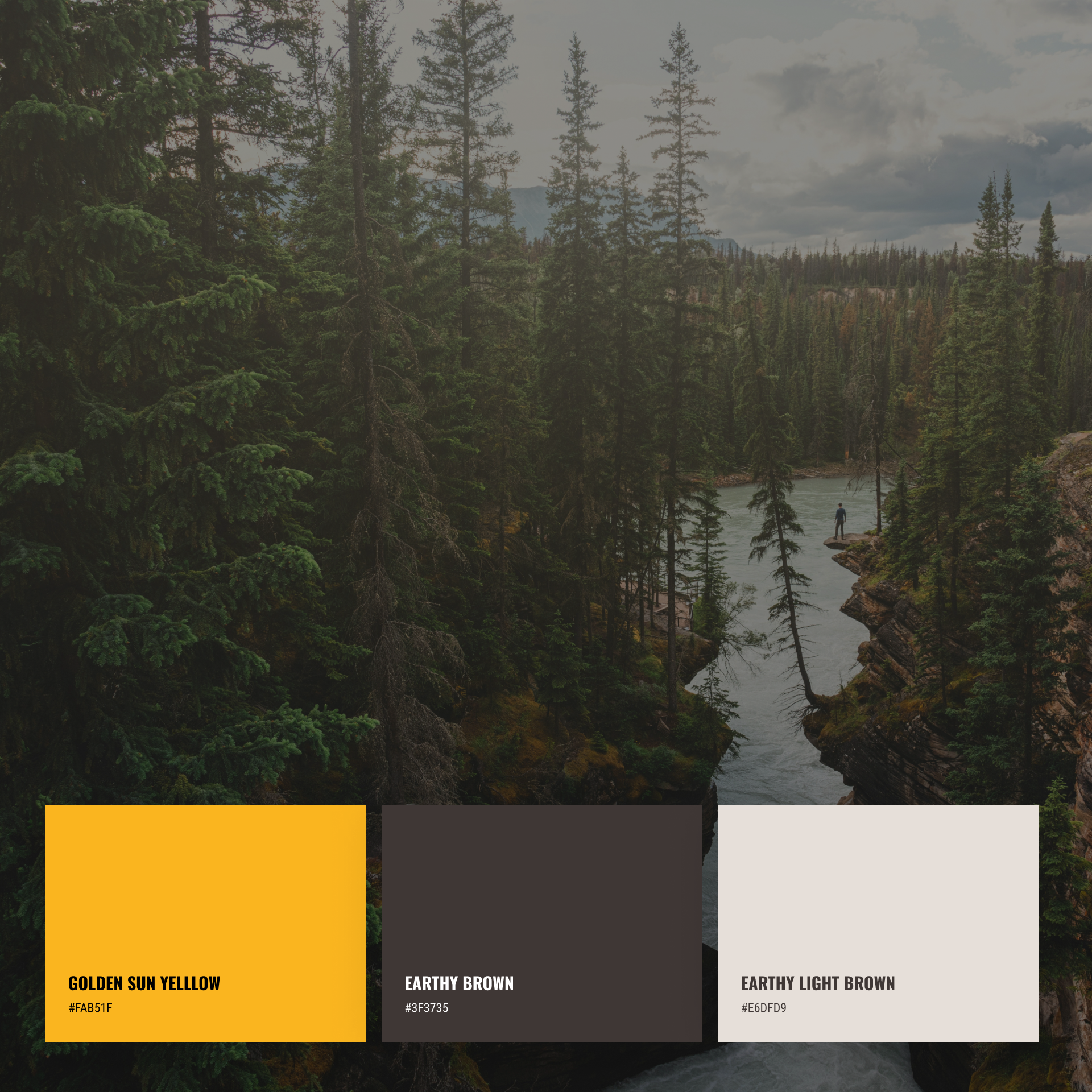
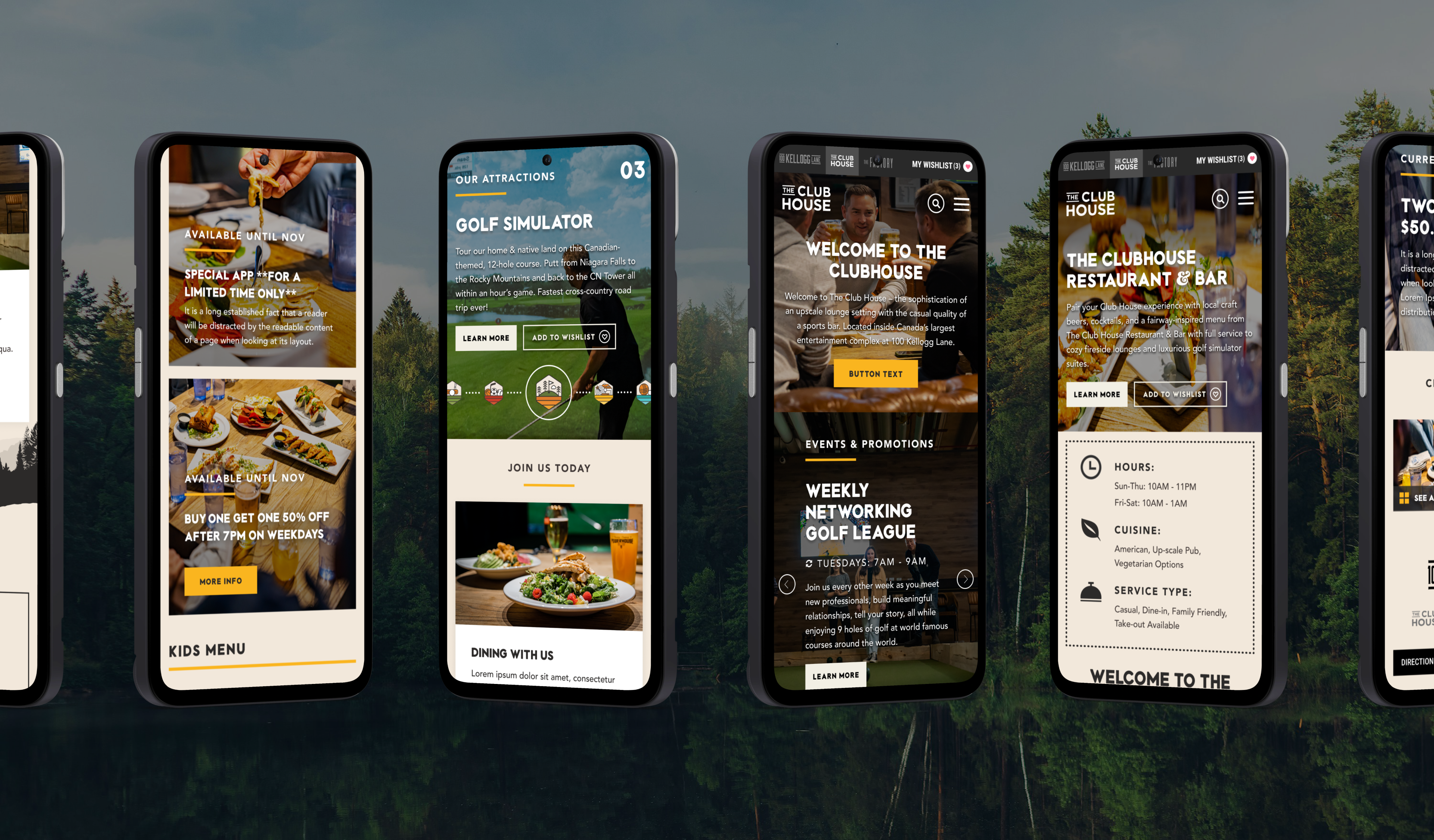
The Clubhouse, a sporting and dining venue within the 100 Kellogg Lane district, had hints of a ‘summer camp’ aesthetic on their website, but they weren’t fully leaning into the woodsy, Canadiana vibe I felt in person. Moreover, the owner wanted to tweak their brand persona to elevate past families with children, to reach older demographics like adult sports teams and corporate events.
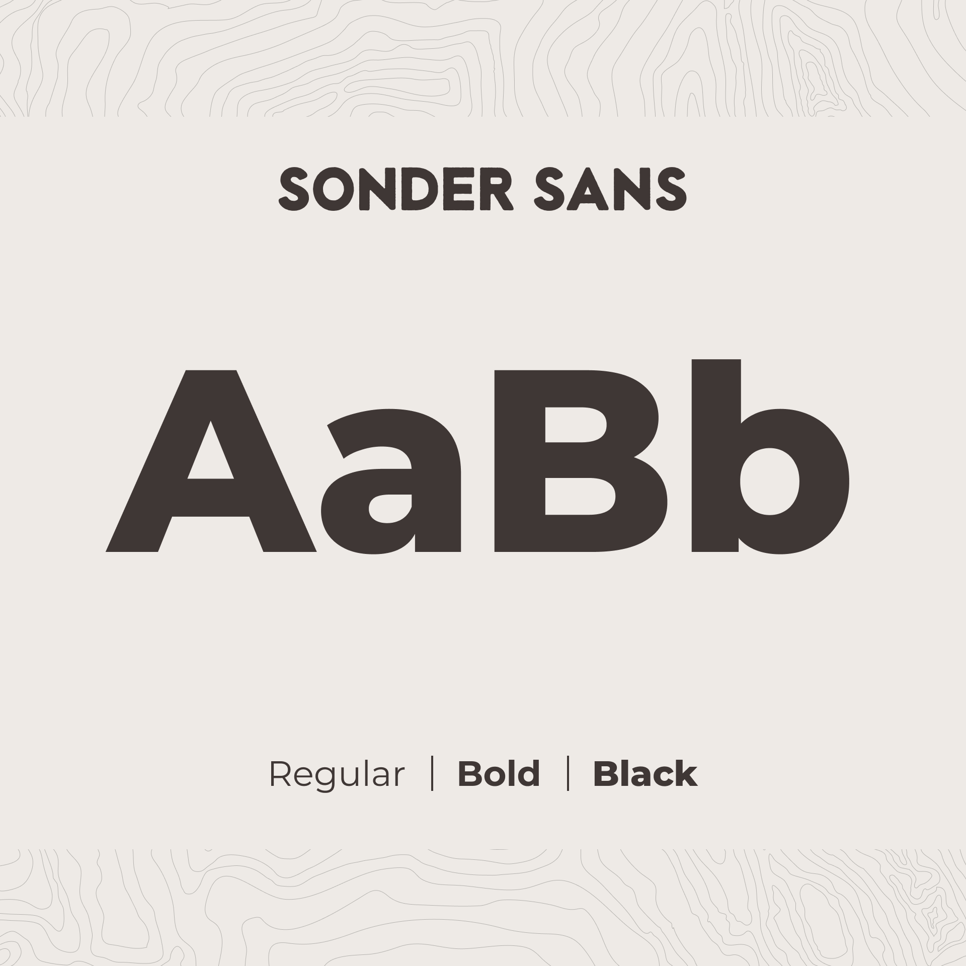
For this reason, I kept the camp whimsy but elevated it to 'glamping': refined nature motifs of woodgrain and mountain landscapes, paired with clean, modern photography that encompassed the desired customer base.
The Solution
An Innovative Event Ecosystem
Amplifying Event Discovery & Streamlining Planning
I amplified promotional areas for events & attractions on key landing pages to increase exposure to the breadth of activities 100 Kellogg Lane has to offer, and paired it with a new global favouriting system to keep the user's interests organized.
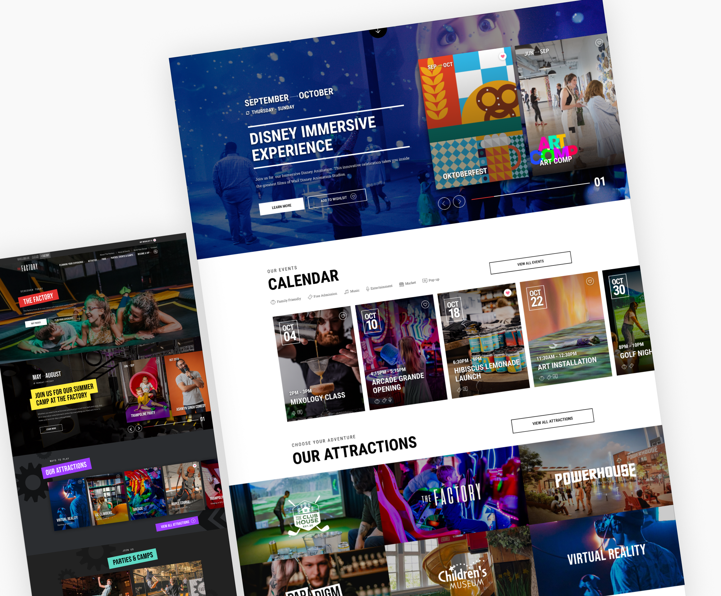
Positioning 100 Kellogg Lane as a one-stop Destination
‘worth the drive’
Despite the wide breadth of activities 100 Kellogg Lane has to offer, it struggled with one problem: the property is not located in a convenient part of town.
For this reason, it was imperative to covey the message that there was more than enough activities and attractions available to them to plan a full day trip, thus, making it ‘worth the drive’.
My first step to rectifying this issue: exposing web users to as many activities as possible throughout their browsing journey.
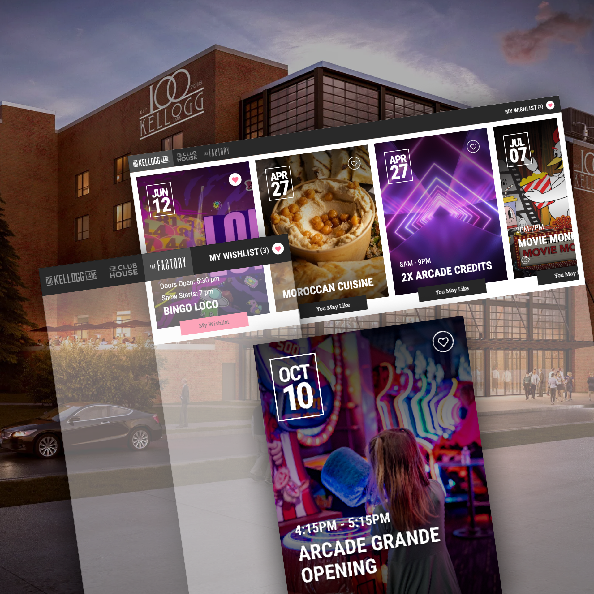
Creating a wishlist tool
Once I made finding activities easier, I implemented a system that would allow users to track and share these attractions with ease, encouraging groups to plan their trip together.
First, I added the ability to favourite attractions, events and activities throughout all domains.
Next, I implemented a global, sticky navigation bar that allows easy access between sub site properties, and to the user's wishlist count. The wishlist count doubles as a link, taking the user to their favourites list, where I then implemented smart recommendations to surface even more activities that they may have missed.
The Solution
Improved Cross-Property UX
Distinct Personalities, Consistent Information Architecture.
Since my plan so far was to make context switching easier, and amplify the unique distinction between brands, I needed to make sure we created a consistent underlying architecture that was easy to anticipate.
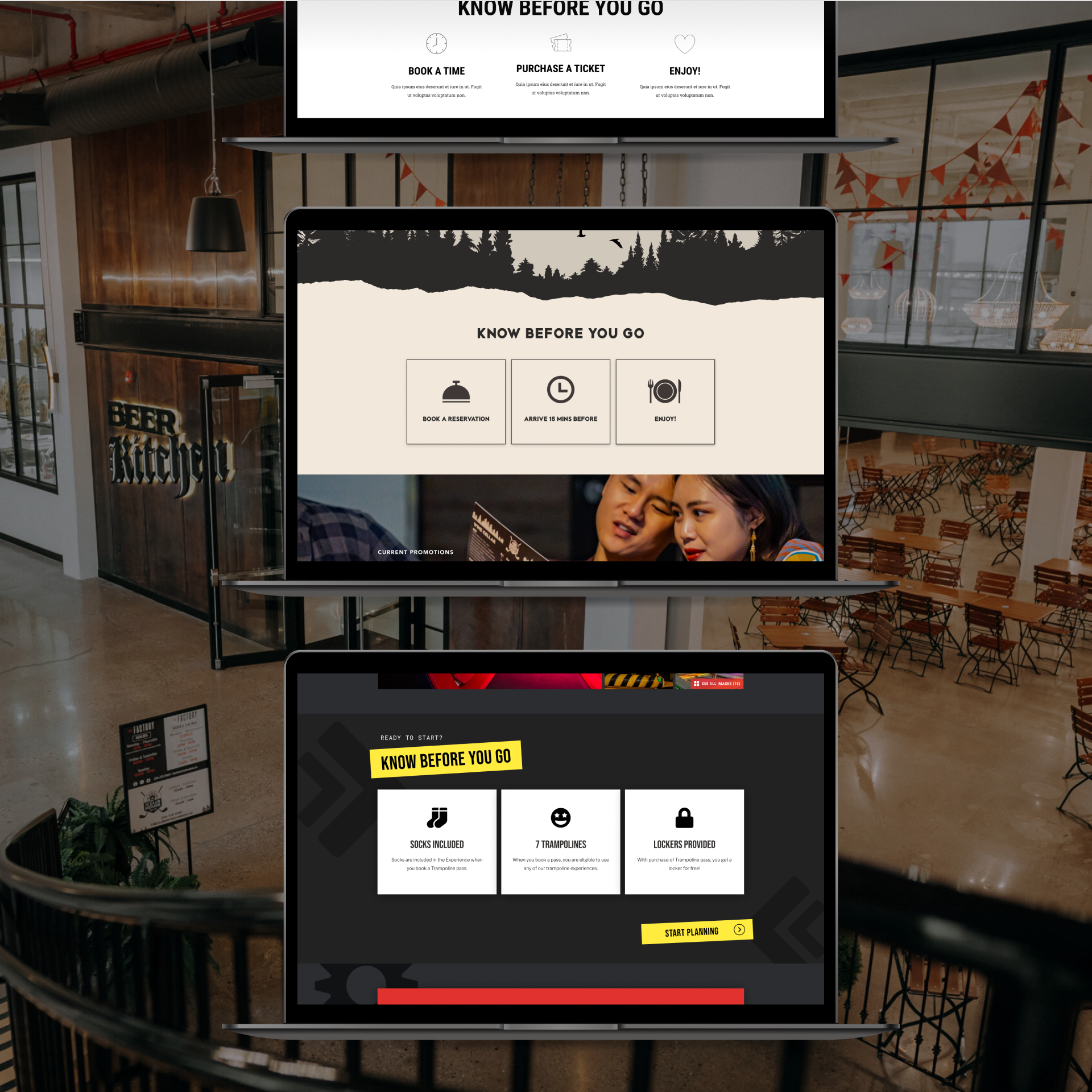
Consistent IA Patterns
I implemented consistent content conventions in areas like event calendars, attraction information, and ‘before you go’ sections on key pages throughout the global eco system so that the user would anticipate where to find content with ease, no matter what colour, tone and brand aesthetic accompanied it.
Key Takeaways
Why was this project special
I loved the challenge of designing three entirely distinct brands simultaneously, while also solutioning a way to connect their unique attractions within one coherent ecosystem.
From beige to neon
The most exciting projects are the ones where you can make the most impact from the starting state, to the finished product. Although I enjoyed immersing myself in each of the 3 brands we tackled, the place where I feel I made the most impact was on 'The Factory'. When we started this project, I couldn't believe how much 'aliveness' was 'left on the table' in terms of the potential of the energy we could bring to the website's design. I loved working with a client who was willing to push themselves out of their comfort zone and go in a completely novel direction. The heading 'from beige to neon' completely encompasses this experience because it shows just how far we came with the new design direction.
Paired with our exciting new visuals, I loved sharing my ideas with the client on how to surface the events in a broader, more meaningful and organized way for their users.
Seeing the excitement on the client's face in terms of what the new favouriting functionality could provide to their business is what makes being a designer so fun.
Next Case Study